Neoteric Photography aims to explore photography in an age where the image is everywhere. The image has become prolific yet easily forgotten. Hoping to find something to hold onto, something that will survive longer that it takes for pixels to appear upon a screen.
Today we are adding new galleries for our two projects from Creative Media Production. I began by opening my website on Wix and I checked the copyright was correct, the social links were working, the navigation was working and the homepage was well designed, and in my case it is my own work.
I began by creating a new page. I did this by clicking on pages and menu in the left hand menu and adding a new blank page. I then renamed it to my photography project name and I then dragged it under the portfolio section to make it a subpage.
Next I clicked on the add button in the left hand menu and went to text and added a heading. I then edited this to my photography project title and I also added a paragraph to add my introduction.
I the added a gallery buy clicking on the add button and then gallery and then I chose the portrait slider gallery and I clicked into manage media and uploaded my images.
I saved and republished after each action to ensure that is was viewable and working.
I then added a 'back to portfolio' button and made sure that is was consistent with the rest of the site and the same font. I then saved and published and checked that it worked and linked to the front portfolio page.
Next we are adding the front page images to our portfolio and buttons for navigation
I then went to my pages and menu and went to 'Add Menu Item', I then added a new page and renamed this to the name of my video production. I now had all the gallery pages I needed.
I then Wento to the front portfolio page and I dragged the new pages underneath to make these subpages. I then went to the 'Add' button on the left hand menu and then 'image', I uploaded an image from my photography project, I edited this in Wix by cropping and resizing and adding a filter that maktched my other images on the front portfolio page.
I then went back to the 'Add' button and added a button and customised this to match the other buttons and used the same font 'Palantino Linotype'. I then added a link to the correct page. I then saved and republished and then previewed the site to make sure everything worked. I checked my new button the front page and the back to portfolio button on my project page. I checked my writing for spelling and grammar errors. Republished again.
I then repeated the actions above by adding an image from my video production and adding a new button to my new page 'Sock Monkey Magic'. I then added the correct link and checked this worked with the page.
I then added a title, introduction and a new 'Back to Portfolio' link and my final video will be added upon completion.
I then saved everything, checked that everything worked and previewed and then republished. Last thing was to check my mobile view of new pages and portfolio. These are all okay and did not changing but I might make some minor adjustments to the size of text on pages.
I finished all the work and then saved and republished again.
I think these pages are looking good and present the work well, I stilll probably need to recheck everything but I am happy with navigation, presentation on the front portfolo page and the links.
Today we are looking at curating our images. I have already curated my own as Tarot cards however just to look at quality control and curation again with the class I have picked these images.
The Fool: 1251/1268
The Devil: 1321/1320
The Lovers: 1425/1415/1451/1455
I have opened Photoshop and then I have clicked on File in the top menu and then open and I opened 3 images that were possibilities for my first picture in my collection. I visually inspected the images and chose the sharpest image and the one that I felt had the most impact.
After I chose my image I then went to 'image' in the top menu and then to adjustments and then to 'Curves' which opened a dialog box. I wanted my black to be blacker to I very slightly moved the curves to darken and deepen the background
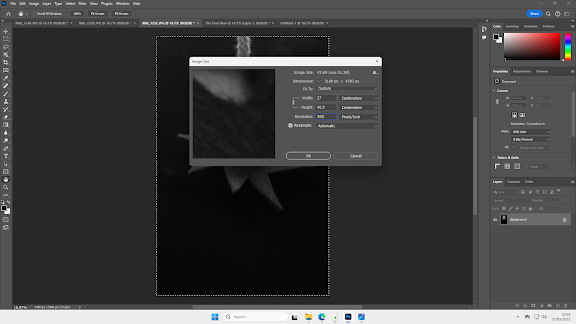
Next step is that we need to present image and make it ready for our website gallery. I then went to the top menu and chose 'File' and then 'New'. A dialog box opens and I chose 'Print' in the top menu and 'view all presets'
I then chose A3 size, portrait orientation and it was 300ppi so that my background for my image is high resolution
My next step was to prepare my image for my canvas, so I clicked on 'Image' in the top menu and then I changed my image size (width and height) to just less than A3 Size (29.7 x 42cm) and then I changed my resolution to 300ppi to ensure that it was the same resolution as the canvas.
I then went to 'Select' in the top menu and the 'select all' . I then went to 'Edit' in the top menu and 'Copy'. I then went back to my new canvas tab and then clicked on 'Edit' and the 'paste'. I then clicked onto my move tool in the tools menu and using the transform controls I adjusted the image very slightly so I could add my title.
I then clicked on the 'Text' tool in the tools menu on the left hand side and then I clicked on the canvas to position my text. I then changed the font to Harrington. I kept the colour black and I then changed the font size to 72pts. I then just positioned this to the right of the image on the canvas.
I then saved the image as a psd and jpeg file in my final images file ready for my website gallery.
I will repeat this process for all of my collection on my website.
A Bad Idea (2024) by Conor Flynn is a short film of 2 minutes and 23 seconds. The film is a very simply story of a man who is looking for ideas to make a short film. We see shots of his internet search and him choosing an idea he likes. The scene then moves to the kitchen where he creates smoke like David Fincher but goes on to try to recreate the Hannibal Egg Trick. This is the main body of the film with the man performing take after take to try to recreate the trick. The scene goes through the night into the next morning, when he finally performs the trick. The joke is then shown at the end where he has forgottten to take off his lens cap.
I will be analysing three shots and looking in detail how these work within the film. My first shot is a wide medium shot.
This shot at 0.42 seconds estabilishes the location of the action, the man's kitchen. The shot is slightly low angle so we are very slightly looking up to his face, this is like a leading line in that the low angle draws your attention upward towards his face. Martinez states that 'standard low angle shots are created by positioning the camera just slightly below the subject. These shots are subtle yet effective, making the subject appear more prominent without exaggerating their size or presence.' (Martinez, 2025) This shot is also rule of thirds and this method is used throughout and works well as smoke action here in this shot comes in from the opposite side filling the shot. The shot is wide so it encompasses the backdrop of the kitchen with the plates and cups, sink and light in the background. Dunham from Studiobinder states that the rule of thirds; 'Create[s] conversation between the subject and background' (Dunham, 2020).
The domestic scene is clear and the manner of his clothes and his mother's voice in the background clearly exemplifies his location. The lighting has a warm brownish/orange tinge which reminded me of the photographs I used to take indoors on my old film camera this is the temperature colour for indoor shots, 'under tungsten lighting, a setting around 3200 Kelvin could be suitable' (Martin, 2023), in this shot it could be around that level to create the warm low light. This warm colour and lowlight shows also that it is evening/night time. The medium shot also shows what the man is doing and the audience can clearly understand the scene.
The second shot is the close up at 0.56 seconds. I have chosen the close up as the close ups are intercut with the medium shot throughout and give detail to the action the man is taking (i.e trying to break the egg through the spatula after throwing it)
In this shot we have a narrow depth of field with the shot clean and crisp at the top of the spatula the eye is drawn down as the spatula handle goes out of focus and the yellow light in the background, works to light up the spatula in the foreground of the shot. The rest of the shot is low light and this continuity between this shot and the meduim shot helps us to believe in the man's endeavour. 'The goal of continuity editing is to make the mechanisms of filmmaking invisible as to help the audience dismiss disbelief more easily.' (Deguzman, 2021)
The third shot at 1.27 is another wide angle medium shot at a low angle. I chose this shot as it is just after light has changed from night to day (Take 49).
I also chose this shot as we are at a slight angle to the side (using rule of thirds) and we are drawn upwards to the mans face and at the same time can see the action of his hands with the egg at the the centre of the shot. The light is now daylight the colour temperature has changed but the man still in the same clothes and performing the same actions continues with his mission to perfect the shot.
As I have touched on above the lighting in this film changes from low light in the first half, the evening/nightime in the characters home to daylight. The kelvin value of the low indoor lighting is proabably around 3200, as stated above. The daylight kelvin value is around 5500 and this is just a clear datlight light that looks like very natural light in the film. Here is a kelvin scale which explain the colour temperatures
The change of lighting in this film was used as creative device and is integral to the film. The man has been up all night trying to perfect the Hannibal Egg Trick. This passing of time from night to day (in filmic time) really gives the audience the sense of the length and difficulty of his endeavour.
References
Dunham, B. (2020). What is the Rule of Thirds? Definition and Examples in Film. [online] StudioBinder. Available at: https://www.studiobinder.com/blog/what-is-the-rule-of-thirds/ [Accessed 12 May 2025].
Martinez, S. (2025). Low Angle Shots: Tips, Tricks & Best Practices for Stunning Filmmaking and Photography. [online] Pixflow Blog. Available at: https://pixflow.net/blog/low-angle-shots-explained/ [Accessed 13 May 2025].
Martin, G. (2023). Kelvin Scale in Photography: Mastering Color Temperature. [online] PRO EDU. Available at: https://proedu.com/blogs/photography-fundamentals/kelvin-scale-in-photography-mastering-color-temperature [Accessed 13 May 2025].
Deguzman, K. (2021). Continuity Editing — The Invisible Cut. [online] StudioBinder. Available at: https://www.studiobinder.com/blog/what-is-continuity-editing-in-film/ [Accessed 13 May 2025].
The next in pre-production was to create shot list. I used my storyboard as a basis for my shots. I then considerd the timing for each shot, this will be useful for editing and when I shoot knowing exactly I footage I need.
I am now ready to start filming, I have planned to do this on Bank Holiday at the end of May. I just need to ensure that have all my resources for the day and the correct equipment. I will then post my production of this video.
I have now finalised my idea and mocked up storyboards with potential shots and order. I will now go through the planning for my explainer video. Crafting Joy: Sock Monkey Magic
What is your final idea? Please explain in two sentences your chosen video and the theme/your idea
To create an explainer video where I explain how to make a sock monkey. I will show the materials needed, the process with the correct stitching and the final outcome.
Considering the form, What are the location or locations of your video shoot?
The location will be my own home, I will just need a large table and a plain background
How long do you expect your video to be?
The video will be 3-5 minutes long.
How are you filming your footage? Please state the phone or camera model you will be using
I will be using a Canon 700D DSLR, I may also use a smaller olympus camera or my phone for some shots.
What extra equipment will you be using?
I will be using a large and a small tripod. The large tripod will be for my medium shots. I will use the small tripod and a smaller camera to get details of my hands and the sewing.
What is the plan of your time and how much you will need to spend on this?
The actual shooting may take a few hours, as just making the monkey actually takes around two hours, and then actually shooting the correct shots whilst making the monkey will be longer. The editing of the shoot will then take me probably about 5 hours.
What do you imagine the final video style and content will look like?
I am expecting this to be in the form of an explainer video, and so will be in this style. I want this to look homely and friendly, not corporate!
Have you considered the Titles and credits and any additional subtitles needed? Explain how your ideas here
Yes, I want there to be clear titles so that this will work well on YouTube. I then may add additional subtitles or prompts throughout in text, as in other explainer videos. Yes there will be clear credits at the end.
Shooting and reshooting will need to be done? Have you factored in what you will do if you need additional footage?
Yes, I am expecting that I will need to reshoot some shots but I intend to also review as am going along as this a lengthy process. I should have time for reshoots if necessary
What will you be editing on, and how long do you expect this to take?
I will be editing on Clipchamp and I expect this will take me around five hours.
Write down any other thoughts or comments related to your plan.
Making an explainer video, the planning is key as I will need all the equipment ready for the Monkey and my video shoot. Some of the shots may be challenging as I am filming by myself and it is myself in the video. I expect that once I have the shot positioning correct, I will be able to repeat shots well, and there will be good continuity. In terms of the audio, if I make a mistake or it is not good, I can record the audio separately and add this over the shots, and this may work better anyway. I will also be using copyright free music at the beginning and end, and possibly during if there is just action and no speaking. I also may have issues with lighting if I have to reshoot as lighting conditions in my home can change due to the weather and to ensure continuity it would be better to get all shots in the same lighting condiotns.The edit is key to this to make a lengthy process short and clear.
In class today we created a storyboard using LTX Studio. I created a day in the life storyboard and this is the story I created. This studio is using using AI however as this a pre-visulaisation -no AI will be in my final work.
I have created my storyboards using LTX Studio. This is AI assisted however you just write in detail your own story so that is can create an accurate storyboard with shots and a timeline. The timeline was quite fun and I added a soundtrack!
This storyboarding really helped to solidify the shots and ideas and so now the project is called Crafting Joy: Sock Monkey Magic
The storyboard is here and although I could not do more as I only had a free amount of credits this really does go through the range of shots that will be used and the shots needed.
After much consideration, my final idea will be Making a Monkey. I will make a sock monkey in an explainer video. The shots are not too many, however, getting the different shots and angles will take time (as well as making the monkey!). I will create a plan and shot list to ensure that this can be successful. I intend to shoot either on the Canon 700D or an Olympus DSLR. I may use my phone for some shots in different set up but I am still considering this.
Sewing explainer videos are very popular, in this example, there is no voice over or explanation - just music and the action is the creation of the monkey. The shot is just one shot and there are extra instructions on screen as well as the pattern to download and you can subscribe to the channel
This is one approach; the other approach is to have an explanation and a person showing you how this is done. Again, most of the video below is a top down shot of the actions, there is also the man's voice over and subtitles so the explanation is clear at all times. This video is detailed and you could easily follow this real time and watch and copy.
Explainer videos are great for, obviously, explaining things! However, this is not their only purpose and they are used for many purposes for small and large businesses. They are an easy way to hook in users to products and services. They can help boost search engine optimisation, boost conversion rates, have easy links to social media and are easily shared and so they improve business. They are also good for people as people learn from them, they gain an understanding and sometimes a skill, and they can help people connect with a community online that enjoys the same things as they do. They can also appeal to a range of learning styles and people find their favourite people to explain things and often subscribe and follow them online.
It is important for this project to understand what makes the explainer video not just okay, but really good so people want to watch this and learn something from it. Forbes states that there are five key elements that make an explainer video great, and they are:
'A clear and concise script
A clear voice-over
An understandable video caption
Engaging visuals
A catchy and memorable soundtrack' (YEC, 2022)
Forbes also states that, 'The average user will not spend more than 20 seconds on your site if they're not hooked.' (YEC, 2022). On the internet, people will click away as soon as they are not interested, and now there is so much choice - why should they look at my video? Looking further at the research, Forbes advises the following: 'Plan the script, make it short and sweet, use simple language, keep the tone light and create rich visuals' (YEC, 2022). In my own video, I plan to set up to shots that will be constant so I have a constant recording from two angles, and so I don't have to shoot them separately. I also plan to complete a voice over just on the computer so that I can add this over the explanation as well as any straight to camera shots. I also plan to make a storyboard and shot list tro ensure it is absolutely clear how I will be doing this. Pre-production will be the key to making this really work.
Frontiers in Communication state: 'The use and importance of online videos about news, science, and climate change are continuously increasing (Allgaier, 2019; Frees et al., 2019; Galan et al., 2019). For example, 62% of Germans use YouTube frequently or occasionally as a search engine for specific questions and issues (Koch and Bleisch, 2020). Almost 70% watch videos on general knowledge topics, and 65% watch explainer videos or tutorials, with the share being even higher among young people (Koch and Bleisch, 2020; Wissenschaft im Dialog, 2021).' (Schorn, 2022). The importance of this is that most people receive and learn information from websites, particularly YouTube, and younger people are even more likely to watch YouTube for explainer videos and tutorials. The increasing use of explainer videos, tutorials and learning online has changed how people learn and what learning means. The impact of Covid had a massive effect on people's attitude to online learning and how institutions and websites changed to accommodate how people wanted to learn and in what way.
I may here be creating a fairly simple explainer video about making a sock monkey, but thinking about how this could mean I could teach others to do this, and how they might enjoy this, and it would bring joy to others - it is important and I do not take that lightly. There is nothing forgivable about a bad explainer video!
References
Mezzolab (n.d.). Top 30 Benefits of Explainer Videos. [online] www.mezzolab.com. Available at: https://www.mezzolab.com/blog/top-30-benefits-of-explainer-videos [Accessed 4 May 2025].
Schorn, A. (2022). Online explainer videos: Features, benefits, and effects. Frontiers in Communication, 7. doi:https://doi.org/10.3389/fcomm.2022.1034199.
YEC (2022). Explainer Videos And The Key To Making Them Great. [online] Forbes. Available at: https://www.forbes.com/councils/theyec/2022/09/16/explainer-videos-and-the-key-to-making-them-great/ [Accessed 4 May 2025].