Followers

Sunday 28 October 2018

Website Creation One

As I had already completed the website prior to this course beginning I will discuss the updates and improvements I have made to ensure that the website is absolutely at its best. First I checked my overview to ensure all the correct settings are inplace and enabled. 


This is important as I want to optimise the website as much as possible to make it easy to find in a search and that all details are correct. Some settings are only available on a Premium Plan - at present I am sticking with the basic plan.

I checked my homepage and I am still happy with this configuration the navigation is good and works well - I am happy with the colours and the scrolling images.


I then started to add metatags and descriptions to the the settings on my gallery pages this is so that it will be easily found on search engines and will be much more user friendly.  I also enabled cache rendering so that again the site is kept clean and smooth for the user.


Next I changed the page settings to ensure again that the page itself is easily searchable and added further tags for the gallery page.

I then added an introduction to the work itself so that there is a concept fro the work that the user can read. I will repeat this with my other gallery page.


Website Research

Robert Mapplethorpe


I have been researching photographers websites and the first website I looked at was Robert Mapplethorpe.  This website is run by The Robert Mapplethorpe Foundation as Mapplethorpe died in 1989 of AIDS.  Mapplethorpe spent his early career developing his skills as a photographer through the use of polaroids and he studies art at the Pratt Institute near Brooklyn. Mapplethorpe's use of polaroids gained him some attention in his first exhibition in 1973, at the time he was living with Patti Smith in The Chelsea Hotel which also housed a number of artists who would go on to become well known for their works - this circle of artists and friends Mapplethorpe used as his subject and after his first exhibition Mapplethorpe acquired a Hasselblad camera which he also began ti use in his work.  Mapplethorpe's work ranges from portraiture where he emulates Greek Sculpture to beautifully sensual images of plants and flowers.

The website The Robert Mapplethorpe Foundation is consistent and well laid out withe the headline of the Robert Mapplethorpe Foundation appearing on each page along with the menu which appear as you scroll over the top. Below you can see screenshots from the site - I was most taken with the first image on the home page - simple and beautiful - filling the page and with scrolling images so the image changes every few seconds.  The portfolio page is easy to use with the images in thumbnails so you can just click through.  The About page is informative and explains the foundation and there is a well written biography page with images.   Overall this website is easy to navigate, great for information, consistent and I am pleased to see the artist and his work represented in the best way possible online.


Helmut Newton

The second website I researched was Helmut Newton which is also from a Foundation The Helmut Newton Foundation - I thought it would be in keeping to look at two foundations to compare.  Helmut Newton I have written about in a previous post and looked at this website for information.  In terms of the look of the website this is much less impressive.  The website firstly appears quite small on the computer screen page.  The home page image is okay however does not really represent the body of work Newton created.  Going further into the site as you can see below the image on the page to go into Newton works is a  picture of himself which is not really the nest image of the man.  The Biography page is just black with writing and the navigation is more awkward as you have to go into 'Helmut Newton' to get his biography, exhibition and works which really I think should be easy to find on the main menu.  The header is consistent but not very exciting or inviting - overall this could be far more impressive considering Newton's body of work - disappointing!


Monday 22 October 2018

Research: Helmut Newton


This week I intend to concentrate on researching all my dictionary listings therefore I will begin by looking at the photographer Helmut Newton.


Helmut Newton was born in Berlin in 1920 as Helmut Neustadter, Newton left Berlin in 1938 and found work in Singapore on the Singapore Straits Newspaper, following this he travels to Australia and serves five year in the Australian army. Newton became an Australian citizen in 1946 and marries the model June Brunell a year later. From 1956 to 1964 works for various fashion magazines including French, British  and Australian Vogue and Elle magazine.  In 1971 Newton suffers from a heart attack and convalesces in New York. From 1974 to his death i 2004 Newton has a variety of exhibitions around the world and is awarded the commendation to “commandeur de l’ordre des arts et lettres” by the french Ministry of Culture in 1996. (Helmut Newton Foundation)

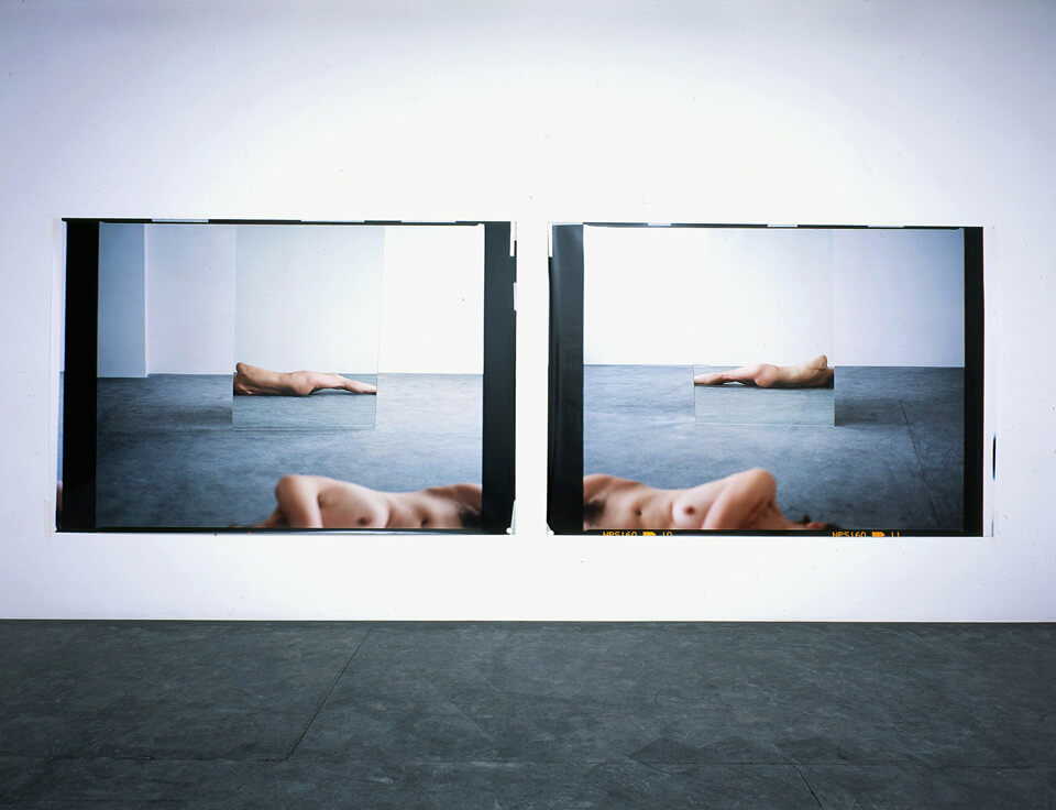
Newton's work is  combination of art and fashion photography, Newton used models that were; 'statuesque and sultry models, postures as solid as stainless steel.' (generatorhostels.com).  Newton also photographed iconic images of celebrities which are immediately recognisable in his cinematic iconic style.  Newton captured the essence of cool, rendering all those in front of his lens into icons.  The models in his images are almost hyper-real statues that dominate the landscape, you eyes are drawn inescapably from the form they present. The images are sensual, erotic, beautiful and a times disturbing.  Newton understood how to entice the viewer into his world and looking at his images you become the ultimate voyeur, you are complicit, you cannot look away...

Image result for helmut Newton


helmut-newton-main-image

References

Bal Harbour Shops (2018) Helmut Newton: Exposed [Online] Available From: https://www.balharbourshops.com/fashion/culture-watch/5719-helmut-newton-exposed
(Accessed 22nd October 2018)

Generator Hostels (10/08/16) Explore Helmut Newton's Legendary Iconic Photography [Online] Available From:  https://generatorhostels.com/parallel/articles/amsterdam/explore-helmut-newton%E2%80%99s-iconic-legendary-photogra (Accessed 22nd October 2018) 

Helmut Newton Foundation (2018) [Online] Available From: http://www.helmut-newton.com
(Accessed 22nd October 2018) 

Watergatexy (16/02/15) The Erotic Stylish World of Helmut Newton  [Online] Available From: https://watergatexy.wordpress.com/tag/helmut-newton/ (Accessed 22nd October 2018)

Thursday 18 October 2018

First Dictionary Listing

I have started to add content by looking at Jemima Stehli.  Jemima Stehli is a Feminist Photographer/Artist who used her own body in her work.

Image result for jemima Stehli images


In this work she stripped for a number of men that she knew and asked them to take the picture when they wanted to as she stripped - this was a comment on the male gaze and the reaction of the men in each image is very different - some are surprised, some happy, some stare blankly at the camera.

Steh030001 webedit


In this work above from 2003 - Stehli photographs herself at various angles using mirrors and the empty space so that parts of her body are visible - again thise feels like a body performing in the space and we are, as viewers, forced to gaze upon her body and consider each curve, her skin, her breasts in these contemplative images.  The use of mirrors emphasises and enforces the idea of the gaze and 'looking' photographically. 


On my dictionary listing I had added facts about Stehli where she was born, education and exhibitions and then written a short blurb about the artists and added an image.  I am considering how much content to add and how I should add links to create a wide web of information about each artist. 

This was my process fro this: 


This is the listing in the directory above and how it will look as you click into her space


This is the listing - I have changed the text and colours however I still think the background image is problematic and will need to be changed to make each page more readable. 

Monday 15 October 2018

Continuing to Create My App..

I continued to work on my About section on my app, I changed the background for the whole app to something much lighter and changed the font and colour settings of the icons to make them blend better with the backdrop.


I now also added the dictionary section to my app i did this by using a listings section as this works as a kind of database and is easily searchable using keywords, categories and names.  You can see here I started by adding Art Photography as there is no content you get the sad face!


I want to now start to add content so that I can see how that looks and whether this will work well on the app so for my next post I will be writing and researching one of the photographers that I wanted to use on the app.

Starting to Create My App

I began by simply putting together a basic template to begin the process: 


I called it simply DeVelde for the moment and then I will begin deciding which features I would like to customise.  I began with the the About Me page and as the App creator points out this is one of the most powerful pages as it tells the world who you are and why you are doing this - it is used to reach out to you target audience.


I wrote about the mission of the app in the following section and added my website and an about me as the founder of the app onto this page.


As you can see from this the background and colours still need change to make this work well and be readable.  You will see progress of this creation in my future posts!


App Software Online: Appypie


Prior to choosing Appypie the app software that I have chosen to use I researched other app software - I started by looking at this: Website Tool Tester Blog which discusses the differences between 18 different online apps.  As this article states many apps are PWA (Progressive Web App) therefore essentially a mobile friendly website.  Native Apps are what most people actually want to buy however to create these is far more expensive but you can get them listed in the Android and Apple ecosystems. 


There are many different app builders to choose from each with different pros and cons and to go through all of these here would be very laborious so I will go into instead the reason I have chosen Appypie: 


  • It has a cheap basic package at $12 per month which I can cancel if I do not like it.
  • It has a user friendly interface
  • It does not require computer coding
  • It has the functionality I require to create my dictionary of photographers
  • I can add instant chats
  • I can promote and market 
  • I can add push notifications
  • I can monetise this app
This is the dashboard to start using all the features which are easily accessible and simple to use. 

Major Project Initial Ideas and Project Sign Off


For my major project this term I would like to create a dictionary of photographers that is easily accessible. Therefore I would like to create an app and app content of photographers - I will begin with photographers that really interest me and although in this project I may only be able to create six to ten entries this could be the start of a much bigger project in time. Here is a photograph by Helmut Newton from his Polaroids collection which his wife curated after his death in 2004. He will be one of the photographers that I will be writing about. 

By Helmut Newton from Polaroids (2011)


I have also completed my project sign off here so that you can see other software that I intend to use and the list of photographers I would like to research.


I will need to consider also the title and design of the app and the features that I would like to employ.  I will write much more about this in my next post which will be researching app creators online. 

Sunday 7 October 2018

The Final Advert & Reflection

This is my final advert for Fertility Magic....


Reflection: 

I like it that this advert actually looks a little old fashioned and out of date.  I enjoyed creating the oval images as this did remind me of bad portraits from my photo albums and how they used to be presented in oval frames.  I think the balance of the advert works well and the text explains the magic!  If there was much more time I would have spend much longer on this and added perhaps a background colour and messed around much more with the colours and compositions used.  I am looking forward to creating my own project as this means I will have more time to develop this artwork and create something in my own area that I am really passionate about...

Final Advert Creation

Now all the elements have been completed I can put the advert together using Photoshop.  I begin by creating a new A3 canvas at 300dpi so that it can be output if I wanted to create a high quality print version.


I then using the elliptical marquee tool selected the two images that I wished to use in the advert and added these and resized and moved to make this as balanced as I could in the advertisement.


I then added the text and kept the colour in keeping with my logo I used Britannica Bold to create the look I wanted throughout.


I moved the text and images slightly to ensure that everything lined up correctly and I also added a disclaimer to ensure that no liability could be placed upon Fertility magic if the magic did not work!

I saved this file is both psd and jpeg formats so that I could change if I wished and also upload where I needed to easily and quickly.


Logo Creation

I wanted the logo to be natural and to have all the properties that would appeal to women wanting children and so I kept this simple using a simple stock image as below to begin..


I then used photoshop to change the colour I did this using Adjustments and then Hue/Saturation - I altered the hue and saturation to achieve the colour I wanted as below.  I then added the text and changed the colour, I used the arc and adjusted this to create the halo effect of the text over the Mothers head.  


My final logo looks like this: 

I am pleased with this result - I am hoping the colour will work well with the advert - if it does not this can be altered later on.


Initial Plan and Contact Sheets

To begin I drew out a rough sketch of what I intended for the advert.  I intend to create a logo and call my company 'Fertility Magic' I will also take images of myself with a baby and pictures of the magical statues that I spoke of in my last post.


The Plan for 'Fertility Magic'


The logo I got from a stock image and will adjust on Photoshop to make my own:

I chose this symbol as the breastfeeding mother seems the most natural and closest in terms of showing a bond between the idea of mother and child.

Below are the contacts of all shots I have taken in preparation for the Advert  - the Mother child shots I took at home however these could have been improved by taking them in the studio or in natural light.  As I was short of time in terms of deadline for the advert I will see if these will work, if not I will reshoot. 

The Magical Statuettes I shot in the studio and I am very pleased with the results.


 Mother/Baby Shots 


Magical Fertility Statuettes


Friday 5 October 2018

Creating My Own Advert: Ideas & Research


I have considered the kind of advert I would like to make and I wanted to make an advert on Fertility and Fertility treatment.  I looked at adverts for fertility treatment and the first one here was a surprise at it advertises a contest to receive treatment, many others offer ways to donate sperm or eggs in exchange for fertility treatment like the third advert below.  In terms of content and layout often they use images of family, biological images of the body, babies etc.  The logo is placed usually in one of the corners and the name of the clinic appears clearly in each ad. Overall the adverts are not overly exciting or innovative - the egg on here is probably the most effective in simplicity, message and composition. 

I have chosen to do this as when I first got married I bought from a flea market two African figures (you will see these in my next post).  The figures sat on the mantelpiece and the man I bought them from said they were fertility objects.  Every week I polished their little heads however with in a month of being married I was pregnant and I blamed these figures for this!   Thinking about this and looking into more research on these African figures it is thought that 'According to tribal legend, to ensure a couple’s fertility the statues are to be placed on either side of a doorway leading into a bedroom. If a woman or her spouse touches either statue as they enter the room, they will soon get pregnant.' (Ripley's 2018)  This related to their own statues that they acquired in 1993 and had become extremely popular as an exhibit however these magical African fertility statues are popular throughout Africa and differ from country to country in their appearance.  They are much sought after as fetish objects.  Therefore my advert will be along the lines of 'You have tried science - now try magic!'


Source: Agora Clinic

References

Ripley's Believe it or Not (2018) Legendary African Fertility Statues [Online] Available from: https://www.ripleys.com/fertility-statues/ (Accessed 5th October 2018)

Creating an Advertisement: Ideas and Initial Research


We have been discussing creating an advertisement and the Art of Advertising in class. The Harvard Business Review quotes William Bernbach (an advertising giant in the 1960s and 70s) as stating; “Advertising is fundamentally persuasion and persuasion happens to be not a science, but an art.” (Ignatius A. March 2013). This idea of using text and image to persuade and affect people in their buying habits is an interesting task for an artist. Artists tend to have a fractious relationship with big brands and corporations on the one hand they would like to be paid money for the work they produce on the other they are considered to be 'selling out'. Whatever your views on this, there is no doubting that some ads are truly great and extremely clever. My favourite adverts are camera ads both historical and contemporary as they tend to be quite funny and also often quite sexist!

The first advert below is a contemporary advert for Olympus suggesting that by adjusting the filter you can have a new girlfriend everyday! The second from Vivitar and the instructions point not just to the camera but the girl, with statements like 'interchangeable hair available in 29 colours', pointing to the bra it just says' completely removable' and 'head tilts, pans, swivels and nods.' These adverts do exemplify that there is still the notion that only a man can handle a camera and that women are exchangeable and usable objects. However they do still make me laugh and whenever I am holding my camera I do think that I am in control and it is a powerful weapon....I am just hoping I use mine for good!


Source:


References


Ignatius A. (March 2013) The Harvard Business Review, Advertising is an Art and a Science [Online] Available From: https://hbr.org/2013/03/advertising-is-an-art-and-a-science (Accessed 4th October 2018)

My Blog Buddy


Carrie Mansfield

My Blog buddy will be Art & Design Tutor Carrie.  I will be looking at her blog which is on Interior Design and she will post comments on my blog to support me and my work - looking forward to sharing!!!