Today I am making a bookcover for Flipbook/Chapbook which I will create on Photoshop. I opened Photoshop and Clicked on 'File' in the top menu and then clicked on 'New'. In the dialog box I clicked on 'Print' in the top menu and chose A4 size, portrait orientation and resolution was high at 300dpi and I chose a white background for my canvas.
I searched for a suitable image, I was looking for an image that represented Mika the Japanese woman in the book I am writing. I found something that I thought would work as the woman in the image in to the side of the frame and there would be the right space for the title and my name on the cover. In my previous post where I had added this to Blurb I used the same image on the front and back but just reversed the image and this did work and was the right feeling for the story in this book.
Target Market
I also thought about the target market and I am hoping this will appeal to women millenials/Generation X. Women do reads more and the millenial market is larger and they will read both in traditional form and in ebook form so there are additional ways to capture this market. In 2025 the global book market was worth $103.5 billion (Taiwo, 2024). Format distribution in 2023-24 was broken down into 65% print books, 20% ebooks and 15% audiobooks. For my own target market of Millenials (35-44) Print books was the most preferred format at 58%, reading an average of 14 books per year and spending an average of $245 per annum. Gen X (45-54) print books again the preferred format at 65%, average reading of 16 books per year, spending $267 (Taiwo, 2024).
I looked at further research to find out what sort of books were most popular and what people are reading. Love reading states that; 'In 2024, Fiction achieved its highest sales since accurate records began, surpassing the previous peak by an impressive £50 million.' (Love Reading, 2025). Information released prior to the Frankfurt Book Fair states that book prices whike still increasing are slowing down and in some countries acually decreasing, unfortunatly in the UK the price increase in 2024 was 1.9%. (NIQ, 2024). In terms of my assumptions above through research it has been proven that, 'research confirms that while women read books by women and men equally, men overwhelmingly reject books written by women in favour of male authors.' (Womens Prize, 2024). The reseach here also showed that men on average read a lot less than women. The choice of fiction aimed at women who are millenials and Gen X, is the right choice here as these are big target markets that are growing.
I then on Photoshop went to 'File' in the top menu and then 'Open', I was happy with the image and so did not need to make adjustments. I then clicked on 'Select' in the top menu and then 'Select All'. I then went 'Edit' in the top menu and 'Copy'. I went back to my canvas tab, then cicked on 'Edit' in the top meu and then 'Paste'. The image was now on my canvas and I used transform controls just to drag out the image to cover the page. Then I clicked back to my move tool on on tools menu to ensure my tranform stayed in place.
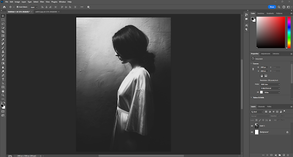
I then wanted to add my title and my name so I clicked on the 'T' tool in the tools menu and the tools for this appear at the top my workspace. I then clicked on the canvas, I changed the font using the tools for the text tool to Baskerville Old face, I also changed the size to 36pts for the title and changed the colour to white. I then clicked back to the move tool and just manouvered this into place. I then repeated this process with my name using the same font and colour but this 30pts.
Lastlu I used the gridlines so that the centre of the image was used to line up both text pieces and they balanced giving a good rule of thirds to this image.
I then clicked on 'File' and the 'Save' and this is psd format so I could edit this later if I needed to . I then also clicked on 'File' and the 'Save a copy' and used the dropdown box to save in jpeg format so this could be used anywhere.
I do like the design of this cover, I think it is gentle and appealing and well balanced as a design.
References
Love Reading (2025). Fiction Book Sales in 2024 Top The Lot While Non-Fiction Lags Behind. [online] Lovereading.co.uk. Available at: https://www.lovereading.co.uk/blog/fiction-book-sales-in-2024-top-the-lot-while-non-fiction-lags-behind-9226 [Accessed 18 Feb. 2025].
NIQ (2024). Global Book Market 2024 shaped by strong fiction, declining non-fiction and slower price increases. [online] NIQ. Available at: https://nielseniq.com/global/en/news-center/2024/global-book-market-2024-shaped-by-strong-fiction-declining-non-fiction-and-slower-price-increases/ [Accessed 18 Feb. 2025].
Taiwo, I. (2024). Book Sales Statistics 2024: The Complete Industry Analysis - ExpertBeacon. [online] Expertbeacon. Available at: https://expertbeacon.com/book-sales-statistics/#google_vignette [Accessed 18 Feb. 2025].
Womens Prize (2024). Gender bias in men’s reading habits still exists - Women’s Prize. [online] Women’s Prize. Available at: https://www.womensprize.com/gender-bias-in-mens-reading-habits-still-exists/ [Accessed 18 Feb. 2025].


