Today we practiced setting on the camera for a photography task this was to prepare us for the photography brief. The brief for the task was to take high and low angle of images of each other. We looked at examples of this kind of image from well-known photographers. We looked at a range of images by Terry O'Neill, Terence Donovan and Corrine Day. Here is an example of a high angle image from Corrine day.
Neoteric Photography aims to explore photography in an age where the image is everywhere. The image has become prolific yet easily forgotten. Hoping to find something to hold onto, something that will survive longer that it takes for pixels to appear upon a screen.
Followers
Tuesday, 14 January 2025
Creative Media: Above & Below - Photography Practice
Saturday, 11 January 2025
Sequential Images Self Study: Monkey Madness
After sequential image practice in class, we looked at further artists using sequential images and though I have looked at Jurgen Klauke before for this project I was interested in this image from images I showed in class, Formalising Boredom.
Jürgen Klauke (1980) Formalisierung der Langewiele
Klauke has other images from this series and the exhibition blurb states that these images were moving into a more post-punk aesthetic. 'In the three-part photo sequence, the artist himself and another darkly dressed young man are seen attacking a whitewashed brick wall with various weapons, holding a pistol to its chest and driving an axe into it. In the process, the two appear highly concentrated, making the already enigmatic scene even more absurd.' (Artfacts, 2022) I chose this series due to its existential nature, it represents the boredom of society and results in extreme acts. the characters are isolated and feels as we are all alone with our own rituals. ‘Formalisierung der Langeweile' is regarded as a milestone in Klauke's oeuvre, marking the end of a narcissistic preoccupation with his own person and a turn towards the examination of society.' (Media Art Net, n.d.)
I enjoy making work of my own rituals and one of these is making monkey's I do this as a realxing exercise. This monkey however was a special monkey for thsi project so he was originally going to e a Bauhaus Monkey based on Bauhaus design. Bauhaus began in 1919 and was originally an architectural movement that wanted to bring togtehr all artforms in unity. Walter Gropius wrote; 'So let us then create a new guild of craftsmen, free of the divisive class pretensions that attempted to raise an arrogant barrier between craftsmen and artists! Let us together will, conceive, and create the new building of the future, which will unite everything in a single form—architecture and sculpture and painting—and which will one day rise heavenwards from the hands of a million craftsmen as a crystalline symbol of a new and coming faith' (Getty, n.d) Bauhaus aimed to bring artists and craftsman together so they could create a functional design, functionalism was the aim of the movement. I wanted to consider these ideas including some of these images whilst creating my monkey.
References
Artfacts (2022) Jürgen Klauke: Formalisierung der Langeweile [Online] https://artfacts.net/exhibition/juergen-klauke:-formalisierung-der-langeweile/1005805, Accessed 11/01/2025
Getty J.P. Trust (n.d.)www.getty.edu.. Bauhaus. [online] Available at: https://www.getty.edu/research/exhibitions_events/exhibitions/bauhaus/new_artist/history/ [Accessed 11 Jan. 2025].
Media Art Net (n.d.). Media Art Net | Klauke, Jürgen: Formalized Boredom. Medienkunstnetz.de. [online] doi:http://www.medienkunstnetz.de/works/formalisierung-der-langeweile/.Accessed 11/01/2025
Thursday, 9 January 2025
Sequential Images Class Practice
We completed a class practice on creating sequential images this week. This was in the manner of Eadweard Muybridge, who we looked at class. Here is an example of his work, I chose the male, jumping as I quite enjoyed these images of the human form.
I decided wanted to take sequential images of my bag as my title will be 'What's in my Bag' Therefore I used a large A2 piece of paper which was pastel-coloured and I placed on my office floor. I then started to take out the items in my bag and place them on the paper and I photographed these in sequence. I used a
Canon 700D camera, I changed my camera settings to Aperture priority. ISO 400 as these were indoor shots and a wide aperture F5.6, shutter speed was aroun1/30 which was quite slow however for a quick task these images were fairly straightforward top down shot. These are the settings below.
I opened Pixlr E, I then clicked on 'Create New' and then in the dialog box I clicked on Print in the top menu and then I clicked on A4 size canvas. I then added my title in the left hand box. I then clicked on back ground and then chose white background and then clicked on 'create'.
I then opened my chosen images from the set of images I took for the practice. I did this by clicked on File in the top menu and then clicked on on open. I then browsed by desktop and found my images and then added to Pixlr.
I then cropped all my images just to get rid of rough edges. I went to the crop tool on the left hand menu and adjusted accordingly for each shot. I then went to top menu to 'adjustments' and in the drop down menu clicked on 'brightness and contrast' I adjusted the brightness of each shot by around 16 points each for consistency
I then wanted to add all my images to my canvas so I went to my first image clicked on 'select' in the top menu and then clicked on 'copy' I then went back to my canvas and clicked on 'paste. I then adjusted the image using the move tool for positioning and transform controls to change the size. I then repeated this process for each image to create the sequence above.
Tuesday, 7 January 2025
Creative Media: Object Lesson
This is the first Creative Media project of the term 'Object Lesson'. In this project we are choosing an object and using this as a starting point for a short one week project. As I was starting this prior to the class I have a rather large postcard collection at home and the postcard I was drawn to, and the object that I am choosing is this one..
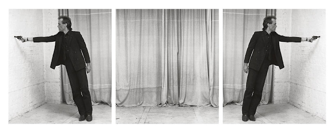
I had to scan this in as this is not available on the internet - I found other images from this series but not Image 5. I chose this image as it emphasises the dark and shadows, it was framed behind handmade red glass. My previous post was about the Fayum Portraits the artist of these portraits worked from dark to light. This looks like a negative or infrared image, a negative shows the dark parts light and vice versa. An infrared image explained by Adobe; 'The human eye cannot see infrared light. It lies beyond the visible light spectrum. But you can take photographs with an infrared filter or infrared film, which produces intriguing effects' (www.adobe.com, n.d.) however although I have not yet found a definitive answer I believe this image maybe one that was edited in Photoshop and used a dodge tool. The image came from an exhibition titled 'To photograph the details of a dark horse in low light' and the article about this states that; 'The awkward yet rather poetic phrase camouflages an underlining dilemma for the photographic industry as film stock historically performed poorly in capturing black skin. A photograph of Kodak’s ‘Shirley’ vividly illustrates the industry’s racial bias as the film was calibrated to capture the white skin of an imaginary proto-subject. Here, the ‘dark horse’ is in reference to the film’s supposed ability to transcend this bias and photograph black skin with equal detail.' (Bohr, 2012). I found this interesting and the process maybe what will come into play later. I was not thinking of racial bias or the Fayum portraits as such but more about some lines I read in John Berger's that had began by discussing the imprint of Christ's face on cloth; 'the image now celebrates the existence which is beyond reach. it offers a substitute for tangibility. The imprint is like the footprint of a creature that is elsewhere..' (Christie 2017:28). I am thinking of the absence of things, the darkness before the light and here continuing with these thoughts of the imprint. So I began by tracing the image to feel the contours of the image

I will now start to experiment with blowing these up and drawing the outlines as above to see if I can create a credible final piece that explores making marks and through these traces giving a new life and identity to the shots.
Griffiths, K. (2020). Found Photobooth Photos – Photobooth Journal. [online] Photobooth Journal. Available at: https://photoboothjournal.com/category/found-photobooth-photos/ [Accessed 8 Jan. 2025].
Friday, 3 January 2025
Welcome to Spring Term!
Christmas is over, another new year begins. Over this short break, I read several books, the one I would like to discuss is The Shape of a Pocket by John Berger. John Berger (1926-2017) was a writer, artist, novelist and art critic. 'Susan Sontag once described Berger as peerless in his ability to make “attentiveness to the sensual world” meet “imperatives of conscience”. Jarvis Cocker, to mark a recent book of essays about Berger, said: “There are a few authors that can change the way you look at the world through their writing and John Berger is one of them.”' (Brown, 2017). I came to know Berger through the TV series and book Ways of Seeing, he spoke about photography and art and I came to understand so much through Berger's explanations. The book I have just read, The Shape of a Pocket, is about all kinds of art and stories from life. As this term in Creative Media is about portraits I will discuss the Fayum Portraits from the book. These portraits were discovered originally in 1615 'by the Italian traveller Pietro della Valle during his journeys in Asia and Africa.' (National Archaeological Museum, 2023) however further discoveries have been made and more than 1000 Fayum exist today all over the world. The Fayum are portraits made of the dead from Ancient Roman Egypt between the 1st and 3rd centuries, as Berger writes; 'they were painted whilst the Gospels of the New Testament were being written' (Berger 2001: 53)
The Fayum portraits are quite beguiling to look at these portraits were painted sometimes while the person was alive but often posthumously. They are naturalistic, they look right back at you from centuries ago and seem to be so immediate and this is what Berger found them to be so touching. They were painted by Greek Egyptians (hence the style) as all are facing forward whereas Egyptian artists painted only in profile. Berger states; 'Facing them, we still feel something of the unexpectedness of that frontality. It is as if they have just tentatively stepped toward us' (Berger 2001:56) The diverse nature of the portraits are that there was a hugely diverse population. 'They served a double pictorial function: they were identity pictures - like passport photos- for the dead on their journey to Anubis, the god with the Jackal's head, to the kingdom of Osiris; secondly and briefly they served as mementoes for the departed to the bereaved family.' Berger 2001:54). These portraits were created as Berger states by an artist in an act of submission. They are immediate, they are for the purpose stated.
'Images of men and women making no appeal whatsoever, asking for nothing, yet declaring themselves, and anybody who is looking at them, alive! They incarnate, frail as they are, a forgotten self-respect. They confirm,, despite everything, that life was a gift.' (Berger 2001:58)
With those considered words I will leave this post with some final thoughts, I choose one of these people (below) and wonder what her life was, as the portraits were of professional urban middle-class people, perhaps she was the daughter of a teacher or perhaps she was a florist or dressmaker. Her large eyes stare at us without judgement. She is who she is strong in life and beautiful, as she will now be seen and remembered.
References
Berger, J. (2001) The Shape of a Pocket, Bloomsbury Publishing Plc, London.
Brown, M. (2017). John Berger, art critic and author, dies aged 90. [online] The Guardian. Available at: https://www.theguardian.com/books/2017/jan/02/john-berger-art-critic-and-author-dies-aged-90 [Accessed 3 Jan. 2025].
National Archaeological Museum. (2023). Fayum portraits - National Archaeological Museum. [online] Available at: https://www.namuseum.gr/en/collection/fayum-portraits/ [Accessed 3 Jan. 2025].
Friday, 6 December 2024
Reflection
This term I created a new website and new project 'Still Mortality'. On the website, I quite enjoyed recreating this and choosing a different image for my homepage. The homepage image came from 'The Army of Dolls' project and I thought this was appropriate as the images were created entirely digitally and the doll in the lake I do think really works with a good rule of thirds and colour scheme that suits my site and my work.
I chose Playfair Display font and used this throughout - I chose this as, although it may look a little formal and 'old-fashioned' I perhaps and both of those things so this was a good decision and it does work well on the site and is sans serif and easily readable.
On the portfolio page with my book, it is embedded from Blurb and you can flip through the pages however it still does not expand in the correct manner on the page. With that in mind, I added a button to Blurb and here you reach the sale page where you can preview at full page and buy the book. I was not completely happy with this and I could make it into a flipbook in a different form in the future as I would like this to be more responsive and user-friendly. I also like doing this on Blurb as I like to get the hard copy and have a real book, also I like it that it is out in the world as it should be. It is for sale and can be easily found.
The project itself Still Mortality was actually more fraught with issues. I intended to use the Polaroid however I soon realised I could not get the images I wanted using this method with the text that I intended. I then chose to use an older Olympus and took a set of images however the card corrupted and the camera itself (a poor Olympus E-3) was stuttering towards death with a red blinking eye that would go off so after declaring the camera officially dead and being unable to uncorrupt the card I decided to shoot them again on the Olympus Mark II - I do think these were not quite what I wanted still but time was ticking and decisions needed to be made!
Finally, I decided to use images from my university time as it was about time and other images from different times interspersed with the new images. The text was all new and I thought the text was actually stronger than the images in places. This certainly is not my favourite piece of work and I do think I would have not necessarily published if it was not for this deadline. I am hoping next term I going to create some far more interesting pieces as part of my work here. However, as much as I am critical of 'Still Mortality' it did meet the goals I set out and was completed in a timely manner and published so that it was successful.
Final Website Updates with Still Mortality
I finalised my project book on Blurb adding the original images. On Blurb I added this for sale and bought a hardcopy version of the book.
This is how the final page looked on my website
On the button you can go to Blurb see the full page book and buy the book. I also added back to the portfolio button.
In addition, I added some other pages of past work to my site
I added another book 'The Quietus' and a film 'Uncertain Times' plus links to previous paid writing on line about photography.
I then checked the mobile view most the issues here seemed to be text size and alignment so I decreased the text size on each portfolio page, I realigned centrally the buttons and title and also I decreased text size on buttons. I saved and then republished all changes.
I will test my website again on my mobile and on different devices just to check there are no further issues. For the moment I do think that this is up-to-date and completed for this term at least!