Followers

Thursday, 20 February 2025

Critically Evaluating My Website

I have now completed all the pages of my website so I will be evaluating it here by checking through these questions to ensure that there are no issues or problems I need to fix prior to making my website live.


Planning stage:

What were your initial ideas for creating a website? style / name / template

my initial idea was to create a website that would represent my artists work which should include photography, performance, writing and film. As an artist the site would be in my name and I choose a photography template as this was the closest to the kind of work I do and was very customiable. 

Do you have a tagline on your website?
No I do not have a tagline, I have a subheading with my area of study Photography and Performance.

Research:

Which designers / artists (relevant to your continuation route) websites did you look for inspiration?
I looked at the websites of Hermann Nitsch and Pippi Lotti Rist, Performance websites are often not that well made but Nitsch's website was encyclopeadic and Rists was the extreme opposite and very minimal.  I am hoping that my website will be a balance between the two and I will be able to engage my audience with my design, easy to use navigation and my work.

How many pages did you want to make on your website and why? Did that change as you progressed onto the research / designing stage?

I have made four main pages that are on my main navigation menu, I also have started by adding one subpage for my first project. I like the simpicity of the four pages and subpages can be added whenever I want to add new work. 

Content:

What is the purpose of your website?

The purpose of my website is to attract an audience to my work, I can use this site as a showcase and I can promote on social media, at exhibitions or in galleries.  I can also use this as a link to my audience as they can contact me and we can begin a conversation.  I can and will later add another page about the latest news and what I am doing and where my work is showing. 

Who are your potential website users?
My potential users I am hoping will be an audience to my work, I expect that my main audice maybe Generation X and possibly millenial.  It will be people who ar interested in conceptual photography and film so quite niche.  

Why do you think it is important to have a digital portfolio website?
It is essential to have a website as an artist as this how the majority of users will access my work, most will probably do this from a mobile phone so it is absolutely essential that themobile view is very good and exceptionally user friendly so my work can be accessed anywhere. As stated previously users can view my work here, later on they will be able to view the latest news and also they can contact me. 

Design:

Which design elements / tools did you use? (e.g.: infographics, fixed header, static background image, navigation menu design, text boxes, image galleries, social media feed) and why?

My website design has a grey/white colour palette and ues a static header and footer so that these can be viewed on all pages.  The backgrounds are all static and I have added a full background photograph to the homepage - I may add a silding gallery to the homepage later on but for now the one image filling the background does have impact. The image I chose I think is a very good representation of me, with a mixture of the domestic and the books that I love.  The text throughout is Palantino Linotype which I chose as a sans serif font and discovered;  'Palatino was designed by German typeface designer Hermann Zapf, who also created Optima. It was initially released in 1948 by the Linotype foundry.' (Leurs, 1997)  Interestingly Monotype produced a very similar font Book Antique, this is on microsoft Windows and Microsoft Office.  I have included the social media bar in my static header as this means this will also appear on each page and is accessible at all times to the reader/audience and they can access more information about me and my work.  

Which template did you use in Wix and why?
As stated above I used a photography template as this suited the format and style of my work and was easily customisable to accomodate the work I will produce. 

How many pages does your website have and why?
 Again this is stated above - Four pages and I will add subpages for work and I may add a Latest News page on the main navigation menu 

Navigation:

Does your website have working social media icon links?

Yes I have added a social bar in my static header, I have added Blogger which is the work I do teaching Digital Arts, I also have Linkedin which is my professional profile and CV.  I have also added my YouTube Channel which includes performance and film work. 

Are your pages connected / interlinked?
Not all (yet!) I have made sure the portfolio has back butons and links to all pages.  I will add a back to home button on my about page and possibly on my contact page too so that there really is easy clicks back to where ythe user wants to be throughout.

Is it easy to navigate?
Yes as above many buttons and teh navigation menu appears at the top of all pages as it is placed in my static header. 

Does the “Contact” page / email link work?
Yes in preview and pre-live tests this works but will need to be UX tested once the website is live. 

References

Leurs, L. (1997). The Palatino font | 30 typefaces - their look, history & usage. [online] Prepressure. Available at: https://www.prepressure.com/fonts/interesting/palatino [Accessed 20 Feb. 2025].

Creating a Website: Portfolio Page

 Today I am setting my portfolio/gallery page, ready to add my project work for this term for assessment.

I have opened Wix and  the I am going to click on Pages and Menu and the 'Portfolio'


Next I added a new page by clicking on 'pages and Menu and then 'Add menu item' and then 'New Page' I then changed the name of this page to the name of my project.  I then made this into subpage by clicking on the three dots at the end and choosing 'subpage'


I then change the colour of my main portfolio page to match the rest of my website.  I did this by just right clicking on the background and then clicked 'change background' in the dropdown box.  I chose the shade of grey that is the same as the rest of the site.


I then added a title to the page and description.  I did this by clicking on the 'Add' button in the left-hand tools menu and choose 'Heading' 1 for the title and a 'small paragraph' for the description.   I then clicked on 'Edit Text'  and changed the font to Palatino Linotype, the font of my website for the title was 70pts.  I then changed the paragraph to 33pts. I then used the 'Add' button and clicked  Add Image and I uploaded a still from my film.  I slightly cropped this in the image editor in Wix.  I then lined up and centred the text and image using the gridlines on Wix.


I repeated actions above on my project page, except on my project page I added my project which was a film.  I did this by clicked on 'Add' and chose 'Videos and Music'  I chose the Youtube film box and then went to my Youtube channels and copied the link to add to the URL needed to display the fim. 


My next step was to add a button to my Portfolio front page, I did this by clicking on 'Add' and then 'Button' .  I then clicked on 'Edit Button' and Changed the text to the title of my project and added the link to the page that I wanted it to go to.  I then went back and clicked on the paintbrush to design the button and I changed the font to Palatino Linotype and the size and colour if the text. 


I then I repeated the action above to create a 'back to portfolio' button on my project page.


I then checked my mobile view I needed to make my buttons and text smaller as can be seen below


Here is the changed size of the button here on my portfolio page - this now works correctly 


I have continued to update my page and I have written an introduction to my project used the same text palatino linotype at 20pts.  I realigned everything on the page using gridlines.


I then checked and redid my image on the portfolio page as I knew I could do this better! I clicked on the image went 'change image' then uploaded the new screenshot from the film and realigned with gridlines


I saved and previewed all this work to check it was all working well then I checked my mobile view again as I had made changes 

I centred 'portfolio' and checked the text and image on and the front portfolio page this was all looking good


On the page with my project I made all text smaller and the back to portfolio smaller and I think this will be better for the mobile.  The film appears at the end of the page however this can appear full screen and can be watched in full screen mode with just rotation of the mobile. 


I think I am happy about the site for the moment however I will update and make changes if I feel anything does not work as well as it should after UX testing 


Tuesday, 18 February 2025

The Pelican Case: Mock Up Digital Flipbook

 I wanted to try out a digital flipbook programme FlipHTML5.  I began by opening a Google Doc and then inserting the front cover that I created on Photoshop. 


On the first inner page I added copyright to the bottom as per book conventions

On the second page I added the book title 'The Pelican Case' and my name.  I centred this using the formatting tools in the top menu and I chose Playfair Dispaly at 25pt for the title.


I then added page numbers by clicking on 'Format' then page numbers.  I chose to add these in the footer and I clicked on on do not show first page.  Then on the fifth page I added my contents


I then added an illustration on the next page just by inserting an image.  I then copied and pasted all the text from each chapter.  the title of each chapter was in bold 14pts, main text at 12pts.  All the text was in Playfair display font.


I also added Picture on the last page.  I then downloaded the whole document as a PDF file. 

I then went FlipHTML5 and uploaded my book - this was then converted to a flipbook which worked well and I could see teh latyout and format in this version.

To view the book Please click on The Pelican Case


Creative Media: Book Cover Creation on Photoshop/Target Market

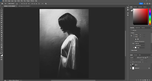
 Today I am making a bookcover for Flipbook/Chapbook which I will create on Photoshop.  I opened Photoshop and Clicked on 'File' in the top menu and then clicked on 'New'.  In the dialog box I clicked on 'Print' in the top menu and chose A4 size, portrait orientation and resolution was high at 300dpi and I chose a white background for my canvas. 


I searched for a suitable image, I was looking for an image that represented Mika the Japanese woman in the book I am writing.  I found something that I thought would work as the woman in the image in to the side of the frame and there would be the right space for the title and my name on the cover.  In my previous post where I had added this to Blurb I used the same image on the front and back but just reversed the image and this did work and was the right feeling for the story in this book.  

Target Market

I also thought about the target market and I am hoping this will appeal to women millenials/Generation X.  Women do reads more and the millenial market is larger and they will read both in traditional form and in ebook form so there are additional ways to capture this market. In 2025 the global book market was worth $103.5 billion (Taiwo, 2024).  Format distribution in 2023-24 was broken down into 65% print books, 20% ebooks and 15% audiobooks.  For my own target market of Millenials (35-44) Print books was the most preferred format at 58%, reading an average of 14 books per year and spending an average of $245 per annum.  Gen X (45-54) print books again the preferred format at 65%, average reading of 16 books per year, spending $267 (Taiwo, 2024). 

I looked at further research to find out what sort of books were most popular and what people are reading.  Love reading states that; 'In 2024, Fiction achieved its highest sales since accurate records began, surpassing the previous peak by an impressive £50 million.' (Love Reading, 2025).  Information released prior to the Frankfurt Book Fair states that book prices whike still increasing are slowing down and in some countries acually decreasing, unfortunatly in the UK the price increase in 2024 was 1.9%. (NIQ, 2024).  In terms of my assumptions above through research it has been proven that, 'research confirms that while women read books by women and men equally, men overwhelmingly reject books written by women in favour of male authors.' (Womens Prize, 2024).  The reseach here also showed that men on average read a lot less than women.  The choice of fiction aimed at women who are millenials and Gen X, is the right choice here as these are big target markets that are growing.   

I then on Photoshop went to 'File' in the top menu and then 'Open', I was happy with the image and so did not need to make adjustments.  I then clicked on 'Select' in the top menu and then 'Select All'. I then went 'Edit' in the top menu and 'Copy'.  I went back to my canvas tab, then cicked on 'Edit' in the top meu and then 'Paste'.  The image was now on my canvas and I used transform controls just to drag out the image to cover the page.  Then I clicked back to my move tool on on tools menu to ensure my tranform stayed in place. 


I then wanted to add my title and my name so I clicked on the 'T' tool in the tools menu and the tools for this appear at the top my workspace. I then clicked on the canvas, I changed the font using the tools for the text tool to Baskerville Old face, I also changed the size to 36pts for the title and changed the colour to white.  I then clicked back to the move tool and just manouvered this into place.  I then repeated this process with my name using the same font and colour but this 30pts.  

Lastlu I used the gridlines so that the centre of the image was used to line up both text pieces and they balanced giving a good rule of thirds to this image. 


I then clicked on 'File' and the 'Save' and this is psd format so I could edit this later if I needed to .  I then also clicked on 'File' and the 'Save a copy' and used the dropdown box to save in jpeg format so this could be used anywhere.


I do like the design of this cover, I think it is gentle and appealing and well balanced as a design.  

References

Love Reading (2025). Fiction Book Sales in 2024 Top The Lot While Non-Fiction Lags Behind. [online] Lovereading.co.uk. Available at: https://www.lovereading.co.uk/blog/fiction-book-sales-in-2024-top-the-lot-while-non-fiction-lags-behind-9226 [Accessed 18 Feb. 2025].

NIQ (2024). Global Book Market 2024 shaped by strong fiction, declining non-fiction and slower price increases. [online] NIQ. Available at: https://nielseniq.com/global/en/news-center/2024/global-book-market-2024-shaped-by-strong-fiction-declining-non-fiction-and-slower-price-increases/ [Accessed 18 Feb. 2025].

Taiwo, I. (2024). Book Sales Statistics 2024: The Complete Industry Analysis - ExpertBeacon. [online] Expertbeacon. Available at: https://expertbeacon.com/book-sales-statistics/#google_vignette [Accessed 18 Feb. 2025].

Womens Prize (2024). Gender bias in men’s reading habits still exists - Women’s Prize. [online] Women’s Prize. Available at: https://www.womensprize.com/gender-bias-in-mens-reading-habits-still-exists/ [Accessed 18 Feb. 2025].

Monday, 17 February 2025

Blurb Book Layout: The Pelican Case

 I have now completed the book and so I started to complete the page layout, this is the front and back cover - I liked this image and reversed it on Photoshop to give this mirrored look.  The text throughout is Alegreya


I then added copyright and title and contents page, on this add a small image of myself as in this book I was not going to add an about the author page so this is just a snippet of me instead.


I showed the first chapter on previous post so in this section I will show the third chapter 


I enjoyed writing this chapter the most, it could be as I could feel much more affinity with the woman and understood her completely whereas he second chapter in the pub I still think needs work and I think is a little clunky and awkward in places.  The whole book needs proofreading again and I need to add picture credits at the end.


Sunday, 16 February 2025

Digital Arts Major Project: Silent Scream - Process Two

 I continued editing, after my rough cut, I tidied up the clips and transitions and then I began by adding music. I went to the free music archive and chose a piece by Plushgoolash. I chose this piece as it was completely absurd and reminded me of the Bonzo Dog Doo Dah band.  Here is a Bonzo clip of Jollity Farm...


I liked very much one of the comments underneath which read:
@chrishowgill888
1 year ago
Neil once told how they were stopped by a cop in the USA, just driving to a gig. He wanted to know what weapons they had - when he was told "none" he asked, "how do you protect yourselves?" Vivian said "Good Manners!"'

In my own film I imported the music using 'import media' the music is in MP4 format.


I then began adding text subtitles, I used rapid red text in Crimson Text font with a black background.  I clicked on 'Text' in the left-hand menu and chose the text then in the right-hand menu changed the font and background.


i did this throughout to exemplify Trump's orders since the inauguration.  I then at the end added credits

I again clicked on Text in the left-hand menu chose the 'credits roll' and wrote these out, I changed the font again to crimson text.


I then exported the video in High quality HD  onto my computer, my drive and onto Youtube. Please see the final cut here.


I am quite pleased with how this turned out, I liked the music and words, I think the images work and as a performance film it does what I wanted. It could have been smoother, and more stylish - but I wanted it to retain that performance feel to it and too slick and ut may have lost this...


Digital Arts Major Project: Silent Scream - Process One

 After software practice with Clipchamp, I began the filming of my clips for my project.  I used a Canon 700D camera and filmed in Black and white, I used continuous auto-focus, and I used a remote control as I was filming myself.  I also used a tripod for all shots which were all located in the domestic environment.  These shots will be mixed with stock images in my final film. 


Here are some of my rushes, I have added as links as these files are too large to upload to blogger.

Video One

Video Two

Video Three

On the final video this will be rendered and added to YouTube. 

I then collected stock footage to add to this which represented the Trump inauguration, this included footage of the America Flag, Explosions, Deportation, War and Money 


I began by adding my footage to ClipChamp, I did this by clicking on 'import media' and selecting my clips from my computer


I then added the title and my name to the beginning of the timeline.  I did this by clicking on Text in the left-hand tools menu and dragging the desired text into the time line.  I then changed the font and size in the right-hand text editor.  I also then chose to reduce the seconds to 3 seconds for each title page. 


I then began thinking about the opening scene and I had decided this should start with an explosion and the American Flag so I added these clips to the timeline just by dragging and dropping.


Once in place, I created a crossfade of 2 seconds so that the explosion and flag would overlap.  I did this by clicking on 'transitions' in the left-hand menu of the crossfade.  I then went to the transitions editor on the right-hand menu to adjust the time. At 17 seconds I used the snipping tool to cut the flag video, I then wanted to change everything to black and white so I clicked on each clip and then in the right-hand menu went to 'effects' and chose a black and white filter.

I then detached all audio from all clips using the 'detach audio button on right-hand menu.  I made a rough cut slicing the clips together and adding the same crossfade throughout.


My roughcut looked okay so now I just needed to tighten up the edits add a running subtitle and add sound/music.  I will add this process in my next post.