I will be creating a website that will represent my progression route (Photography) and me! I will be using this website to add my portfolio work throughout the year at DMUIC.
To create my website I have used Wix and so I began by choosing a template.
I clicked on the text on the Home page and then clicked on Edit text. I then went through the dialog box which popped up and changed the font to Playfair Display and Playfair Display Bold and I also changed the size of the font. I edited my Name and the Title of the website. I now have a consistent font for all titles and name.
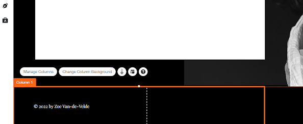
I then change the copyright to my own retaining the copyright symbol but editing the year and name.
I then changed the background image for the home page. I click on the background and I changed the column background to an image that I got from Unsplash (I will change this to my own image later). I downloaded the image to my desktop and uploaded the image to Wix and added it to the column. I then deleted the background image that was on Wix so that my background was just black behind the image to give the homepage impact.
I checked and edited my mobile view of my home page. I needed to rearrange the page to make it work and reupload the image. I had to change where the text sat on the page as it did not work the same as the desktop display.
I then changed my contact page so that anyone looking at my website could contact me through the contact form. I removed any items I did not want from the page and then I edited the message to my own to suit my website. As the page is not that interesting I added an image. I also checked the setting to ensure that all messages went to my email.
I was happy with the results of my home page and contact page on the website - I will of course return to this and add my own image on the home page. I do however like the design and the font/typography and colour scheme and think it will work well with my work.


No comments:
Post a Comment