Followers

Wednesday, 12 October 2022

Individual Research: Francesca Woodman

When I was creating my own sequential images I was reminded of Francesca Woodman (1958-1981), a young photographer, now a martyr to photography as she took her own life.  Woodman created many self-portraits which are poignant and haunting exploring issues of womanhood and place.  


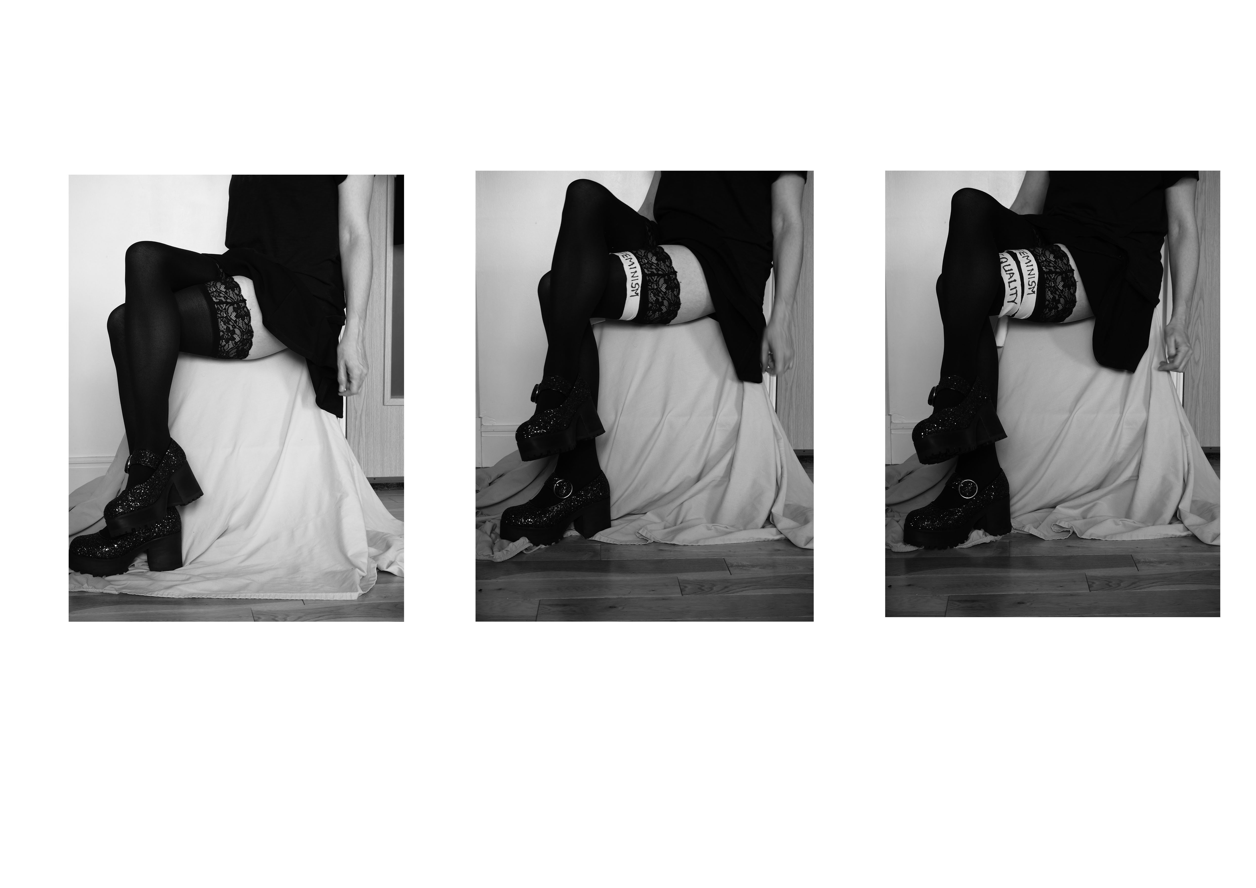
Many of her images are in abandoned or wrecked buildings and the textures of the dilapidation contrast to Woodman's own body and perhaps express her sense of herself as she explores photography, technique and composition. 'Corey Keller describes in her accompanying essay, her work “approached female selfhood and sexuality from a deeply personal – rather than political or programmatic – point of view.”' (Wrigley, 2011).  Woodman did create sequential images, and these were staged narratives that did explore feminity in the environment often in her images faces are not seen just disappearing or blurred bodies mingled into the surroundings. 'The privacy, light, space, and peeling walls of the pasta factory also allowed her to experiment further with her confrontational nudes, the hazy figures blending into furniture, her disappearing forms, elements that have since become synonymous with Woodman’s style, and in some cases interpreted as dark omens foreshadowing her tragic end' (Wrigley, 2011) Why I was reminded of her work was the image below where he is dressed in multiple suspender belts. Solomon Godeau writes about Woodman from a feminist standpoint and 'she points out that Woodman’s seemingly traditional nudes (with reference to art history) often include a detail that disrupts the composition and forces us to consider them more deeply. One example is Untitled (1979–80). A naked woman is lying across a Victorian sofa. On closer inspection, we see that she is wearing several garter belts. The extra stockings adorn the wall behind the sofa, inviting various interpretations.'  (Tellgren, 2015)


I like to think of this image as the multiple selves or sides to woman, every day playing the part of woman.  As the 'other' in society, we are in the eyes of others still an object which many ideas of what we are being placed on.  The use of traditional and sculptural lend these images weight and as Solomon-Godeau points out there is a disruption in the image that makes the viewer think.  There should be disruption in photographs, now more than ever, as we are bombarded by images we need something to make us stop and actually look at an image to consider deeply everything in the frame.  Here the stockings hanging in the background almost give a sense of history or of previous lives, the multiplicity of the belts could be interpreted as restraints as much of women's clothing is made to be restraining. The picture itself is almost restrained the woman is not looking directly at us, we are not being challenged directly however it does challenge indirectly and subtly and plays upon your mind upon turning away and perhaps this is why thsi photograph is the one I returned to..

References

Tellgren, A. (2015) Francesca Woodman: On Being an Angel. [online] Artblart.files.wordpress.com. Available at: https://artblart.files.wordpress.com/2015/12/essay.pdf [Accessed 12 October 2022].

Wrigley, T. (2011) Francesca Woodman. [online] AnOther. Available at: https://www.anothermag.com/art-photography/1532/francesca-woodman [Accessed 12 October 2022].


Sunday, 9 October 2022

Sequential Feminism: Final Work

 Here is the final sequence...


Reflection

I think these images work well as a sequence however I do think if I did it again I would get closer so the words were even clearer. When these are large on screen I think the message is clear but here they do look a little small.  I do like the legs and that the upper half can not be seen as I think the anonimity lends to the message that this is all women.

Sequential Images: Individual Work - Feminism

 This week in class we discussed and created sequential images, for our own individual project we planned an idea in class to carry out for self-study.  The images I planned in class I sketched out see below.

The idea was to show feminist issues through the sequence by adding an issue for each image.  When I was planning this sequence I was considering the fourth wave of feminism and how successful that had been. Britannica states that the fourth wave of feminism began in 2012, 'with a focus on sexual harassment, body shaming, and rape culture, among other issues. A key component was the use of social media to highlight and address these concerns. The new wave arose amid a number of high-profile incidents. In December 2012 a young woman was brutally gang-raped in India and subsequently died, sparking local protests and international interest' (feminism - The fourth wave of feminism, 2022)  Ten years later and still social media acts as both friend and foe to women as there is a still much work to do on all these issues but as with the first three waves of feminism we still have not managed to secure equal rights globally. To read about the waves of feminism please click here.

Going back to the images, I set up my Olympus OM-D E-M10II, I set it up on a tripod and started with settings of ISO 250, F8.  I used a remote trigger to be able to complete the images whilst in position as I was the subject.  I took around 280 images so I ended up with 10 contact sheets so I won't post all these here!  

Here are a few just so you can see the setup and process.


I kept the pose and set up the same however in the first shots the words could not be read easily so I changed where the words were placed on the legs.


ISO 250, F7.1, Shutter Speed 1/13

This shot gives the idea of what I was trying to achieve in the images.  In my next post I will show the final sequence.


References


Encyclopedia Britannica (2022) feminism - The fourth wave of feminism. [online] Available at: https://www.britannica.com/topic/feminism/The-fourth-wave-of-feminism [Accessed 9 October 2022].

Sunday, 2 October 2022

Welcome to Autumn Term 2022

 Welcome to the new academic year!  Here we are again back at the beginning. I will begin this term by looking at Hannah Hoch.  I always find her work makes me feel a little sad but here we begin with this work Ohne Titel (without title) 


I am starting with this as it exemplifies to me the fractured nature of woman, an ideal put together in the head of a man.  Höch (German, 1889–1978) was part of the Berlin Dada group in the 1920s and worked on mixed media images that reflected and satirised popular culture and ideals.  However, she mostly worked on gender issues.  Hoch stated that; “Most of our male colleagues continued for a long while to look upon us as charming and gifted amateurs, denying us implicitly any real professional status.” (Hirschl Orley, H, 2022)  Hoch's photomontages explored women's role in society and Hoch dedicated herself to promoting women through art. The Art Story states; '[Hoch was] A political iconoclast, she actively critiqued prevailing society in her work, and, implicitly, through many of her life choices. Her active interest in challenging the status of women in the social world of her times motivated a long series of works that promoted the idea of the "New Woman" in the era.' (Hannah Höch Photomontages, Bio, Ideas, 2022)

In the above image, the man is represented as a respectable but aloof generic male figure while the woman has been made almost grotesquely out of proportion with a hue infant head.  This representation of marriage and perhaps the idea that marriage infantilises or reduces women's role in society as a whole, once married a woman then (at this time) has to be a perfect wife and mother.  She is no longer allowed or expected to have a job or an important role creatively or at work. 

Hoch was a pioneer in her field of Photomontage/mixed media imagery and was one of very few women to be working creatively in the Dada movement.  Hoch continued to make work but could not exhibit during the Nazi regime and moved outside of Berlin, after the war she conituned to work and in 1976 there was a retrospective of her work.  Hoch had a message and she (a little like Heartfield) was trying to warn women of the dangers of being a woman.  At this time Hoch warned bout how women were portrayed in the media.  She warned women of the dangers of advertising through her work and how this affected women.  

These issues sadly still exist today for women and women themselves often do not or cannot stand up against the wrongs that are done to them in society.  I started this post by stating that Hoch's work makes me sad, as you can see her work has sadness.  Women if you can, do stand up!


References

Hirschl Orley, H. (2022) Hannah Hoch. [online] Available at: https://www.moma.org/artists/2675 [Accessed 2 October 2022].

The Art Story (2022) Hannah Höch Photomontages, Bio, Ideas. [online] Available at: https://www.theartstory.org/artist/hoch-hannah/ [Accessed 2 October 2022].

Gallagher, P. (2022) The Mama & the Dadas: The pioneering feminist artwork of Hannah Höch. [online] DangerousMinds. Available at: https://dangerousminds.net/comments/the_mama_the_dadas_the_pioneering_feminist_artwork_of_hannah_hoech [Accessed 2 October 2022].

Thursday, 1 September 2022

Website Updates and UX Testing

 For this I am just checking my website and updating as necessary and making sure all links work and update anything that could be improved 

I will begin by checking my copyright notice and this is correct and appearing on each page 


I also am updating my social links and I have updated my Linkedin recently so I have added this and it should appear at the bottom of each page 


I have published again to ensure that everything is live and working. I then check my homepage and the navigation and the image and menu is all working.  On my portfolio page clearly I had used it to instruct students and so there were random buttons and pages that were not linked I have fixed these and published again.


I checked all other pages and these work and are proofread and published again.  I then checked my mobile view as this is how most people will view my website.  


Contact page is okay however the portfolio page does not work properly and will need adjustments I will nedd to work on this and so I will come back to this later for redesign.


I checked all the actual portfolio pages and these are all laid out out properly and work well - here is an examples of one of my portfolio pages. 


The About page is working well and the artists statement 


I also previewed the mobile view and checked the menu is working and all other links are working.


So everything has been checked and in my next post I will show the redesign of my portfolio front page as this is really not working on the mobile view. 


Thursday, 4 August 2022

Software Test: Photopoetry

 Today we were testing the software for our projects, for my own project I was going to use Photoshop as it should work well for the image/text piece that I am creating this term. I will be using my own images to complete this experimental piece.  These are the images I am gong to use and the properties of the images - I took these on my Samsung phone.  All the settings were the same for consistency.


1/50, F1.8, ISO 250


                                                                  1/50, F1.8, ISO 250


On Photoshop I created a new canvas by clicking on 'new' then 'Print' and I chose A3, on the dialog box I changed the resolution to 300 and chose a black background and made this portrait.


I then opened the first image I was going to add, I used the clone stamp tool to clean up some blemishes on the image.  I then checked the levels and light using curves and I made a very minor adjustment making the images slightly lighter so the image would 'pop'


I then used the Text tool and added text in a new layer.  I chose Palatino Linotype and 24 pts and changed the text to white so that it could be seen on the black canvas. I then added another layer of 


I then added my second image and completed the same process with text and image - I used the move tool to move the text around so I could experiment further with layout.


This is the final piece of this layout, the words are just an experiment and are not the words I will use in the final piece.  I will now try a different layout with different images and words to see what this looks like. 


I also tried a different layout using a white canvas and experimented with different sizes and text.


Monday, 1 August 2022

Inspiration: Alain de Botton-The Architecture of Happiness


From Alain de Botton (2014) The Architecture of Happiness (P88-89)

The pages above are from De Botton's book the Architecture of Happiness.  The images from Swiss pseudoscientist Johann Kasper Lavater and his book Essays on Physiognomy (1783).  This book analysed painstakingly every facial expression and how it changed the meaning/feeling conveyed.  Each had a title such as 'benevolent and tender' or 'brutal and cynical' .  Botton cited these in his book as he discusses forma nd how we see human fom in all kinds of objects and in architecture the way a line or a shape cuves can affect our mood, our thoughts, our associations. He states; 'We can judge the personality of objects from apparently miniscule features  (a change of a few degrees in the angle of the rim can shift a wine glass from modesty to arrogance)'. (De Botton 2014:87)  The reason I was reading the book was that I have always been interested in how architecture has teh ability to affect mood and feeling and often I think modern architecture is unhuman and, for instances, walking through the ultramodern Jubilee Line extension in London, is a cold experience where we become just one of many ants moving through this metal maze. 


The creators of this; 'Described as "the biggest architectural sensation of their kind since the Moscow Underground'' (Jubilee Line Extension, LONDON — aLL Design International Architects, 2017).  After experiencing the Moscow underground personally, this seemed even more inhuman.  People may say it is beautiful but the stations, imposing and ornate overwhelm the citizens.  The citizens are just a mass reminding me of the photographs of Titarenko.  Taylor write of the Moscow underground: 'At rush hour, to enter the cheap but majestic, efficiently run metro in the center, you pass through the turnstile and are swept into a crowd thronging toward one of the three rapidly moving escalators. You ride down into an arch-ceilinged tunnel so long and deep that stations served as bomb shelters during WWII. Uniformed attendants at the bottom hector passengers through loudspeakers—“Take that purse off the handrail! You there, no running!”' (Taylor, 2015)


Titarenko saw the mass and with slow shutter speed they became like smoke and no longer individual human forms. This is why De Botton's look at Architecture was fascinating as it is about how architecture affects us everyday.  One of my own joys in life is to return home to my flat.  It sits in the city centre in Leicester, it is small, it is too hot in summer, too cold in winter but it is has everything I want cleanliness, comfort, clean lines and functionality but separate rooms, privacy and safety.  Modernity is very keep on open spaces, offices with no privacy, spaces that are crammed with people but make people feel less than people.  If everyday we are made to experience this this will have an affect on the soul. I often imagine the perfect space for me to live and work, I imagine how life would be changed by this change in space, in connection with the world.  Beauty is very subjective and as De Botton points out: ' the very notion of beauty having come to seem like a concept doomed to ignite unfruitful and childish argument.  How can anyone claim to know what is attractive? The creation of beauty, once viewed as the central task of the architect, has quietly evaporated from serious professional discussion  and retreated to confused private imperative' (De Botton 2014: 28)  Although he states this even if the argument is different and form and functionality may be what is discussed the architect/artist/creator cannot but help themselves impose their idea of beauty into everything they create and in our own homes, if we love them and we want our lives to be improved we impose our imperative all over our private abodes as this little space is our sanctuary.


References

De Botton A. (2014) The Architecture of Happiness, Penguin Books, London. 

aLL Design. (2017) Jubilee Line Extension, LONDON — aLL Design International Architects. [online] Available at: https://all.design/news/jubilee-line-extension-london [Accessed 1 August 2022].

Taylor, J., (2015)  Moscow: Opulent, Overwhelming, and Pulsing With Power. [online] Culture. Available at: https://www.nationalgeographic.com/culture/article/150322-ngmytown-jeffrey-tayler-moscow-putin-red-square-kremlin-lenin-yeltsin [Accessed 1 August 2022].