Neoteric Photography aims to explore photography in an age where the image is everywhere. The image has become prolific yet easily forgotten. Hoping to find something to hold onto, something that will survive longer that it takes for pixels to appear upon a screen.
For Digital Arts we are going to create a major project in our subject area. My subject area is Photography/Film, so I will begin on this post to explore some of the ideas I have been thinking about.
I have been thinking about the Trump Inauguration as this greatly upset me, we are now in Trump World which is against all my liberal values and so I wanted to make a response to this using Performance art. I would like to do something to express my feeling of disgust and despair so I was think of Yoko Ono's Performance Art and Music. Below is a video of Screaming with John Lennon - I like the idea of screaming and it being a performance of some kind - perhaps in different locations.
Yoko screaming in Get Back (n.d)
I also thought again about experiencing Pippi Lotti Rist in a gallery lying on the floor, the film was celebration of the feminine and it was experiential. Here is another example of Rist which I think is more about performance and sound
Pippi Lotti Rist, Wicked Game (1995)
In this song it starts off quite calm and then descends into screaming, I like the visuals and the audio with Rist singing the song until it is incomprehensible screams. In my own piece, I like the idea of the visual being quite strange so different locations are good but also perhaps different me's, or maybe many repeated me's. This is multiplicity photography and I have done this before but with more locations and a strong theme I think this could be done well in this project. Here are some examples...
I need to explore more of these ideas in much more depth however as first thoughts I quite like some of the ideas here. I will be looking at some intended research for my project in my next post and this will help me to develop my final idea for my project.
For this Photography Project as my portrait shots tend to be self-portraits simply for ease of model! I have been re-reading Susan Bright's Auto Focus. This book is all about the self portrait in Photography and I thought I would share artists that interested me and have sparked some ideas.
I will begin with Ken O'Hara who in the 1970s became known through his portraits of people which were 'tightly cropped headshots, printed in full bleed, with no explanatory text.' (Bright, 2010:28) the repetition of the shots made this an interesting art piece. He then did the same with himself through the day for many days, the book was like a concertina and his day unfolded through these shots.
The top images are called extreme portraits, I could not find many references to O'Hara on the internet so these were some of the few images I could find there are more in the book). I liked the idea here of just photographing every part of the day however this is quite a project to undertake in the short time we have. Also this would be my real day and I do like to stage my photographs so I looked at further artists.
The next artist I looked at was Sunil Gupta who is an Indian-born, Canadian artist who, in his series 'From Here to Eternity' (1995) began when he was diagnosed with HIV. The shots he created in this series were a self-portrait shot paired with a London Gay Club. These images I was really taken with as I like the juxtaposition of his portraits of himself at medical appointments, at home and then showing places that looked closed down, this is a very personal journey but in the images, there are 'links between religion, salvation, colonization and control' (Bright: 2010:42)
This idea of the personal links between place and portraits I thought could work well for me as my links to places and myself maybe personal or maybe with a message but it could work the same with just title and the two images. As I have suffered from the effect of a stroke and my day somewhat works on rituals of medication I think I might like to explore this idea.
The last artist I wanted to share here was Florence Paradeis, this French artist also makes films and her photographs; 'seem like exquisitely edited moments from her films' (Bright, 2010:200). I liked these images as these 'moments' do not necessarily have any wider meaning they just are images that she states ate 'frames from a film that I didn't get round to making' (Bright, 2010:200) and this makes sense as I can always see image that I have never made and this would be an interesting exercise in quite strange scenes in a frame.
In these particular images it is the performance aspect that attracts me to them I believe we all perform to an extent in the photograph.
I am now torn between an idea similar to Gupta as this would mean five photos of myself matched with five places - this is certainly very simple to do with the right places and the right idea of the message. This would work within the timeframe and https://artfacts.net/artwork/stop/48230I am almost tempted to create colour images to do this. The Paradeis images are also an attractive idea as I could create images that are just in my mind and these would be a strange compilation of images however these are more complex precisely because they have remained in my mind! I think overall I will attempt a project like Sunil Gupta - it comes from a different place, a different experience and that is why is could make for a really interesting series.
References
Bright S. (2010) Auto-Focus: The Self Portrait in Contemporary Photography, Thames & Hudson, London.
This is the final process for my Plutus Bank advert. I will do this on Photoshop (however students you should use Pixlr as practiced) I will begin by finding an image for my advert as I will use a whole page image as my research showed this is what the other banking adverts did. I searched on Un Splash and Pexels for copyright-free images and I found these images that I thought might work with the subjects around the right aga that I was targeting.
I chose these for the space in the image for text, tagline and logo.
I then opened Photoshop. Clicked on 'New' in the top menu and in the dialog box clicked on Print in the top menu the A3 then chose 300dpi, a white background and landscape and clicked 'Create'
As most of the images I chose were portrait, I opened my favourite three in Photoshop and I decided on the portrait image therefore I then went to image and image rotation and I rotated 90 degrees to create a portrait canvas. I then clicked on the chosen image tab, clicked on 'Select' in the top menu and then 'Select all'. I then went to 'Edit' in the top menu and then 'Copy'. I clicked back to my canvas and then clicked on 'Edit' and then 'Paste'. I chose this image as the subjects were older and I thought this would have impact immediately if, for instance, it was seen on a bus shelter or similar.
I then wanted to add a text layer so I clicked on 'T' in the left-hand tool menu and then clicked on the canvas, I went to the text tools in the top menu and changed to the font I wanted to use. I chose Elephant at 52pts for the tagline at the top of the image. The subline at the bottom with the bank name and further tagline was 48pts in capital for the name and 36pts in italics for the tagline.
I just now needed a logo so I went to adobe express to create one. I created this logo as the banks I looked at all just had typography and no icon so I thought this suited the conventions.
I also created one with a transparent background. I then went back to Photoshop. went to 'File' and 'Open' and opened my transparent log I then cropped using the crop tool on the left-hand tool menu. I then Selected the logo as before I clicked on 'Edit' and 'Copy' and then went back to my canvas and clicked on 'Edit and 'Paste'. I then used the move tool and transform controls to change size and positioning.
Lastly, I saved this both as a psd file and a jpeg and stored on my desktop and my drive.
This is my final advert for Plutus Bank
Reflection
I am quite pleased with the outcome here I think it aims at the right target market of Gen X and The image has a good impact and the message is clear throughout. I could have added this was a Swiss Bank and I could have added a QR code to scan as these are both additions that might bring more traffic to the sign-up to the bank but as an awareness of the bank and finding it would work as the start of a campaign. I really like the logo I think this is great for banking, the other typography could have been better and perhaps I could have worked more on this aspect as I was not quite satisfied with the type. Overall a good advert though and I was fairly pleased with the result.
Yesterday we went out onto campus and with a model (Billie) we created natural light portraits. We started with setting of F4/5.6, ISO 200 as it was quite a bright day. Auto white balance and exposure compensation on zero to begin.
Before we went out we looked at photographers work from early portraits of David Octavius and Robert Adamson, to images from Life magazine, Annie Leibovitz and David Bailey.
Here is an example from Octavius & Adamson, their images poses were based on paintings, I chose this image as I thought it was a quite impactful shot that clearly has been influenced by Victorian genre painting and tonalism and there is an excellent use of the rule of thirds. This is from the MOMA in San Francisco.
I also looked further at Life Magazine images as these stories do really give a sense of the zeitgeist of the time. I chose an image from the Vietnam War. This image shows the helicopter pilot from the series 'One Ride with Yankee Papa 13' and shows the soldiers through their day. I chose both these images as they both use available light. Again the rule of thirds in this image is clear and the framing of the shot with pilot's face as the most dominant part of the image close-up really gives a feeling of connection which is what makes a great portrait.
Here are the images I took on the day, I took around 200 shots on the contact sheets. I created these on Photoshop.
I was quite pleased with the shots I managed to get, it was a good day with some sunshine and I managed to get some in black and white and some in colour. Here are some of my best shots from the day.
On the colour shots I chose two that I thought stood out and really worked in terms of sharpness, composition and framing.
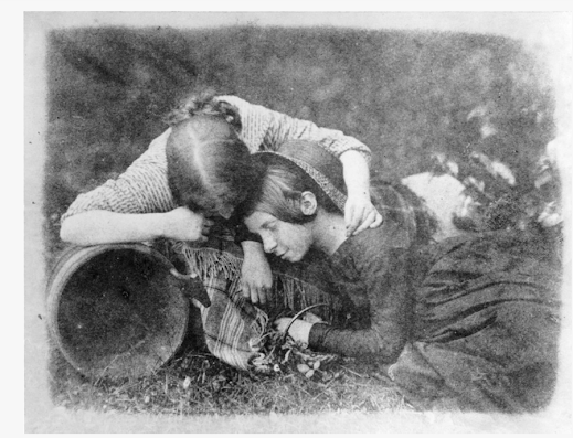
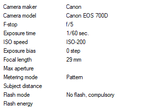
This shot used a wide aperture at F5 and a fairly slow shutter speed of 1/60. it was nice and bright with no exposure compensation. The background really lightened the image and I felt this worked well in colour with the raindrop background and light just glinting of the droplets, the model's face stands out well and there is a good use of the rule of thirds.
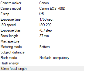
The second colour shot, I thought the pose worked really well and was from a slightly low angle. again wide aperture of F5, ISO 200, however in this shot I slightly underexposed at -0.7 this had the effect of slightly deepening the colours.
The black and white shots I had many choices so I will just put a few here.
In this image, a really good close-up really focussed on the model's face, a good rule of thirds this was a wide aperture at F5 however the background dropped out slightly to create blur due to the focus on the model's face and a short focal length. I did not use exposure compensation in this shot.
I chose this shot as I really liked the leading line of the road and the model's pose enhances the line of the shot, rule of thirds again and as the background has dropped out again due to focal length this worked well.
This was one of my last shots and I really liked the clarity of the image, very sharp and clear and the model looking into the camera worked well the line of her body through the shot clear focus at the forefront of the image has an impact. In this image I had underexposed by -1.7 this gave depth to the darker shades and tones.
Reflection
Overall I am pleased with the outcomes from this shoot, I got some images that have impact, work technically well and if I was using this for a fashion shoot there was some good poses that really worked. If I shot this again I would have tried further poses and positions on the model and I also would have perhaps included some top-down images (High angle) as I think this would have added to the shoot.
The brief on advertising is to create an advertisement and so I began thinking about what I would like to advertise. I have been thinking about the uncertainty in the world, climate change, cost of living crisis, supply chain issues and war. On an individual basis this can make life feel uncertain, will my home be safe and secure? What happens if there is an economic crisis? How will I protect myself and my family?
So with these thoughts, I considered my own money and how to keep it safe. So what is the safest place in the world for money? Traditionally Switzerland, as it is a neutral country and it has all those vaults filled with everything. Interestingly now Switzerland has become the world leader in creating digital vaults to hold digital assets; 'Switzerland is successfully positioning itself as a pioneer in safeguarding digital assets and strengthening its role in global wealth management.' (Switzerland Global Enterprise:2023). Thinking about this it would be a good idea to create a Swiss Bank for not just rich people but for everyone where they could safeguard their money both real and digital/Cryptocurrency for the future.
I will begin by looking at other banking advertisements and consider who they are for, whether they work and how and where they are advertised. I started by looking at my own bank and how they advertise. This is Monzo bank that is just through an app with no physical premises.
Monzo bank advertising in this case seems to be suggesting that you will enjoy relaxing in the sun by banking at Monzo - there is no tagline here just the name of the bank - I personally think if I was a new customer I might want a little more information on why I should join this bank, the man in the picture looks like Gen X so is this an advert for that generation? I realised then that this could not be the whole advert and I found the advert which is actually a short film and the tagline is 'money never felt like monzo' with the characters doing pleasurable things. Giving the idea that banking at Monzo is a pleasurable experience. Again it is selling a lifestyle idea for you to buy into as a customer.
Going to a more traditional bank I looked at adverts for HSBC. HSBC pride themselves on being a global brand but who care locally - their tagline here states 'When we see beyond borders, we see opportunity everywhere' and then next to their logo 'opening up a world of opportunity' the global aspect is highly important therefore these adverts seem to be aimed at people who perhaps travel often, business people and perhaps younger people - students who may live in two different countries. The typography on this advert is much more serious looking than the Monzo which is more rounded and gives a sense of fun. I think in my own advert I would prefer a more fun approach to serious banking!
The adverting adverts encompass this idea further by pointing out that their accounts have no fees anywhere in the world.
The other bank that I use is the Co-operative Bank. I chose this bank as it was supposed to be more ethical and invested in ethical concerns rather than things that may harm the environment and I do believe this is still the case with this bank
The 'Withdraw from this' campaign is focussed on climate change and encourages the audience to withdraw from other banks and join the co-op as it will do better things for the environment. The co-op bank logo is quite simple and known so although it looks old fashioned it is well known as a brand in the UK. The message in capitals and across the icecaps melting is simple and effective as a tagline.
The co-op advert film enhances this message and gives further facts about what the bank has done and to reiterate that it does not fund businesses/people who are destroying the environment. I like this as it is why I joined this bank. I do think though for my own advert I need to focus on once clear message.
My own bank needs a strong name, a tagline and a good logo to make it work and looking at the other banks here - I would like to target Generation X as I have some ideas about how to market this and I believe Generation X are at a time in their lives where they want to safeguard their money for their retirement and their children who have left home and in these times need more financial assistance with housing and living costs.
After looking at the research I have decided my tagline should be 'You played, you worked, now rest easy' which is a combination of how Monzo has marketed their bank with a playful, enjoyable experience and I wanted to combine this with security, like in the HSBC advert so I will add as a subheading; 'secure your money in the safest place in the world' or something like this.
Have decided on the name of my bank which will be 'Plutus' this is the Greek God of Wealth; Plutus was 'a son of Demeter by Iasion, Plutus is the Greek god associated with wealth; he is also tasked with choosing who deserves good fortune. Aristophanes says in his comedy, The Plutus, that he was blinded by Zeus, who hoped that removing Plutus' sight would allow him to make his decisions in an unbiased manner, and select recipients more fairly.' (Learn Religions: 2019)
I felt this name was a good strong name for a bank and had the correct meaning behind it.
My next step was to just mock up the layout which will look something like this;
The typography I want to be sans serif, friendly, rounded but serious enough to suggest security. I went through a few fonts/typefaces for consideration as below
I quite liked Elephant however this may be too bold, so I think Rockwell maybe my second choice. I will try these on the advert and see which version works best.
This is all my planning my next post will show my process and final piece.
References
Switzerland Global Enterprize (2023). Switzerland is the world’s digital vault. [online] S-GE. Available at: https://www.s-ge.com/en/article/press-release/202302-homeofblockchainswiss-report?ct [Accessed 16 Jan. 2025].
Learn Religions (2019). 7 Gods and Goddesses of Prosperity. [online] Learn Religions. Available at: https://www.learnreligions.com/god-of-wealth-4774186 [Accessed 17 Jan. 2025].
Today we are making a practice advert. My advert will be a donkey sanctuary charity. I am going to create this advert on Pixlr. I will create a logo, tagline and consider my target audience.
I opened Pixlr, then clicked on 'Create New' and then chose Print in the top menu of the dialog box and then chose A4, added a title and clicked on Background and chose white. Then clicked on okay to make my canvas, My poster will be portrait so I clicked on 'Image' in the top meu and then rotate canvas.
I then clicked on File in the top menu and 'open' and chose my donkey image from my desktop which I had downloaded from Unsplash as these are copyright free images and are free to use. I then wanted to add my donkey to my canvas so I went to my donkey image and clicked on 'Select' and then 'Select All' from the top menu and then I went to 'Edit' in the top menu and then 'copy'. I then went back to my canvas and clicked on 'Edit' and then 'paste'. Now my image is on my canvas.
The next step was to create a logo on Adobe Express. So I created a name for my charity and chose the style and the colours I wanted.
One version was transparent, the other had a background colour, I will now add this to my advert.
Next I added a new text layer by clicking on the 'T' in the left hand tools menu and then clicking on the canvas. I then changed the words to my tagline and then I change the colour to compliment my image and logo. I used Beornheard font at 68pts and then I used the alignment to left align the words. Finally I added further words with a donate now section and used the move and alignment tools to place this ion my advert.
Please see my final advert here which I downloaded as both a png and a jpeg file for higher quality.
Reflection
This was a good practice as it helps me to think about the graphic design and structure of the advert and who my audience are and how I will reach them. I quite enjoyed he colour scheme which worked with of the colours in the image and I think this is simple and clean and would bring donations.


.png)


.jpg)