Followers

Tuesday, 5 April 2022

Three Amazing Ideas for Media!

In the welcome post I discussed photography instruction books so I could make my own photography instruction book.  Look at these great images below, perfectly executed visual instruction.  


I like the idea of creating an old style photography instruction book so this would be a book I could take the photographs for instruction and I could write the text and could complete a published book perhaps on Blurb.  


My second idea is to create some digital art - a few years ago a create a series of images called the Army of Dolls and I very much enjoyed this and would like to create another collection of Digital art - this could be sold on a site for NFT's and could be really interesting to do - this was one of the images I created previously - I would like to expand and work on this with some new ideas about using the dolls in a new collection 

A Moment of Quiet By Zoe Van-de-Velde

The third idea is to work on the story I created last term in my chapbook as I did the first three chapters of The Story of Milk - I would like to to finish this as I was enjoying writing the story and I think it has the potential to be a novella.  


I will consider these three ideas carefully considering time constraints and which would add add to my skills and be most useful to explore.


Monday, 4 April 2022

IIM Initial Ideas: Art Inspired by Artists

 Today we were discussing art inspired by art and I was particularly taken with the work of Cindy Sherman in the presentation.  This is an unusual piece of work by the photographer as although it fits into here oeuvre of recreation of classic shots as in Film Stills.  In those works she was every kind of woman and was visually discussing the role of women in society.  In this shot the Museum of Modern Art states; 'It's different from some of the other works in the series that may be more caricatured. In this one we see this mimicking of the original painting much more clearly.' (Cindy Sherman. Untitled #224. 1990. | MoMA, 2022).

In the series History Portraits/Old Masters (1988-1990) this was the first time Sherman took on the roles of men in her images and in this image; 'Caravaggio's painting is believed to be a self-portrait of the artist as the Roman god of wine, Bacchus. Right here. she's a female artist as a male artist as the Roman god of wine.' (CinĂ©-club : Untitled #224 de Cindy Sherman, 2022).  Sherman used her usual method of costumes, makes and in this case prothesis to recreate the image.  Sherman chose the image of the sick Bacchus here, for reasons we might never know, however the change of gender and the use of photography have heightened this recreation into something reimagined. 

The image I have chosen is an image from the Poughkeepsie Journal, Untitled (1999)


Katy Grannan took intimate portraits of strangers, her imagery 'relies on documentary photography as a point of reference in order to merge reality and fiction, while capturing the subtleties of her sitters’ psychologies.' (Untitled (from the Poughkeepsie Journal) | The Guggenheim Museums and Foundation, 2022).  Katy Grannan is an American artist who finds her subjects through newspaper advertisements The images portray the subjects how they want to be seen and Grannan has a sensitivity that allows the sitter to express themselves and the subsequent image 'is imbued with secrecy, desire, and hidden intentions' (Katy Grannan | Fraenkel Gallery, 2022)

What does the artwork make you think of?

This artwork makes me think of the girl's vulnerability and perhaps I related to this image as I felt very vulnerable at a similar age. I really enjoyed the shot with eth low angle and the camera just lifting to her face.  The bedroom/living room that she is in has a very soft and feminine feel maybe why she felt comfortable taking the shot in her own home and surroundings. The white of her bra gently matched the white/creams in the room and her blond hair was the same colour as the soft wood.  Beautifully lit the girl is alone and there is a beauty to her innocence. 

What do you think you could do to reimagine this work?

I would like to recreate this in my own home setting, I would use myself as the model and perhaps look at either changing the colours to see the effect - what if the girl is wearing black or red would this make her less innocent or perhaps instead of the small tampon string there is something larger and more obvious emerging from her intimate places.  I would lie to recreate the pose though - I do think the answer will be in the environment and the mode/colour of the dress. 

What medium or method might you use?

I will use photography - however, it could be interesting to recreate this as a painting.  I will think about this further and I will definitely try out drawing painting the shot as I think this could lead to more interesting thoughts about the image.

Planning

I will need to do this in the daytime in my own home using natural light.  I will think about the dress and environment and will use different clothes but I want to take the same pose so that it does pay homage to the original.  I will be using my Olympus camera and tripod with self-timer to take this and will add my contacts and test shots in the next post. 

References

The Museum of Modern Art. 2022. Cindy Sherman. Untitled #224. 1990. | MoMA. [online] Available at: https://www.moma.org/audio/playlist/261/3365 [Accessed 4 April 2022].

Cineclubdecaen.com. 2022. Ciné-club : Untitled #224 de Cindy Sherman. [online] Available at: https://www.cineclubdecaen.com/photographie/photographes/sherman/untitled224.htm [Accessed 4 April 2022].

The Guggenheim Museums and Foundation. 2022. Untitled (from the Poughkeepsie Journal) | The Guggenheim Museums and Foundation. [online] Available at: https://www.guggenheim.org/artwork/9363 [Accessed 4 April 2022].

Fraenkel Gallery. 2022. Katy Grannan | Fraenkel Gallery. [online] Available at: https://fraenkelgallery.com/artists/katy-grannan [Accessed 5 April 2022].

Blog Checklist for Digital Arts

 Welcome to the new term - here is the blog checklist which exemplifies all the post that should be completed for Digital Arts


Here is my Blog Checklist which I will be using to monitor my own progress

Saturday, 2 April 2022

Welcome to Summer Term 2022!

 Welcome to the new term and what an exciting term ahead!  I am hoping to post new projects, new ideas, and great research.  

Normally in my welcome posts, I discuss an artist, writer, or photographer whose work I have been inspired by or has piqued my interest because of matters that I am preoccupied with at the time.  So today in a departure from this slightly I would like to discuss old photography books.  These are books that now may seem antiquated but the principles all still hold true.  The great thing about photography, technology may have transformed the ways to take an image and democratized its use of it but the rules of photography itself; composition; light; use of colour, and depth of field remain the same.

Photograph by John Garrett
From Practical Composition (1984)

The images I will post here are from the Dixons World of Photography book series.  The one above is from Practical Composition (1984).  The text for this image reads; 'Garrett was working on a calendar when, during a break, he snapped this picture of his model playing with the child.  It was exactly the right moment when the sun-tan line on the mans' back aligned with the top of the grass.  It was taken at a shutter speed of 1/250 at f8, with a 35 mm lens which was fitted for a previous shot.  The lens gives slight distortion which helps the picture by exaggerating the difference in size of the two figures.' (Practical Composition: 1984:123)
This text describes the circumstances, gives the technical detail, and gives context to the shot.  The reason I love these books is that they are filled with these great images, some of these images would be considered unacceptable now which means I can only draw upon this great archive!

Photograph by John Garrett
From Practical Composition (1984)

In this image, the text reads; 'The model here stood in an inflatable paddling pool and an assistant was on top of a ladder with a watering can.  Backlighting picks out the water and a Softar lens attachment give the soft-focus.' (Practical Composition: 1984:121) Again the description here is great showing the simplicity of the set up and the fantastic effect of capturing the light and the water drops through that light on the flesh.

In the book. Creative Photographic Lighting, there are chapters on the light source and positioning.  Here is an example:

Positioning the Light Source from Creative Photographic Lighting (1984)

On this page, you can see simple examples with clear explanations of how the image works.  The top image explains the use of backlighting and secondary lighting on the faces of the women.  In the lower image a top-down shot explains that just by changing the angle of the woman's face the lighting flatters rather than flattens the features. 

Photograph by John Kelly from The Way to Professional Photography (1984)

In the above shot, the text reads; 'If you miss the peak of an expression, don't release the shutter.  As in this portrait, there should be no strain.' (The Way to Professional Photography, 1984:91)  The act of taking the photograph is a patient and gentle practice, capturing that moment is an art and here the photographer has done this perfectly.  The model's expression, the eyes looking directly into the lens the small hint of a smile with lighting perfectly coming in from the right-hand side shows the skill of a photographer at work.

As can be seen from all these shots there is a naturalness, yet technical brilliance to them all.  Now, often everyone thinks there a photographer with their phone but real photography always shines through


References

Dixons World of Photography (1984) Practical Composition, Eaglemoss Ltd, London

Dixons World of Photography (1984) Creative Photographic Lighting, Eaglemoss Ltd, London

Dixons World of Photography (1984) The Way to Professional Photography, Eaglemoss Ltd, London


Wednesday, 9 March 2022

Creating a Website: Home Page/Template/Contact Page

 I will be creating a website that will represent my progression route (Photography) and me! I will be using this website to add my portfolio work throughout the year at DMUIC.

To create my website I have used Wix and so I began by choosing a template.


The first thing I did was to go to the left-hand side and go into the menu icon. I then went to the three dots to get into each section and I deleted all unwanted sections.


I clicked on the text on the Home page and then clicked on Edit text.  I then went through the dialog box which popped up and changed the font to Playfair Display and Playfair Display Bold and I also changed the size of the font.  I edited my Name and the Title of the website.  I now have a consistent font for all titles and name. 


I then change the copyright to my own retaining the copyright symbol but editing the year and name. 


I then changed the background image for the home page.  I click on the background and I changed the column background to an image that I got from Unsplash (I will change this to my own image later).  I downloaded the image to my desktop and uploaded the image to Wix and added it to the column.  I then deleted the background image that was on Wix so that my background was just black behind the image to give the homepage impact.


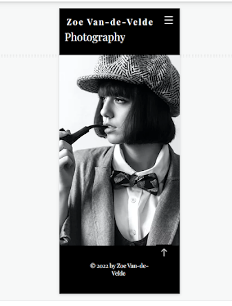
I checked and edited my mobile view of my home page. I needed to rearrange the page to make it work and reupload the image.  I had to change where the text sat on the page as it did not work the same as the desktop display.


I then changed my contact page so that anyone looking at my website could contact me through the contact form.  I removed any items I did not want from the page and then I edited the message to my own to suit my website.  As the page is not that interesting I added an image.  I also checked the setting to ensure that all messages went to my email.


I also checked my mobile view for my contact page - which looked good and I did not need to edit. 


I was happy with the results of my home page and contact page on the website - I will of course return to this and add my own image on the home page.  I do however like the design and the font/typography and colour scheme and think it will work well with my work. 


Tuesday, 8 March 2022

Milanote Board: Initial Ideas Film of Lost Things

 This is my milanote note board which explores my ideas and my intended research for my ideas for my major project this term.  I am hoping to make a short film that will explore the idea of lost things.  The film will use still and moving images and will either be silent or with music/voice-over in the manner of Sans Soleil by Chris Maker (1972) and maybe the look of Wim Wender 'Wings of Desire' (1987)


Friday, 25 February 2022

Inspiration: The Hunger

 The Hunger is a 1983 film directed by Tony Scott. It stars Susan Sarandon, Catherine Deneuve and David Bowie.  This a film about vampires in a contemporary world.  The soundtrack is by Bauhaus and this stylish and beautiful film has some excellent shots and cinematography. 


The Hunger was directed by Tony Scott who;'[graduated] from college with aspirations of being a painter, he was soon tempted into making adverts with his elder brother’s production company' (Leader, 2013). As can be seen in The Hunger Scott's understanding of painting and advertising has clearly influenced the look of the film, every shot looks like a slick and sexy advert; 'Billed with taglines like ‘Nothing Human Loves Forever’ and ‘So bizarre… So sensual… So shocking’, The Hunger was essentially an art-house update of the wave of unashamedly sexy vampire flicks of the 1960s and 1970s' (Leader, 2013) .  The film was mostly shot in London as essentially the budget wasn't big enough for it to be shot in his preferred location, New York.  The Hunger has also the look of 1980s videos of Duran Duran and Human League and uses Film that adds to this look.

The make up and prosthetics were actually cutting edge at the time: 'The Hunger is considered a benchmark film in the history of Prosthetic make up. On this movie Dick Smith pioneered the use of PAX make up to colour Foam latex appliances and it was also the first time a prosthetic appliance was covered with hand laid hair/stubble for David bowies multi stage old-age make up. Its technical achievements are highly regarded in the SFX make up field.' (The Hunger (1983), 2004)


Reference

Imdb.com. 2022. The Hunger. [online] Available at: <https://www.imdb.com/title/tt0085701/> [Accessed 25 February 2022].

Crisolago, M., 2022. Susan Sarandon On Aging and The Virtues of Being a Character Actor. [online] Everythingzoomer.com. Available at: <https://www.everythingzoomer.com/arts-entertainment/2018/09/13/susan-sarandon-acting-aging-film/> [Accessed 25 February 2022].

Leader, M., 2013. Looking back at Tony Scott's The Hunger | Den of Geek. [online] Den of Geek. Available at: <https://www.denofgeek.com/movies/looking-back-at-tony-scotts-the-hunger/> [Accessed 25 February 2022].

Cinematography.com. 2004. The Hunger (1983). [online] Available at: <https://cinematography.com/index.php?/forums/topic/2869-the-hunger-1983/> [Accessed 25 February 2022].