Followers

Saturday, 2 March 2024

Final Development: Everywhere and Nowhere

 After taking the images I put the mages that I wanted to use on Photoshop. The idea was to place all the images together to create a composite image.  In each image I wanted to disappear as I discussed as my theme for this project so the first thing I needed to do was set the background image, this was just the image of the room itself.


I then opened each image I intended to use (5 in each case) as the brief was for 10 images and then I used the quick selection tool on the left-hand side menus and selected the subject (myself).  I used the + and - tools to adjust the selection in the top menu bar and then I clicked on Edit and Copy and went back to my back ground image and clicked on paste. 


I then once I had the new layer used the move and transform tool to place the image in the correct position as in the original image 


I then lowered the opacity so that I was faintly visible. I repeated this same process for each image.


Once completed with all the images that I wanted in the final piece I saved as psd and jpeg ready for my gallery.


I also created a cube to go with this on the site.


Everywhere and Nowhere: Second Shoot

 My first images for 'disappearance' were all about the light, the light of the morning sun in my flat and myself becoming overexposed through a flare and then not being there at all.  I made these images into a cube that I have had sat on my desk for a few weeks now and I quite like these images and the physicality of the cube. Here is the digital version..


However, for these second images linking the idea of twilight and disappearance, I took these in the dusk light.  In the later images, I had to switch on the house lights as it had moved from dusk to darkness.  I used my camera by braille for the shoot.  For the images here I wanted the camera static so I had the same shot over and over and only I moved within the frame. 

These are the contacts and in these shots, I used aperture priority, F.3.5, ISO 400, and exp compensation +1.  I shot in monochrome and in RAW and high-quality jpeg.  Also, I did a few shots in the middle using a fixed 25mm lens as I had some other thoughts which involved redaction. 


The images on their own are not that interesting as that is not their point to be alone.. However here are a couple of the shots and EXIF details 


This shot is well balanced with a good rule of thirds and the pose and the domestic bedroom setup works for this particular project as I stated earlier the camera is static and there was no variation in focal length.


As stated there is no real variation in settings the shutter is slow making these quite soft images but this was useful to the final result I am aiming for.


The image above is the centrepiece of the final image and I wanted this looking to the viewer as all the other images are more passive and this is the direct connection. 

In my next post, I will show the development of the final pieces for the website.


Friday, 1 March 2024

Final Boards: Twilight House

 The completed boards are here at last, I still have a couple more final outcomes to add and another materials and sustainability board but this gives the idea of how they will look finally. Remember if you are doing commercial property use SMARTdraw for floor/site plans but only use the free trial - don't pay for anything!


Twilight House Final Boards Process

 I have been working on an interior design project this term 'Twilight House', I created the design on Homesbyme as this is free and you can have fully rendered 3D images of the designed rooms and I could create my floor/sit plan easily in 2D with dimensions and square footage.  

The boards, I created on Photoshop by creating a canvas ('New' in the top menu and then I clicked on 'Print' in the dialog box and then chose A3, landscape orientation at 300 resolution, I also just chose a white background to begin)  I then added an abstract image by Ben ayes from Unsplash to use as my backdrop on each board for my designs.  To add this I went to the top menu clicked on File and then Open and then just chose 'Select' and then All in the top menu and Edit and copy.  I then went back to my canvas tab in photoshop and went to Edit and then paste, I used the move and transform tools to adjust the image so it covered my canvas.  I then went over to my layers panels and adjusted the opacity to 78%. 


I then added the logo that I had already created on Freelogodesign.com, I clicked on 'File' and then 'Open' in the top menu and then again used 'Select' and 'All' and then Edit and copy.  I went back to my canvas board and clicked on Edit and Paste then used transform and move tools to adjust size and place in the correct position in the right-hand corner.


I then added the text using the text tool in the left-hand side menu - I clicked on the 'T' and then clicked on my canvas.  I then could change my font, size, and colour easily by using the tool menu that appeared at the top of the screen as I used the tool. 


I used here the Baskerville Old Face Font in 60pts for the title of my project and 48pts for the title of the board.  I will do this for each board so that every board is consistent. 

I now just need to add images and information using the same tools as above.  Here I have used the same font and the titles here, are at 30pts and the text at 24pts. On this board, I could only fit the flooring.  I will need to make another board for furniture and certification for sustainability. I also completed a spelling and grammar check by clicking on Edit in the top menu and then check spelling.


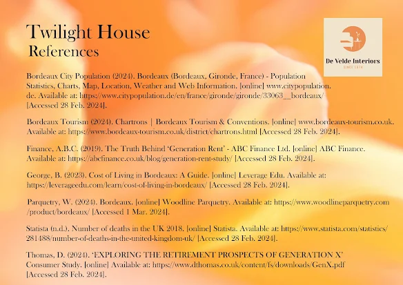
I have created a list of references on MyBib as I have gone along so that these are easily copied to my final references board. 

The process for the architectural/interior boards is the same as which means there is consistency and these can easily be saved as both psd files for editing and jpegs for uploading to Wix in a gallery. 


Thursday, 22 February 2024

Target Market/Ideal Customer: Interior Design

 I created an Ideal Person for my Twilight House design on Venngage.  This is my client for my Interior Design


Being able to afford a home now in the UK is becoming increasingly difficult with 'up to 1/3 of millennials (people aged 23-38 as of 2019) may never be able to own their own home' (Finance, 2019).  The property value to ratio income in 1996 was 3.55 and in 2021 it was 10.01 and over the last three years has increased further. For Baby Boomers by the age of 30, around 50% owned property and for Generation X this dropped to around 45%.  My own interior design was targeted at the Generation X Market as they still have earning power and should be at the top of their earning potential so this home would suit them as they want to start winding down from full-time work or would prefer a more flexible working pattern that enables them to have a more balanced home/work life.  This home should enable them to work remotely and include smart technology to ensure that remote working is as seamless as possible. In terms of retirement, a study by Dunstan Thomas showed that Generation Xers have a 'patchwork quilt' of pension pots and they often are dormant or not consolidated, and  'the average total pension savings of the average Gen Xer resident in the UK is £159,837 and they put in just over £200 each month.' (Thomas, 2024)  However the gender gap for Gen Xers is wide with 'the average pension savings of UK Gen X Men (aged 39-54) is £186,611 and average pension savings of Gen X women is £117,854 (37 per cent less)'  (Thomas, 2024)  Women put a lot less money aside for pensions at just £139 per month compared to men you save £253 per month on average.  This gulf in pensions and the ability to live through retirement is compounded by the fact on average women live longer. 'As of 2020 the life expectancy for men in the United Kingdom was 79, and almost 83 for women, compared with life expectancies of 75 for men and 80 for women in 2002.' (Statista, n.d.)

The home I am proposing here is aspirational and as per my Ideal Customer above and research carried out, it is far more likely that a man of Generation X would have the ability to own this home and live here on a decent income through his remaining working years and be able to retire here.  As a Gen X woman, I can say from personal experience that figures from Dunstan Thomas bear out my own experience and I am close to the average on how much I add to a pension each month.  


References

Finance, A.B.C. (2019). The Truth Behind ‘Generation Rent’ - ABC Finance Ltd. [online] ABC Finance. Available at: https://abcfinance.co.uk/blog/generation-rent-study/ [Accessed 28 Feb. 2024].

Thomas, D. (2024). ‘EXPLORING THE RETIREMENT PROSPECTS OF GENERATION X’ Consumer Study. [online] Available at: https://www.dthomas.co.uk/content/fs/downloads/GenX.pdf [Accessed 28 Feb. 2024].

Statista (n.d.). Number of deaths in the UK 2018. [online] Statista. Available at: https://www.statista.com/statistics/281488/number-of-deaths-in-the-united-kingdom-uk/ [Accessed 28 Feb. 2024].

Monday, 19 February 2024

The Final Book: The Quietus

 After much work, rewriting, proofreading, and working on the design and layout of my book I have now completed this.

The Quietus


I will be embedding the book into my website so you will be able to read online or you can buy a copy from Blurb.  This is only the beginning of the story, I have so much more yet to write! However for this small project I give you the first three chapters and I do hope you enjoy reading this. 


Book Cover Creation: Photoshop

 I am going to create my book cover using Photoshop.  I will show the process here and my design decisions.

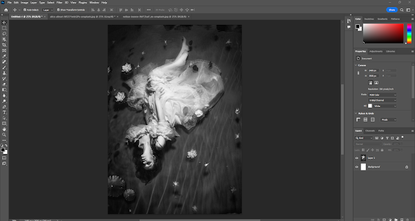
I began by creating a canvas, I did this by going to the top menu and clicking on 'file' and then clicking on 'new'. A dialog box then opened and I chose 'Print' in the top menu and then A4 size.  I then chose the orientation of 'portrait' and checked the resolution which was 300 ppi, as I wanted high quality for print.  I then chose the colour of my background, I chose white as I probably will fill the page with an image.


I then chose a couple of images from Unsplash that I intended to try for my front cover.  I then went back to Photoshop and I went to 'File' in the top menu and then 'Open'.  I then examined both images and then I chose the one I thought had more impact and was more suitable to the title of my book.  I then wanted it to be black and white so I went to 'Image' in the top menu and then Mode and Grayscale.  


I then went to select in the top menu and Select 'All' and then I went Edit the top menu and 'Copy'.  I then went back to my original canvas and clicked on Edit and the 'paste'. I then used my move tool and transform controls that I clicked on the lower top menu as they appeared as I clicked on the move tool.  I then transformed my image to fill the canvas. I wanted my front cover to fill the page. 


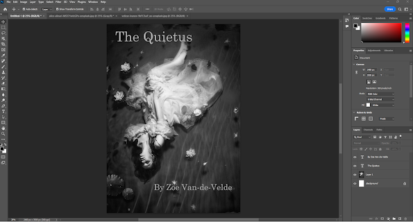
I then added the title and my name to the cover, I did this by clicking on T in the tools menu on the left-hand side.  I then clicked on my canvas and all my text tools were now in the top menu so I changed the title and changed the colour to a light grey shade, I chose this by clicking on the colour palette and choosing this in the pop-up box and then clicking 'ok'.  I then chose the font which was Century Schoolbook at 60pts.  For the author name I did the same however, this was 36pts.  I then used the move tool in the left hand menu and placed the title and author name in the right positions and lined these up using the gridlines. 


Finally, I saved my work by clicking on File in the top menu and then 'Save As', then the file folder appeared and I added the name of my cover and checked it was a psd file and clicked on save onto my desktop. I then went to File and Save a copy and then the file box appeared and I chose jpeg in the drop down menu and saved again on my desktop.  I will also save these onto my google drive. My final work is below. I can now use this, if I choose as my book front cover. 


I created this in class, and it was most enjoyable and it does rival the actual book cover that I used for the finished book.  I really like this image in black and white and the stream and water here, the woman i used on my final cover was completely immersed and floating so I think it perhaps is closer to the title of the work and so probably the right choice - however do really like this version - perhaps I can have alternate covers!