Followers

Sunday, 13 January 2019

Developing an Idea from Rejected Altarpieces: Feet & Flowers


To explore the feet and hands as depicted in the rejected Caravaggio images I started to create some photographic images.

The contact sheets for these are here:


The final images that I have chosen for the study which I felt expressed the realism and naturalness that I was after are these: 


This study shows the detail of the flesh and the details of the lily, the lines on both work well in the image.  The high key set up has meant that the light is even and there is minimal shadow against the black background which is similar to the first Caravaggio with Saint Matthew and the here the figures stood out and the viewer was entirely concentrated on the faces, feet and hands which gave the intensity of the feeling the images.  

These images, I believe, are really quite exquisite and I do think that there is something here that could be explored further. ...

Welcome to a New Term & Beginning Ideas for a New Project


Welcome to the new term - This post will show you the ideas that I have generated and started to explore for a new project. 

The beginning of this first journey starts with 20 ideas in 20 minutes


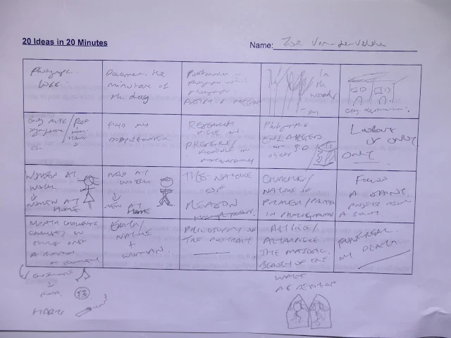
From this exercise I I have generated a wide variety of photographic project ideas the ones that I liked particularly are:


  • Creating an Art Piece/Altarpiece that explores the majestic nature of iconic images and how they become devotional objects
  • A research piece on the philosophy of the portrait
  • Documenting change over a month - a personal change in habits, lifestyle etc and the effects.
  • Photographs enlarged and used as a part of a 3D Installation on physical objects
I will begin by looking into these idea and researching others work to explore whether I can create an original piece that has new perspective of technique. 

Rejected Altarpieces: Caravaggio
Michelangelo Merisi da Caravaggio

Inspiration of Saint Matthew(first version), c.1602
Oil on canvas, 223x183cm
[destroyed in World War II]


Caravaggio used realism and naturalism and this was considered by the church not in keeping with the elevation of Saints and Religious icons such as this image above.  This image was considered not in keeping with the evangelical spirit that was acceptable in this period. The 17th Century Critic Bellori stated: 'the figure had neither the decorum nor the aspect of a saint, being seated with his legs crossed and his feet crudely exposed to the public.'[1]

I chose this image for reflection as it has a photographic aspect in that as a black and white photograph this would be very similar. The hands and the feet are the most prominent areas in the image and it is with our hands that we pray and reach out to worship, to touch others, to show love or hate.  Our feet keep us upright, keep us moving and the appearance of bare feet show a connection not just to God but to the earth and earthly things.


I will consider some photograph in response to this image to reflect more on the aspects of this composition and the meaning of the symbols incorporated.

Also here I would like to explore this piece The Death of the Virgin by Caravaggio:


Death of the Virgin
Italian: Morte della vergine, Italian: Transito della Madonna 1604-1606

Above: Caravaggio, Death of the Virgin, 1605-6, Louvre (detail)


This piece was heavily criticised again at the time as the critic Haarlem Van Mander stated that the model for the Virgin was; “one or other filthy whore” Again the realism and naturalness of the people depicted did not conform to the majestic evangelic images that were acceptable in a house of God at this time.  

The hands in this image are the expression of feeling as the virgin's hand rests upon her stomach in death and her other hand hangs languidly over the bed.  Her face is not a perfect vision but one with expression and lines that reflect all too human qualities,  Again the bare feet connect the participants of the scene to the earth. 

References

Alstrom Apprasails LLC (2018) Mild applause: Caravaggio's Rejected Altarpieces [Online] Available from: http://ahlstromappraisals.com/art-history-blog/mild-applause-caravaggio (Accessed 6th July 2018) 

Art Histories Room (5th January 2014)) Hendrick ter Brugghen and the “ugly” Christ Child
 https://arthistoriesroom.wordpress.com/2014/01/05/hendrick-ter-brugghen-and-the-ugly-christ-child/
(Accessed 6th July 2018) 


Saturday, 12 January 2019

Final Work & Reflection on App

Completed pages and navigation on my app for a Dictionary of Photographers.


The app itself worked well and in testing this could be a very good app however in the time given here this could not be completed as a 'dictionary as I could only make so many listings therefore I have chosen not to publish as this is not a final working app but as a test it showed me that this could be a great project and over time this could be a great app for students and those interested in photography generally.  Below are examples of the pages I have made.  The layout and design I thought worked well and the navigation and additional features such adding social networking features, a gallery for uses to add their own images, contact me page, about page.  The listings themselves as they used images from the photographers may have copyright issues and this would also need to be checked if it went into the public domain.  The images here obviously belong to the photographers or whomever has the rights to these images and that is another reason why publication on an app would have to be researched carefully and permissions sought.


I would create another app in the future however I think this is a longer more in-depth project that would use my own images and would perhaps be for a different use.  Great to learn something new and to try out new software online and I will continue to explore this in future projects. 


Wednesday, 28 November 2018

UX Testing My Website

UX testing is an important part of the process of creating a User Interface Design as this gives an idea of how the end-user finds the interface and whether they enjoyed using it, whether it was useful and how satisfied they were with their experience.  I have created a feedback form on Google Forms that I would like to embed into my navigation bar so that I can UX test my website - this is the form I created

Feedback and UX Testing


I opened Google Forms and then added a title and created my first question, I clicked on the left hand drop down box and chose multiple choose questions.  I then added the choices I wanted.  I then duplicated the first question with the duplicate icon at the bottom of the page and then changed this for my second question I repeated this process until I had completed all the multiple choice question and then added two questions at the end which required a written answer. 

I then customised the form by going to the paint palette in the right hand corner and changed uploaded my own image and change the colour scheme. 

The form is now ready for use on my Wix Website - I wanted a form that would be on the website so that all users would be able to easily find this and test my website whilst on the website itself so I embedded the link into the navigation bar. 


I was pleased with how easily this worked and how it looked on the site and I managed to get 24 response in the first instance from this testing.  

Here is my feedback:


From this feedback I can see that although people mostly thought my homepage was 'good' only some thought it was excellent therefore I need to consider what changes I might make to improve this - I am hoping i will find further information on this in the comments section.


The majority did think the navigation was excellent so I was pleased with thsi result as I thought teh navigation worked well.


The majority thought the portfolio -gallery pages were excellent so again I was pleased with this result as this means the work I am showcasing works well in this presentation format.


Again with the Bio page the majority thought  it was 'good' rather than excellent so I do need to consider this page again and see what i can do to improve this.  


This split the user testers which did not surprise me as personal taste about the look of something is just that...


The majority tested on a desktop PC or Mac so I do think I need to further user testing just on mobile devices.


Some good comments here and some that are useful about the font choices, adding more galleries and some good feedback I will reconsider my website design and show the changes once I have thought of the best way to improve as per this feedback.

Sunday, 25 November 2018

Testing my Gallery

For the app pages I was going to create a gallery on my website to showcase these and add a navigation link straight to the live app. 

So I started by adding another page to my navigation bar:


I then added a slide deck gallery through using the Add bar on the menu


I then removed all Wix images and added my own images from the app 


I am not sure whether I like this gallery yet or if it works as well as other features on my site so I am going to leave it to keep trying it but I may change this to a different presentation method here or just link the app the navigation bar.


Additional Features

I have now added some additional features on my app - I have updated the home page ...

As you can see I have added a Google+ link so I could create a community that goes with this app and also a social networking page which allows user to use this as a social network and discuss teh app and the photographers.  

So it will look something like this when people join and can add photos and videos and chat  and add comments.  I have also changed the background to this beige colour as this suited all the pages better - the black was too dark and the photographic did not work as the text was not clear.  The beige is throughout and I think that this consistency works well.

App Target Market


Who is my app for?  Why make this app and what use will it be? 

My app was designed with undergraduate students and anyone interested in photography. Undergraduate students particularly with the idea that they could search a category and find a starting point for further research.  In a very small snippet which is how people consume information using their phone. 

Statistica states that 178 billion apps were downloaded in 2017 and experts project close to 260 billion downloads in 2022. The revenue of the App Store and Google Play in 2016 was $2.23 billion.  Apps are a lucrative and growing market and with the right app that people really want to use there is certainly moaney to be made.  

Tapping into the right market and getting the app downloaded is the tricky part - the app needs to advertised and this could be through social media, through promotion on the right websites and through word of mouth and good reviews on the app stores themselves.  Getting the app featured and user tested with reviews online are all good ways to market the app.  

My app is free at the moment as the content is in development and there needs to be more work to make this a saleable prospect.