Followers

Monday, 18 April 2022

Media: Photography Shoot - Mark II

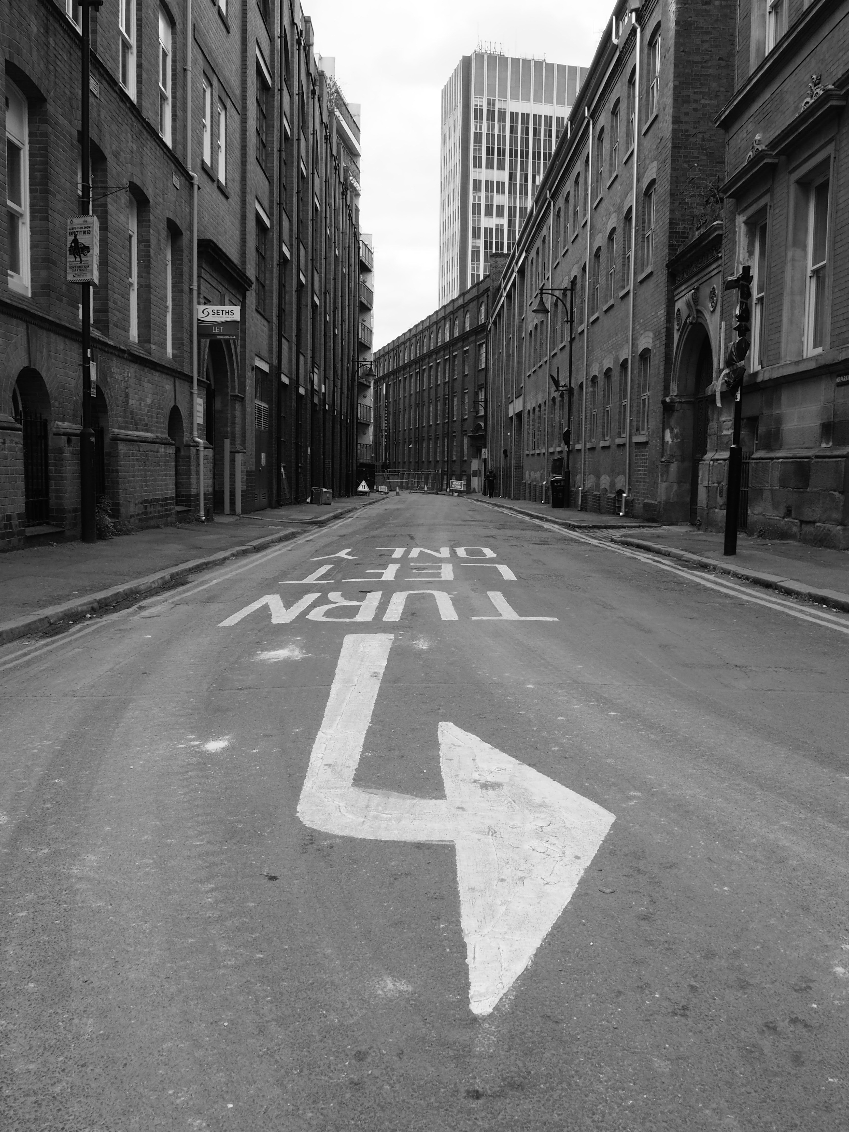
 After completing a shoot during the session around the backstreets, I followed this after looking at the shots, with my own shoot.  I wanted to concentrate on the idea of home and so I photographed around my building and where I lived.  I have lived in this place since 2014 and in Leicester much longer.  My parents were both from Leicestershire, I have known these streets from a young age and have seen the changes.  I wanted this shoot to reflect that familiarity. I shot all of these in black and white as I felt that these were more successful in the first set and I have used some of the same techniques and worked on leading lines as I think during curation these could work well together. I took fewer shots as my camera actually died for unknown reasons on this shoot so I stopped when it stopped - the camera is in surgery I am hoping it is nothing fatal!

I was using my Olympus OM-D E10 Mark II for these shots at ISO 400, I started at F6.3


The shots I quite liked were these: 


'Home' ISO 400, 1/800, F6.3, FL34mm

'No Entry' ISO 400, 1/500, F6.3, FL14mm

I liked this shot as it matched my 'No Left Turn' shot from the previous outing.  


'Yep' ISO 400, F6.3, 1/1250, Exp-0.3, FL14mm

Yes, it's the classic shadow of the photographer shot - put it in as I liked the balance of the road and my building in the background. 


Thursday, 14 April 2022

Media: Urban Landscape First Shoot

 The magic of photography continues.  Today we went out to The Curva and backstreets to take some shots.  The weather, in English style, was overcast and so the sky ranged from grey to white (not ideal), however, it did stay dry and I am hoping I got some good shots.  Started by setting my camera Olympus OM-D E-Mark10 II to ISO 400, F5.0, and just adjusted settings as I went.  Took some Black and white and some colour.  Here are the contacts from the day, took around 150 images.


So I will just look at a few of the images that I thought worked quite well from the shoot.  


ISO 400, F3.5, 1/250, FL 14mm

I picked this one as I walk by this every day to work and there is often evidence of the night before which may include foam, cans and general odd rubbish. I liked the door and the bin I felt this worked well as a shot.


 ISO 400, 1/50, F14 FL 14mm

This shot I enjoyed the turn left only - a sign that life is telling you, you can only go one way! Also this has a great leading line and so the eye is drawn up the street through the image.  


 ISO 400, 1/125, F5.6 FL 15mm

This is not in any way my best shot but I couldn't help but like it, I loved the two bins with the twining leaves above and I kind of liked it that in the background a man is standing at the window.  The balance of this image pleases me....

I will take further images that perhaps have more of a theme, or personal meaning and post these ready for the next session 


Tuesday, 12 April 2022

Media SMART Objective


SMART Objective for Media Project Sign Off 

I will be creating a Digital Art project which will consist of 4-6 final images that will use the concept of The Return of the Dolls following on from my former project of The Army of Dolls. I will use my own and stock images and create the digital art pieces in Photoshop.   will then upload them to an NFT site and create digital assets to sell online.  They will also be uploaded onto my website in a gallery by the deadline at the beginning of June.

Media: Piktochart Developing Ideas

 Finalised my idea for the Media project and I decided to go with the Digital Art project.  I have names this The Return of the Dolls as my concept will be a story that will follow on from The Army of Dolls


Please find my picktochart with more development and explanation here and the link:


Monday, 11 April 2022

IIM Book Cover Design: Initial Ideas & Practice

 This week we are being inspired by written work and so we are looking at book cover design so I need to consider books I might like to redesign.  I am tempted to C.S. Samson, here are some examples of his book covers 


As you can see, these book covers work as a set however I think I could do something interesting with these titles so I am going to do a practice run in class.


I began by creating a canvas on photoshop, I did this by clicking on create new and then 'Print' in the top menu of the dialog box.  I then picked an A$ size from the templates and changed the resolution to 300 dpi for high quality in case I wanted to print.


I then opened by image in Photoshop which I found on Pexels which I thought would work quite well with the book title of 'Revelation'.  As this is a historical novel then I needed an image that was timeless and certainly did not look contemporary.  The image also had the dramatic air that reminded me of the novel itself. 


I then wanted to add the text so I spent some time choosing a suitable font so the typography, again reflected the novel itself.  I chose Euclid Fraktur for the title and authors name and the title was at  100pts & the author at 36 pts.  I lined this up to centre this as the image was central so this would balance well and be aesthetically pleasing. 


I then added a tagline to interest and excite readers and those that know the stories would want to buy this book in the series - I used 30pts Baskerville Old Face 


The final version I saved as a psd, in the cloud and on the desktop and also as a jpeg on the desktop to upload here.

As a practice this worked quite well and considering it was completed in a very short class this gives me an idea about other books or covers I could explore. 


Saturday, 9 April 2022

IIM Art Inspired by Art Final Shot & Reflection

 Here is my final choice of shot for my recreation/reimagining


For the final shot, I adjusted slightly on Photoshop by cropping so that the shot was closer to the original.  I also adjusted on curves brightening the image slightly as the original is slightly more exposed. 

I think as a recreation this was an interesting one as the girl in the original is young and has the look of innocence surrounded by the cream and white but also is in her own environment.  I also have used my own environment for the shot so this reflects very much of my own look in the shot.  I am not young and so don't have the naivety of the original but I think there is the same slight sadness to the look and softness to the image that makes it compelling. 

I also tried this in black and white just to see if this would change the feel of the image. I liked the black and white however I think the color shot works better with the light and the blond hair, purple duvet and sunlight on skin.


IIM Art Inspired by Art: Process

 Today I set up the shoot for art inspired by art images.  I was trying to recreate and reimagine the image by Katy Grannan discussed in the previous post.  

I tried this in my bedroom as the morning light was looking really good and I thought I could shoot at a low angle on my bed.  My flat is small so I had limited space.  I also tried on the living room floor however I think the first set works better here and so I will just share the first set

I created contacts on Photoshop just by going to File - Contacts - and then choosing the file on the dialog box.  

I took the images using my Olympus E-3 with a remote control, I started with the settings at ISO 400. F3.5. I shot in RAW and jpeg so I have both versions for editing. I took 120 images in this shoot,


After studying the shots actually the very first shot I took is the one I liked the best.  I think this is highly unusual however I think it was the nature of the shot.  The original has had a naivety and I think that in the first shot I just tried the pose and this lack of adjustment to the shoot kind of captured something of the original. 

So here are the three shots that I liked the most


The settings for the three shots were:


I will now choose my final shot and decide which will be my reimagining of the original.