Followers

Thursday, 26 January 2023

Milanote: The Story of Honey


I created a Milanote to explore the themes and research I may undertake while carrying out my creative writing project.  I intend to explore the work of Malcolm Bradbury and Mil Millington.  I also looked at my target audience and considered millenials and use of language as this is my intended target market for the story.


The Story of Honey Milanote


Wednesday, 25 January 2023

Quality Control & Curation

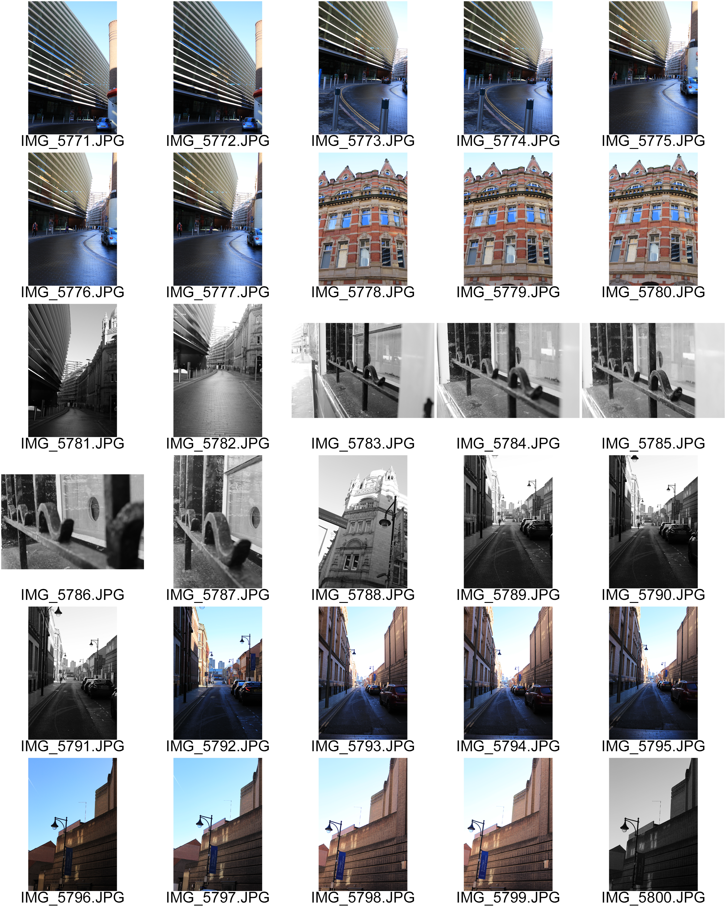
 Today we looked at curation and selected the images that we thought might work in our final portfolio.  I started by selecting images I liked and thought might work together for my final portfolio.  I will consider the curation process later in this post however, the images I choose I looked carefully at each image in Photoshop and adjusted them using various tools here are some examples of the quality control of my images.  So I chose around 30 images to look at more closely so I could make final curation decisions, I want to have more images than I will use in the end as I will be considering the relationship between my images and how they work together as a set.

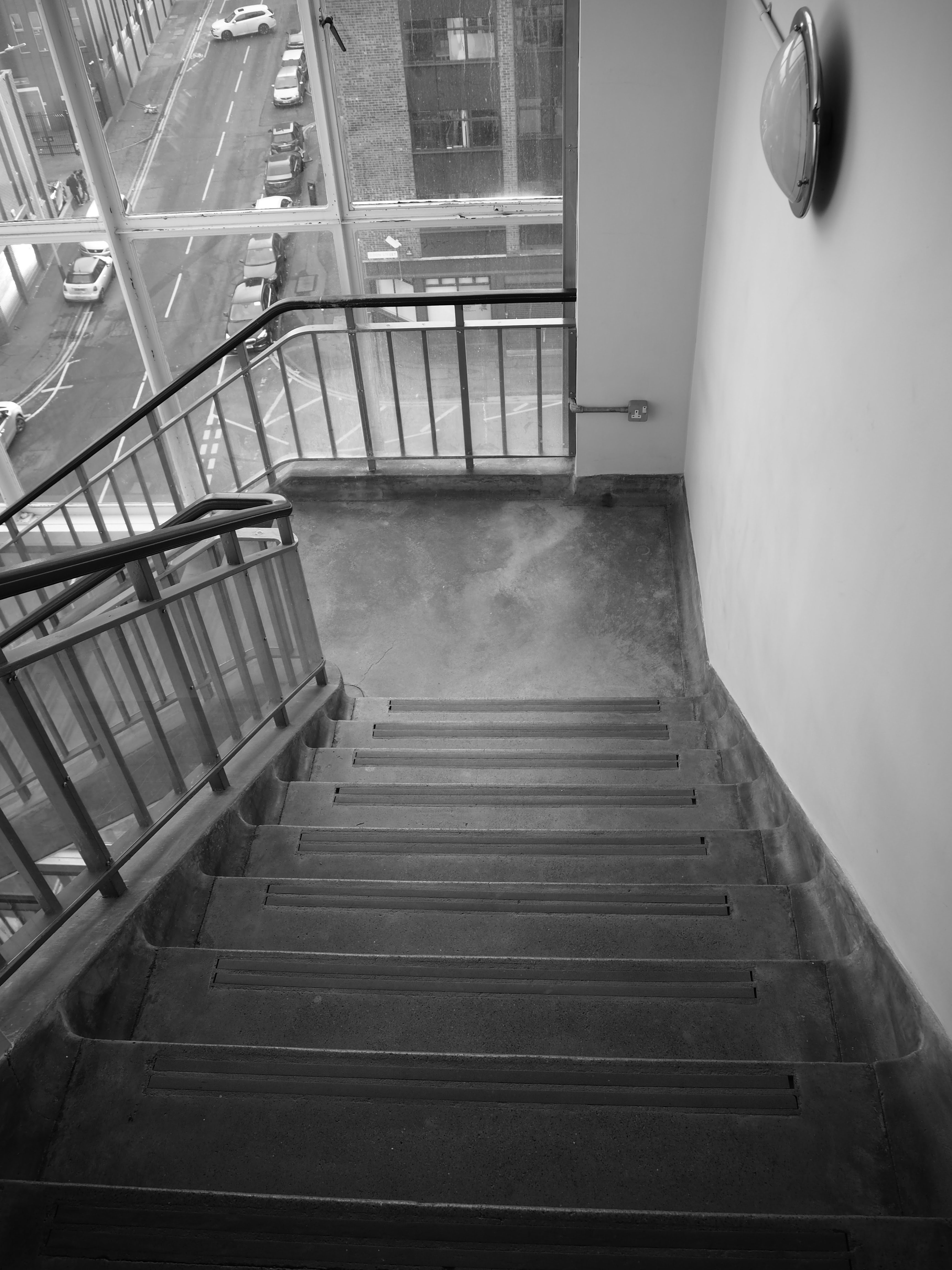
For the below image, I checked the quality of the image, looking carefully for anything that was not sharp, and then as the image was perfectly straight I just adjusted the curves on Photoshop to very slightly brighten the image, the difference is subtle but it will make this the best image it can be in the final portfolio.


I did this for all the images and adjusted each accordingly the image below I liked the concept but it needed to be straightened using the crop, straighten and grid tools 


As can be seen this is much improved, this process is vital when considering photographic image I have now been through the 30 images chosen and adjusted - I will now consider curation to hone down what I actually want to show in the final portfolio and how I want to display these to really have maximum impact.

Curation is: the action or process of selecting, organizing, and looking after the items in a collection or exhibition.  This element of presenting art/media work is very important how items are placed together affect the viewer's perception and it is important as an artist that the work is shown to give the right message or feeling intended. 'It's worth thinking about the etymology of curating. It comes from the Latin word curare, meaning to take care. In Roman times, it meant to take care of the bath houses. In medieval times, it designated the priest who cared for souls. Later, in the 18th century, it meant looking after collections of art and artifacts.'(Jefferies & Groves, 2014) I like the idea here that we are guardians of the work we curate, that we take special care over this and this is what we should be doing whether we add this to our own website or an online gallery or whether it is a physical exhibition.

I listened to an interesting podcast that you can also listen to this here which is about curation this is with  Jennifer Frazier, a senior scientist and curator at the Exploratorium, a hands-on science museum in San Francisco. To listen please click here  I liked this as it was about science and curation and it is important to look at different areas and how they understand curation and care for their work. 

In The Art of Curating By Harbison for Frieze magazine, Harbison discusses curatorial practices and whether some of these had become outdated.  One of teh exhibitions discussed was described as follows: 

'The Barbican’s ‘Magnificent Obsessions: The Artist as Collector’, plumbed the personal collections of 14 artists. The show included Jim Shaw’s selection of found ‘thrift store’ paintings – famously gathered as part of an ongoing project – and Pae White’s collection of more than 3,000 Vera Neumann fabrics, which were artfully hung on diagonal washing lines as a colourful, billowing installation. Hanne Darboven’s knick-knack-laden studio and living room were reconstructed, complete with original furniture, before an installation of her photographic series, ‘Mitarbeiter und Freunde’ (Co-workers and Friends, 1988). Padded out with old rugs, worn tables, antique vitrines, cupboards and excess haulage cases, the exhibition proposed these artists as inspired hoarders and implied their curatorial arrangements were inherently meaningful.' (Isobel Harbison  2015)


I included the whole description here so that the reader could understand what the exhibition consisted of, and it is clear what was intended through the curation of this exhibition with essentially the artist's stuff - I do find that often exhibitions are 'padded out' by including objects and materials to enhance the viewer's experience however whether this is inherently more meaningful or that the viewer needs this to understand an exhibition I would argue that perhaps it is unnecessary.  I hold to the pinion that in curation less is often more as I would rather concentrate on a few images than be overloaded by them, I think this means that I can absorb and reflect on the image or piece more meaningfully than wondering around a mass of 'stuff' as if I need to fill time or have to keep moving.  


The joy of a good exhibition is one where I can sit and take in the pieces rather than fight with a crowd to get a glimpse or be moved through an exhibition without being able to really reflect. An online exhibition obviously means I can take time on my own and as long as I like on the things I really want to see and experience and this is great however I do still think that a physical exhibition is a far more meaningful experience to me as I want to see the original in the flesh and the screen does remove you from that experience.  

On my own website gallery, I will put my images together in the most meaningful way I can so that they work consistently together, so they flow as you go through them, and make sense however I know that these images would still be better viewed in their physical form and I can play with size, space, and light in a physical exhibition which is much more difficult to achieve through a screen or where most people might view this on a mobile phone. Perhaps I am old fashioned or perhaps I do feel we are moving into a time where people are disconnecting from the real world and communicating with it in a meaningful way. As Jean Baudrillard stated: "We live in a world where there is more and more information, and less and less meaning.” ...

References

Jefferies, S. and Groves, N. (2014) Hans Ulrich Obrist: The Art of Curation, The Guardian. Guardian News and Media. Available at: https://www.theguardian.com/artanddesign/2014/mar/23/hans-ulrich-obrist-art-curator (Accessed: January 24, 2023). 

Quagliarello, M. (2021) New Flipboard podcast, "The art of curation," explores the art and science of selection, About Flipboard. Available at: https://about.flipboard.com/inside-flipboard/new-flipboard-podcast-the-art-of-curation-explores-the-art-and-science-of-selection/ (Accessed: January 25, 2023). 


Isobel Harbison 23 APR 15 et al. (2015) The art of curating, Frieze. Available at: https://www.frieze.com/article/art-curating (Accessed: January 25, 2023). 


Tuesday, 24 January 2023

Ideas Generation: Creative Media/Digital Arts - Chapbook - Story of Honey

 This term I will create a small chapbook which will be the the other half of a story I wrote last year.  Last year I created 'The Story of Milk'  this year I would like to create 'The Story of Honey'.  This will use text and image and I will use a mixture of my own images/stock images (some of the this story is based in America) I will use all original text so I will writing drafts and redrafting while taking and sourcing images.

I attempted this previously but did not manage to complete this so I really would like to explore this story again.  At the heart of the story is St Jude who is the Saint of Hope in that he deals in the impossible or difficult cases.


The Story of Honey is about a young man who is studying St Jude and needs to connect with subjects who are using St Jude as an intercessor to their cause through a Novena (nine days of prayer).  Honey starts his journey working in a bar in America and he is embark on a Journey to England where he eventually may meet 'Milk' from my first story.

I will write this in a fairly easy style with short chapters - I will look at writer such as Mil Millington and Malcolm Bradbury


Mil Millington writes humourous books which show the human condition, as I have enjoyed his ouvre and have all his books at home this will be useful to look at style and language and consider my target audience.

Malcom Bradbury worked and wrote about working in an East Midlands University in the 1970s (times have definitely changed) his now classic books have a more in-depth style but also are humourous an light-hearted 


Bradbury dies in 2000 but was a 'Prolific novelist and critic renowned for his wry observations of academia and his support for new talent through creative writing courses' (Harvey Wood, 2000)  I enjoy Bradbury as perhaps like Barbara Pym he writes of an England that no longer exists, an academia that has changed beyond recognition (even to when I studies at University) it was not much different from Bradbury as I also was at an East Midlands university that used be a polytechnic.

Again here I will study the style, language and audience as I write my own narrative.


References

Harvey Wood, H. (2000) Obituary: Sir Malcolm Bradbury, The Guardian. Guardian News and Media. Available at: https://www.theguardian.com/news/2000/nov/28/guardianobituaries.education (Accessed: January 24, 2023). 


Monday, 23 January 2023

The Exchange: Interior Architecture

 For my own self-study shoot, I chose to do the Interior Architecture of my own building.  I live in The Exchange Building in Leicester which used to be the old post office exchange. The building has an interesting history and was at the heart of communication systems in Leicester.  Also, it was the first Drive-In Post Office; 'On 11 December 1959, the United Kingdom’s first drive-in post office opened. It was situated at the new Wharf Street Branch Post Office under the centre archway of the Wharf Street Telephone Exchange building in Leicester, which had a private road running through it.' (Todd, 2013).  The reason I chose to shoot this though was not the building's history as such but personal history, My father bought my flat for me in 2015 and although he hated it and wanted me to have a nice house somewhere, this is the place I love the most, my flat is my place of safety and comfort and for all its flaws I really love this place.  

The Exchange, 4th Floor Stairway

F3.5, 1/640, ISO 100. 0Step, 14mm

I wanted to shoot the interior architecture as I have spent much time photographing the Leicester streets and I thought this would be a little different.  I used My Olympus OMD Mark II. I shot in Black and White, high quality and in RAW and jpeg. These are my contacts from the shoot.


F3.5, 1/100. ISO 100, 0 Step, 14mm

I like this shot as you can see the street below and the leading line through the stairs and the road, takes you on a journey through the shot.

F3.5, 1/60, ISO 100. 0 Step, 14mm

Really enjoy the curves and shapes on this top-down shot of the stairway, the repeated pattern really makes this work 


F3.8, 1/50, ISO 100, 17mm

This shot I enjoyed the way the light hit the cracks on the floor and the eye drew you to the window.

 
F5.6, 3/5, ISO 500, 14mm

I struggled with the light in the basement however I got some good shots of the peeling painting, the concrete walls, and the lines.


Really liked many of the images I took on this shoot, and will be looking more closely at these for portfolio.  I think that interior/exterior shots will work well together for this.


References

Todd, L. (2013) The first drive-in post office in the United Kingdom, The British Postal Museum & Archive blog. Available at: https://postalheritage.wordpress.com/2013/02/04/the-first-drive-in-post-office-in-the-united-kingdom (Accessed: January 23, 2023). 


Urban Landscape: Cultural Quarter Trip

 We visited the cultural quarter in Leicester to explore urban landscape photography. As we were looking at Micheal Wolff and Thomas Struth, I was considering Leading lines (like Struth) in my images I wanted to show some architectural close-ups but I do like the city and Wolff's Architecture of Density which I also tried to exemplify in some of my own work. Leicester, of course, has its own character and identity and this I wanted to explore and show through looking through the lens at Leicester!


I used a Canon 700D for the shoot, beginning with settings around ISO 200, Aperture priority. These are the contacts from teh shoot


For this shoot I used both color and black and white and I think there are some shots that really work well, we were blessed with a cold but very sunny day which really enhanced these. 

F5.6, 1/1000, 55mm, ISO 200

This was looking at architectural density I liked this image from the Phoenix

F5.6, 1/4000. ISO 200, 55mm

and this image from the BT Tower - I can see this from my windows at home


F4, 1/40, ISO 200, 24mm
I liked this shot, the dirt of the pipe the dirty water glistening in the sun, the pavement below...


I will looking further at these shots next week for portfolio but this gives an idea of the shots I will be working with


Sunday, 22 January 2023

Traces: Ana Mendieta

 Ana Mendieta (November 18, 1948 – September 8, 1985) was a performance artist who used photography, mixed media, film, and painting in her work.  Mendieta created challenging work such as 'Rape Scene' (1973) that challenged the viewer to experience uncomfortable truths the piece; 'was created in response to a brutal and highly publicised rape and murder of a nursing student, Sara Ann Otten, by another student in March 1973. The following month Mendieta invited her fellow students to her apartment where, through a door left purposefully ajar, they found her in the position recorded in this photograph, which recreated the scene as reported in the press. Some time later, Mendieta recalled that her audience ‘all sat down, and started talking about it. I didn’t move. I stayed in position for about an hour. It really jolted them.’ (Tate: 2023)  Here, in the image there are broken items on the floor, a suggestion of domestic violence, the woman is leaned over the table she is dehumanised by not having an identity, she becomes just a body as the rapist might see her.  It looks like blood on the womans bottom and thighs again suggesting abuse.  The evidence around the scene and the woman's body are traces of the abuse of a man.  In my own work on 'traces' I used the doll in this same position, abused, dehumanised, highlighting that outcomes for rape are now worse than ever and women's rights are going backward not forward, we are in a time of crisis.


Ana Mendieta's Silueta series Mendieta uses nature and becomes part of the earth. Mendieta clearly felt a depp connection to the earth with and through her body and this series exemplifies her feeling '[Mendieta's] Silueta (Silhouette) series (begun in 1973) used a typology of abstracted feminine forms, through which she hoped to access an “omnipresent female force.”'(Guggenheim; 2023) In the first image, Mendieta becomes the earth, the tree appears to be growing from her and her body is entwined within the branches and leaves.  Her face is obscured as in this she is all woman, with a spiritual connection to the earth.


In the second image, Mendieta camouflages herself against the tree, it is almost animalist and in nature, they are also about identity and place in the world, Brough states that; 'Mendieta’s earthworks occupy a liminal space between presence and absence'  (Brough:2020).  In my own work, I play with presence and absence, and as a woman often we can feel invisible and 'absent' from life as if we have been eliminated.  Mendieta resonates with women as they understand what it is to disappear, to not be seen or to be seen but in the wrong way, an identity thrust upon us by man, society.  Mendieta's work should be meditated upon and considered deeply her presence/absence in these images highlights womans' existence.

References

Tate (1973) 'untitled (rape scene)', Ana Mendieta, 1973, Tate. Available at: https://www.tate.org.uk/art/artworks/mendieta-untitled-rape-scene-t13355 (Accessed: January 22, 2023). 

Brough, J. (2020) This artwork changed my life: Ana Mendieta's "silueta" series, Artsy. Available at: https://www.artsy.net/article/artsy-editorial-artwork-changed-life-ana-mendietas-silueta-series (Accessed: January 22, 2023). 

Untitled: Silueta Series (no date) The Guggenheim Museums and Foundation. Available at: https://www.guggenheim.org/artwork/5221 (Accessed: January 22, 2023). 

Thursday, 19 January 2023

Advert Practice Piece: Pixlr


On Pixlr, I opened the software online and the created a new canvas for my advert A3 portrait with a white background.  I did this by just clicking on 'Create New' then I chose 'Print' A3 in the presets and then I added a name and background of white


I downloaded one image from Unsplash to practice my advert this is the image


Next I added my image to my canvas I did this by clicking on select and then select all, then copy and then I clicked back into the canvas and clicked on edit and then paste.  Then as my canvas was larger than my image I cropped my canvas by clicking on the crop tool, adjusting to create a small border and then I hit return and my canvas and image are ready.


I used Tailor Brands to create a logo.  My company is called 'Donkey Delight' as it is a Donkey Sanctuary.  This is the final outcome


I snipped the logo from Tailor Brands and I uploaded this by opening it on Pixlr and then I used the move tool to put it in the left hand corner.  I also lowered the opacity by clicking on the layer and then the three dots on the right hand layers box and then lowered the opacity using the slider


I created a text layer by clicking on the text tool in the right hand menu and then added a text layer, I used the text tools in the top menu to change the font to Gustavo 135pts and I changed the colour to white and made it bold to stand out on my advert.


This my final advert 


Reflection - this is a good practice however in the real advert I will improve on the text on image so that it is clearer to read and create a better tagline for my product.