Followers

Thursday, 20 April 2023

Wim Wenders: Place Strange & Quiet

 As a photographer I enjoy the stillness and silence of the image, the perfect frame where contained within it is a whole world to be enjoyed and explored.  In Wenders' Places Strange and Quiet, Wenders states; “When you travel a lot, and when you love to just wander around and get lost, you can end up in the strangest spots. […] I don't know, it must be some sort of built-in radar that often directs me to places that are strangely quiet, or quietly strange.”(Wenders 2023).  The image below shows a looming sky, just before a storm and the dilapidated wall with the old painted advert seems to cut into the sky itself.  The street behind is empty and the cars seem unloved and abandoned the blue-covered car pointing one direction and the red van behind seems to perfectly balance the images and the colours of stone and the red car and sign make this picture a wonderfully empty but perfectly full image. Whimsylph writes considers that; 'In Black Square (2002, New Mexico), the hues of blue and red contrast with, even highlight more saliently, the decaying wall and tatty old advert, which poignantly includes the words Why Not Now. This photograph shows a deft painterly skill with colour and composition' (Whimsylph Writes 2014)


This next image I chose to look at the as it included a bench just like my own in my final Traces image.  This empty bench looks out onto what looks like some kind of military ship, a horrible battle grey metal construction that with a walkway up to what looks to be an unpleasant experience. The empty bench here is red so contrasts with blue border to the walkway and the picture kind of works in thirds, our eyes begin at the bench and move upward to see what sitting here what would be the view.  Wenders took many of these images while scouting for film locations, he states; 'My first films were basically landscape paintings, except that they were shot with a movie camera. I never moved the frame. Nothing ever happened in them. Each scene lasted as long as a 16-millimeter daylight reel, which was about four minutes. There was no editing involved, other than attaching one reel to the other.' (Barcelona, 2011) this is a place where some soul-searching could certainly be done.


This next image I show in class and it is still one of my favourites as the empty street corner with the old furniture shop and telegraph wires are made so much more interesting by the slightly bent lamppost that human touch to an otherwise deserted place makes this work beautifully.  The place is called Butte which just adds to the joy.  Whinsylph writes; 'with its sharp vertical and horizontal lines and stark contrasts that render the shadows almost black. With the bleak isolation and uncanny feel here, this could be a scene from an Edward Hopper (1924-67) painting' (Whimsylph Writes 2014)  however I disagree with this reading, in that I do think rather than uncanny it feels odd in a more joyous way, its empty but is sunny and broken, always makes me smile.


I looked at Wenders as I do want to base some of my own work on these ideas and I will be exploring the strange quite places of Leicester very soon...

References

barcelona, dpr (2011) Places, strange and quiet: Wim Wenders, dpr-barcelona. Available at: https://dprbcn.wordpress.com/2011/04/14/wim-wenders-photos/ (Accessed: April 20, 2023). 

Poyner, R. (2021) Wim Wenders' strange and quiet places, Design Observer. Available at: https://designobserver.com/feature/wim-wenders-strange-and-quiet-places/26548 (Accessed: April 20, 2023). 

Wenders, W. (2023) Wim Wenders: Welcome to the official site of Wim Wenders, Wim Wenders | Welcome to the official Site of WIM WENDERS. Available at: https://www.wim-wenders.com/ (Accessed: April 20, 2023). 

Whimsylph (2014) Strangely quiet or quietly strange: Wim Wenders' photography, Whimsylph Writes. Available at: https://whimsylph.wordpress.com/2014/01/19/strangely-quiet-or-quietly-strange-wim-wenders-photography/ (Accessed: April 20, 2023). 

Creative Media Production: Urban Landscape Photography Two

 Today we looked at images by Thomas Struth, Micheal Wolf, and Wim Wenders.  The last term I concentrated on taking images thinking about the composition and framing of Thomas Struth.  I did still employ these techniques this term but I also wanted to get more images like Wim Wenders Places Strange and Quiet.  as it is always good to find places in the city that are abandoned, unused and unloved but have a stillness that is pure beauty. 


The image above exemplifies the places I was thinking about in my own city and is strangely similar as you will see from my own images.  Poyner states;  'In a secluded back yard in Moscow, he chances upon a framed painting of a stag done in orange, green and yellow, which is in curious, almost too perfect harmony with the walls and fallen leaves.' (Poyner, 2021)  

Before we set off we set our cameras to ISO 200 as it was sunny and although a windy day quite bright.  A wide aperture at F4 and then we could adjust from there.  I also used the Landscape pre-set for some images on the camera.  Here are the contacts for the shoot.


My test shots


These colour images I really wanted the depth of colour and texture to come through and here the triangular shapes against the arched really work and the red brick colour in lessening shades really work.


Here the blue sky really sings with this flat images of the Sound House that is in vibrant blue.


Here like the Wim Wenders I loved the quiet place and the abandoned shopping trolley, I shot this in both colour and Black nd white I think both work well and I will definitely use this in final portfolio.


A good shoot of the Cultural Quarter I think my own images this time will be of other quiet places in the city which I find interesting.  I am hoping for good weather at the weekend however maybe images in a storm would be good too!


References

Poyner, R. (2021) Wim Wenders' Strange and quiet places, Design Observer. Available at: https://designobserver.com/feature/wim-wenders-strange-and-quiet-places/26548 (Accessed: April 20, 2023). 


Creative Media Production: Photography Traces Task

 Today I started photography in creative media production and we began by looking at basic functions such as ISO, Aperture and Exposure Compensation.

We then looked at artists who used traces of themselves in their photography, looked at Francesca Woodman, Ana Mendieta, and others 

I created contact sheets on Photoshop by clicking on File, Automate, and Contact Sheet, and then IO chose my 'Traces' file and clicked okay and Photoshop created three contact sheet 

I added these to my google drive as well as my desktop


There were a couple of images I liked from this task using my clothes as a trace of myself 


In these images, you can see that I used a wide aperture and I completed this set in black and white which was an artistic choice before I began the shoot.  The sky was overcast so I used an ISO of 400.

The final image I decided should be the coat I am hoping leaving my winter coat on the bench signals the beginning of Spring.

I added this image to Photoshop and I created a canvas in A3 Black at 300dpi resolution at printable high quality.  I opened the image and used adjustments and curves just to brighten the image very slightly then I selected the image and went edit copy and then back to my canvas and edit paste.  I adjusted the size using transform controls and centred the image with guidelines and then I clicked off the text tool on the left-hand menu and changed the text to white and chose Book Antiqua font to create my title at 26 pts.


I quite enjoyed creating this image and given more time on this I would have created further images that worked consistently as a set to create a traces collection.  I do think this is well framed and composed and the texture of the ground and the wood bench contrast with the softness of the coat which gives this the human touch. 


Thursday, 6 April 2023

Biteable Resume Video Process


In class this week we are making a Biteable video this is to promote ourselves to employers and to consider the skills we have and are developing so that we can show an employer our potential.


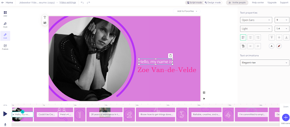
I edited the first slide by first changing the title and my name by clicking on this so that the text menu came up on the right-hand side I then changed the font to Arbutus Slab 14 pts and then I added a picture of myself by clicking on the image and then clicking on 'replace background' and I uploaded my own image.

I also then wanted to change the colours throughout so I clicked on the background and then went to 'Style' in the right-hand menu and changed the colour combinations to one that I found more aesthetically pleasing.


I then check the next slide which states which job I intend to do for I typed in the job of Creative writing programme leader as I have not done this previously.  I then clicked on the image and changed the graphic to a video of writing to illustrate this.


I then added the reasons on each slide and on each slide I replaced the graphics with an appropriate video clip.  I began with teaching experience and as I have quite a number of years of experience I thought this would be a good way to begin.


I then went onto management skill as I have worked in managerial positions in many places including being the manager of a residential care home and a safe house for young people and then after I had a child I moved into education. 

Through my teaching career I have found that one of my strongest skill is curriculum design and I wanted to highlight this here.


On sifter skills I have added and ended with commitment and dedication and from my CV employers will see that I stay in jobs for many years and I have shown dedication to these though CPD and clear progression in my career. 


I added my professional DMU address so that people could contact me and as this was on my website people can also use my website contact page. 


I then needed to look at the length of transitions and the music.

I clicked on the music symbol in the bottom left hand corner and chose the music I wanted for my video. 

I then checked the transition time and number of seconds and that each slide was readable in the seconds given.  I could shorten or lengthen the clips by dragging them out or in on the timeline at the bottom of the page. 

Once the video was complete I went to publish and then I copied the link.  I then went to my editor on Wix and my menu on the left hand side and clicked on the link button and added the video as a web address. This then meant I could view the resume on my Wix site and it was ready for assessment. 


Reflection

I enjoyed creating this video as it was for a job I had never applied for before and it was interesting to see what skills I have and would need for this position.  I believe I have outlined my relevant skills well here and the video works well and is short and snappy.  If I was doing this again I might use a different Video editor as I have run out of credits so  could not add this terms video for free on my site but I could use Adobe Spark or even Movie Maker to edit a good video for an employer if i wanted to show  my skills in the future. 


Welcome to Summer Term One 2023!

 Welcome to the new term and I am really looking forward to a new term of Creative Media Production!  Over the break between terms I have been reading a book by the Marquis de Sade which has just come out called 'The Curse of Marquis de Sade ' By Joel Warner 


This book is really more about the manuscript of 120 Days of Sodom and who owned it and how it came to be in their hands. The book states; 'Locked away in a tower in the Bastille in 1785, Donatien Alphonse François furiously scribbled 157,000 words on 33 sheets of paper in just 37 days, his handwriting so cribbed that it was barely intelligible to the naked eye.' (Held, 2023) .  The idea behind the book is that we jump back and forth through time from the origins of the text and the life the Marquis de Sade to the modern day and how the manuscript is treated and sold and the men who owned this precious scroll. De Sade; 'bragged, “the most impure tale ever written since the world began.” “120 Days of Sodom” chronicles four months of depravity involving multiple victims in a remote castle. Sade wrote in secret, by candlelight, covering the scroll in microscopic script.' (Birmingham, 2023).  There is no doubting that the Marquis de Sade is depraved and 120 Days of Sodom is a litany of acts that become more and more horrifying, no individual reading this would not be affected by the tales told and many of these stories could be considered evil and they are certainly not for the faint-hearted or sensitive of stomach!

The enjoyment of this book really is the history of the manuscript that de Sade himself thought was lost after the storming of the Bastille in 1789.  The issues with forbidden text and the idea that this was material that was quite appalling in some senses to read but strangely sought after but it had to be done without anyone knowing as it could be reputation damaging. Dickey states; 'Up until the 20th century, it’s not entirely clear that anyone had ever read the manuscript itself. Written in a tiny, cramped hand, it was barely legible—but the ambivalence toward the text seemed to go beyond that. The scroll’s owners seemed to treat it as if it were a slug of plutonium: Everyone understood that, on some level, it was incredibly valuable, but no one wanted to actually go near it.' (Dickey, 2023)  This strange dichotomy is, I think, what makes this book such a fascinating read.  the journey of this book is perhaps more interesting that the content of the manuscript itself.

References 

Held, E. (2023) Review | how a notorious pornographic manuscript reshaped literary history, The Washington Post. WP Company. Available at: https://www.washingtonpost.com/books/2023/02/23/marquis-sade-curse-sodom-warner-review/ (Accessed: April 4, 2023). 

Birmingham, K. (2023) The marquis de sade's filthy, pricey 40-foot scroll of depravity, The New York Times. The New York Times. Available at: https://www.nytimes.com/2023/02/21/books/review/the-curse-of-the-marquis-de-sade-joel-warner.html (Accessed: April 4, 2023). 

Dickey, C. (2023) The odd career of the world's most upsetting book, Slate Magazine. Slate. Available at: https://slate.com/news-and-politics/2023/02/de-sade-days-of-sodom-joel-warner-review.html (Accessed: April 6, 2023). 


Sunday, 2 April 2023

Reflection


This term I very much enjoyed working on Interior Architecture photography for my own study.  The images I manages to get here really played  with light and captured a place that I love, a place of safety and for all its concrete and brutalist leanings, it still has its own spirit. It is a place with history, as it used to be the post office exchange, my Mother said she had worked here when she was young.  

The book (The Story of Honey) which was a compliment to The Book of Lost Things I (The Story of Milk) I immensely enjoyed the writing and I do hope that once day I will complete the whole story of both as I have become very much invested in the characters that I have created and I do think this could be a great story.  These books have reminded me again of how much I love to write and if I could do this all the time along with taking the photos I think my life would be far more pleasurable.


As always the constraints of time mean that many things could have been improved and of course with more time I may have shot even more Interior architecture probably trying to capture different lights of the day, like Monet's paining of Rouen Cathedral where he had over 30 canvases of the different lights he captured, painting over and over again to get what he wanted, Monet stated 'The older I become the more I realize of that I have to work very hard to reproduce what I search: the instantaneous. The influence of the atmosphere on the things and the light scattered throughout” (Claude Monet, 1891 artwolf.com) here, of course, photography is ever the box that captures all light and instead of the brush I continue with my magic box.


References

The Rouen Cathedral by Monet (2021) theartwolf. Available at: https://theartwolf.com/monet/rouen-cathedral-by-monet/ (Accessed: April 2, 2023). 

Website Quality Checks and Enhancement Features

 On my website today I will be updating, checking and enhancing the features.  I began by checking my copyright is up to date.  I then checked all the social links are working which they were and this all looks good - they are large and in the footer of each page.

I then looked at SEO (Search Engine Optimisation) 


I also could add web apps to measure and enhance the performance website and I started with adding web stats which will record ad analyse the traffic to my website 


I have added a copyright block so that no one can right click and download images which protect my images.  This is when people right click and then download.  After setting this up now the copyright sign and my name appear so my images are now further protected 


I will continue to add further features as I update but this is a good start for this term.