Followers

Tuesday, 8 October 2024

Advert Research, Ideas & Plan

 This term I would like to go back to creating a campaign for feminism.  I have done this previously however I did not think it was that successful.  This time I want to improve my reach to my target market and I would like to play with further ideas of how to promote feminism this could be: 

  • In the workplace - looking at inequality and diversity
  • Women's Safety such as on public transport and being out alone
  • Women in careers that are not traditionally for women.

                                                                  Glitch: End Online Abuse

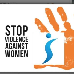
The campaign above is about ending online abuse of women, this highlights the new bill to tackle the abuse of women and girls online.  The image shows a diverse selection of women with the aim of targeting women from different cultures. It is also clearly aimed at younger women and girls as that is what it depicts here.  The colours are bright and eye-catching and meant to attract a younger audience. 


This poster by London Transport is actually to explain what upskirting is and how it is illegal.  This also highlights this abuse to men that it will not be tolerated on the tube.  Attacks on women on trains in the UK have risen significantly, Sky News states; 'Violent attacks against women on Britain's railways have increased by more than 50% since 2021, according to new data.
The number of crimes against women and girls rose from 7,561 in 2021 to 11,357 in 2023, according to figures from the British Transport Police Authority's 2024 annual report.' (Sky News, 2024) what this equated to was that a third of women travelling on trains may be attacked during their commute.  The figures for the Tube in London were equally disturbing; 'The data recorded 909 sexual offences, excluding rape, between 1 December 2022 and 30 November 2023, compared to 866 in the previous 12 months.' (Kelly, 2024) This research makes me feel more strongly about creating an advert for Women's safety.


The advert above is a simple message from Soprotimist Club that; 'started life 45 years ago when a group of young local women joined hundreds of established clubs in Europe with a common aim of working together to improve the lives of women and girls through action, advocacy and engagement.' (Soprotimist Club, 2023).  These sort of groups can be found all over the world as women still fight against violence sometimes from those closest to them and also from strangers.  


I liked this advert It used statistics in the advert and was just showing how women changed their running route to stay safe, this shows how women have to change their lives to be safe and not society that should change to keep them safe. Here the advert shows how men can help women to feel safer. The #dontbethatguy is aimed at men as it is men and society that need to change not women.

With these thoughts in mind I began thinking about the advert I would like to make so I thought about the Beck video 'Up All Night' (2017), the woman in the video is wearing a suit of armour and runs and fights through the party in the armour to save her boyfriend.  The woman looks like Joan of Arc and this idea of a strong armoured woman in my advert I think might work really well.  The Naïve Filmmaker states that the video; 'is full of visual motifs, the magnetic armour, her metal insides, the many levels she appears to be working her way through from what appears to be a lust fuelled orgy to the football team. There is something new to notice with every watch, for example only today I realised that on a number of occasions she rescues other partygoers from themselves by kicking cocaine out of someone’s hand or pushing a girl away from a keg stand, all while remaining true to the mission at hand.' (thenaivefilmmaker, 2021)


I would like to try to use that idea of a woman in a suit of armour and perhaps use a tagline like; 'What does a woman have to do to stay safe?' or 'What clothes does a woman have to wear to stay safe?' or 'How far do you go to feel safe?' I will work on this idea with an image.  I want the image to be clean with no distracting background and a simple grey colour palette.  Perhaps if the woman is on a tube or train then I can be more directive and the campaign name can be 'Safe&Sound' or 'Women Ride Safe'  or 'Sentinel' with the idea of guarding or watching over women to protect them in public transport.  My campaign will be aimed at women and how they can keep themselves safe and how to speak out safely. In my next post, I will show the process of creating this advertisement.

References

Sky News (2024). Violent attacks against women on Britain’s trains up by more than 50% since 2021. [online] Sky News. Available at: https://news.sky.com/story/violent-attacks-against-women-on-britains-trains-up-by-more-than-50-since-2021-13196789 [Accessed 8 Oct. 2024].

Kelly, J.W. (2024). Sexual offences rise on Tube network, figures show. [online] BBC News. Available at: https://www.bbc.co.uk/news/articles/c8829ked1x3o [Accessed 8 Oct. 2024].

Soprotimist Club (2023). Latest News from SI Weybridge & District covering Elmbridge | SI Weybridge and District | SIGBI. [online] SI Weybridge and District. Available at: https://sigbi.org/weybridge/presidents-message/latest-news/ [Accessed 8 Oct. 2024].

thenaivefilmmaker (2021). Beck’s Up All Night: Where John Hughes meets Dante’s Inferno. [online] T H E  N A I V E  F I L M M A K E R. Available at: https://thenaivefilmmaker.com/2021/06/07/becks-up-all-night-where-john-hughes-meets-dantes-inferno/ [Accessed 8 Oct. 2024].

Practice Advert: Lamb Life

 Today we are creating a practice Advert.  This will be for an animal charity I chose images from Unsplash because they are copyright free.

I opened Pixlr E.  I clicked on 'create new' and then in the dialog box I clicked on 'print' in the top menu and chose A4 size, I added a title and then I chose a white background.  I then clicked on create so that I have a canvas for my work.  Then I needed this to be landscape for my advert so I clicked on 'image' in the top menu and 'rotate ccw'

The next step was to open my image that I intended to use.  So I clicked on 'File' in the top menu and then 'open image' and then I clicked on 'select' and then 'select all'.  Then I clicked on 'Edit' and 'Copy' and then I clicked into my canvas and then clicked on 'Edit' and then 'Paste'


I used Tailor Brands to make my company logo.  I then customised the colours and saved this as png onto my desktop.  I then went back to Pixlr and clicked File, open image and then opened my logo.  I then went Select in the top menu and select all and Edit and then copy.  I went back to my canvas and then clicked on 'Edit' and 'paste'  Then I used the transform controls and move tool to move the logo into place. 


The final step was to add my tagline.  I clicked on the text tool in the left hand menu and then I clicked on the canvas and added a text layer.  I wrote my tagline and use the text tools to change the colour to white, the font to Emery at 96pt.  I used the move and transform controls to position the text. 


Lastly, I exported my final piece as png and saved this to my desktop. Please see my final work below.


This advert worked quite well however I would integrate the logo better into the advert if this was for publication and I would improve the tagline and choose different font. 

Monday, 7 October 2024

Practice Advert: Llama Madness

 Today we are going to create practice advert using Pixlr E.  This will be a charity advert. I began by choosing images on Unsplash that were copyright free.  I then opened Pixlr E, I then chose 'create new' then I went to the dialog box and chose 'print' and then I chose A4 and a white background and then clicked ok to create my canvas.


I then opened my image by clicking on 'File' , 'Open image' and then I selected the images clicked on Select All and then I clicked on 'Copy'. I then went back to my canvas layer and clicked on 'paste' and then I used the transform controls to pull my image out and fill the fill canvas.


My next step was to go to Tailorbrands logo maker to create my logo for my Llama charity.  I created this logo called 'Llama Loco' which will be the name of my company.  I changed the colours to be sympathetic with the rest of the colour palette my advert.

I then added the logo to my canvas on Pixlr.  I went to 'file' and the 'open image' and then I cropped using the crop tool on the left had side of the screen.  I did this just to remove excess white space.  I then clicked 'select' all and then 'edit' and 'copy'. I then went back to my canvas and clicked on 'edit' then 'paste'.  I then move the logo into position and adjusted using transform controls.  

I then wanted to make a tagline so I clicked on the text tool the left hand side menu and then I added a text layer.  I then used the text tool menu to change the font to Beornheard 154pts for my top line.  I then clicked on fil to change the colour which I changed to a shade of blue to match the colour palette. I repeated this for my final tagline and used a slightly different shade of blue and it was 201pts in size.

I then exported my final advert as png and you can see this here.


This is just a practice on my real advert I will spend more time on layout, image, tagline and colour palette.


Sunday, 6 October 2024

Final Sequential Images: Sacred Sequence

 Today I shot my final images, I was going to use the interior stairs in my building however although the light was good I felt the framing would not work.  I had to shoot them in colour as I was using interval shooting But I will make them black and white.  I ended up just shooting in the domestic environment.  The camera settings were F4.4, shutter speed 1/13 (using a tripod so this reduced blur) ISO 1000.  These were the presets of Interval shooting I would have used different settings if I had completed this manually.

I then created a contact sheet using the contact sheet generator and I added my title, device and date 


I then opened Photoshop, and chose the images I wanted for the final sequence.  I had an idea I would like images like panels like in a church.  So I cropped the images so only the background door and the subject were visible so they became long and thin and then I went to image, mode and grayscale to make them black and white.  I selected each image and then clicked on 'copy' and then went to the canvas I had created (A3 Black Background).  I then clicked into this and then pasted them.  I used the transform control to adjust the size and position - making sure there was equal positioning between each image (82pts).  I then used the text tool to add the title which was in Bookman Old Style at 30pts.  I wanted it to look a little also like old photos in Gurdjieff's books and also instructional like an old yoga manual.  I then flattened the final image and downloaded as a jpeg.


These are the final images, they were intended to look slightly out of time..


Reflection

The images here are okay the look is about right however with more time I would have shot these again manually and adjusted for light changed  I would also have created more and tried out different sequences.  The black and white and panels work quite well and overall they were what I intended however technically these could be improved.


Wednesday, 2 October 2024

Sequential Images: Ideas & Research

 After practicing creating sequential images, I began thinking of my own ideas for a sequence.  I was interested in the work of Gurdjieff and his 'movements'.  Gurdjieff was a spiritual thinker, philosopher, composer., mystic, and teacher.  Gurdjieff'sofficial site states; 'George Ivanovich Gurdjieff startled the European intelligentsia with a comprehensive psychological, philosophical, and cosmological teaching of ancient origin. He seemed to be stepping into the 20th century from another era, bringing with him wisdom that had been all but lost in the floods of time.' (Gurdjieff, n.d.).  Below you can see an example of his sacred dance and the kind of movements that he believed brought spiritual enlightenment and transformation.  I find the movements quite hynotic and thought that these sequences within the dance would really work as inspiration for my own piece. 

I would like to create a series of still images that represent these movements, so I created a small storyboard of the images I would like to create.  I intend to take these using an Olympus DSLR or fixed lens camera.  I will use the concrete stairways with white distressed walls in my apartment building as I think this will work with the movements I intend to recreate in my own sequence. I will probably shoot these in black and white as some of the earlier Gurdjieff films in black and white have a look that I would like to try to emulate. 

Considering further how I will create my piece I looked at Jürgen Klauke as he has works such as Philosophie der Sekonde (1976) which explores movement through the use of a slow shutter speed


Philosophie der Sekonde (1976) Jürgen Klauke 

The movement here explores identity and expression and use of the inverted triangle as a presentation method draws the viewers' attention through the journey through the shape created here. Klauke, through his work, pushed the boundaries of staged photography and art and photography through his conceptual pieces; 'While most other artists worked within the traditional framework of photographic practice, Klauke developed large formats independently and implemented his ideas in large-format image sequences.(Galerie Guido W. Baudach, 2017)

In the work above 'The Human Face in the Mirror of Sociological-Nervous Processes' Klauke explore identity again with the idea that a Priest and a Murder can look the same and that we are perhaps many identities.  Klauke himself played with gender and identity throughout this work; 'The fundamental themes of Klauke’s work are: the breakdown of human communication, losing the reason for living, the crippling emptiness and boredom of an unfulfilled existence, the suggestive threats to mental and physical identity through the power of the media, and the mechanisation of all areas of life, not excluding the human body.' (Galerie Guido W. Baudach, 2017) I very much like here the works that express a kind of boredom with existence and that physical identity is restraining and the message it communicates is usually unrelated the the feeling person inside.

In my next post, I will show the creation of my images and my final piece for this project.

References

Gurdjieff (n.d.). George Gurdjieff | 20th Century Mystic | Be Community. [online] https://ggurdjieff.com/. Available at: https://ggurdjieff.com/ [Accessed 2 Oct. 2024].

Galerie Guido W. Baudach (2017). Jürgen Klauke: Bewegtes Ich at Galerie Guido W. Baudach, Berlin. [online] GalleriesNow.net. Available at: https://www.galleriesnow.net/shows/jurgen-klauke-bewegtes-ich/ [Accessed 2 Oct. 2024].

Klauke, J. (2022). Jürgen Klauke, Das menschliche Antlitz im Spiegel soziologisch-nervöser Prozesse, 1977. [online] Lenbachhaus.de. Available at: https://www.lenbachhaus.de/digital/sammlung-online/detail/das-menschliche-antlitz-im-spiegel-soziologisch-nervoeser-prozesse-30013612 [Accessed 2 Oct. 2024].

ApertureDigital (2016). Jürgen Klauke: Transformer | Aperture. [online] Aperture. Available at: https://aperture.org/editorial/jurgen-klauke-transformer/ [Accessed 2 Oct. 2024].


Monday, 30 September 2024

Practice Sequential Images

 Today in class we were practicing creating sequential images.  As I was completing this task on my own.  My idea was to create something small using my lightbox. At home, I have a couple of 3D printed statuettes of a male and female form so I thought this would make a good sequence and I considered ideas of Adam and Eve.  One of the artists I most admire is Albrect Dürer. and below is his version of Adam & Eve.  


Adam & Eve (1507) By Albrect Dürer

In my own version, I set up the light box with a black background as my figures are white, I then set up my camera.  In this instance, I used my Olympus Stylus SH-2.  I used this camera as it has a monochrome grain setting and super macro.  I used both these settings when taking my images.  I wanted to really captures the bodies moving in the space with each other.

Once I had taken the images (I took around 40 images) I then created a contact sheet, using a contact sheet generator - I added my image title and camera so that this would appear at the bottom of the contact sheet.  I downloaded this as a png so I could add this here to share. 


Once I had all the originals I could choose my final six images for my final piece.  To put these images together I went onto Pixlr E and I first went to 'Create New' and created a canvas, I chose a black background as my images had a black background and I wanted the figures to really stand starkly white in the final piece.  I then opened all the images that I wanted to use and then carefully rotated all the images using image, rotating counterclockwise.  I then selected each image and clicked on copy, then went back to my canvas and clicked on paste.  Then adjusted the size using transform controls.  Once the images were correctly placed, I used the gridlines to ensure the spacing was correct and even and left enough room around the frame and for the title.  I then clicked on the text tool and created a text layer.  I wrote my title, with a year and my own name.  I then selected this and chose the font Georgia and the size 60pts. This was my final sequence


For a very quick practice this worked well.  The light is correct and the use of the macro meant that the detail is clear and I liked the idea that we can come from painting to 3D printing and still make something very classical and beautiful.

Wednesday, 18 September 2024

Welcome to a New Academic Year!

 Welcome to a new Academic Year 2024-25!  This will be my 11th year at DMUIC and so welcome to all new students in Art & Design and Media.

To bring in the year I thought I would begin this term with O.G. Rejlander's photographic composition Two Ways of Life.


This is a very complex and beautiful composition from a master of early photographic techniques.  Weiss states that; 'he [Rejlander] constructed this ambitious tableau from over thirty separate negatives in part to demonstrate that a photograph could be composed in the manner of a painting' (Weiss M.2018:94-95).  This method of 'combination printing' could be considered in the manner of how we use Photoshop today laying image upon image. Each image here is taken separately then unified through the printing process to form the whole.  In early photography it was common for photographers to try to emulate paintings as this was their reference as to how and image should be composed. Rejlander went one step further and believed that photographs could be raised to the status of Fine Art and this image composition was based on Raphael’s School of Athens (1509–11) (Editors of Encyclopedia Britannica, 2019)

The actual story of the image is the struggle between vice and virtue, it depicts; 'a bearded sage leading two young men from the countryside onto the stage of life. The rebellious youth at left rushes eagerly toward the dissolute pleasures of lust, gambling, and idleness; his wiser counterpart chooses the righteous path of religion, marriage, and good works' (Met Museum, 2000-2024) Rejlander had a skill in capturing peoples emotions and Darwin asked him to take a series of facial expressions of humans and animals for his book Expression (1872) 


White states that; 'Photographs helped to make Expression Darwin’s most popular book. They show his use of novel methods and techniques, and his ability to engage with popular culture, to draw on Victorian sentimentality and melodrama in order to excite readers’ emotions, and encourage them to become active observers themselves.' (White, 2022) This is very interesting in that like social media now, this book brought attention to an idea and then the audience felt that they could participate in the conversation, considering how they express their emotions. 

I chose to talk about Rejlander as now with the deluge of images that haunt our every move it is of vital importance that we concentrate and hone in on what is important to ourselves, our studies and to our own philosophy of life. This image will stay with me, I will be able to picture it in my mind's eye and then come and view it again again and this is what makes it important, every time I will find a new detail and it will always remain a true masterpiece of photography.

References 

Editors of Encyclopedia Britannica (2019). O.G. Rejlander | Swedish photographer | Britannica. In: Encyclopædia Britannica. [online] Available at: https://www.britannica.com/biography/OG-Rejlander [Accessed 18 Sep. 2024].

Met Museum (2000-2024). Oscar Gustav Rejlander, Two Ways of Life. [online] Metropolitan Museum of Art. Available at: https://www.metmuseum.org/art/collection/search/294822 [Accessed 18 Sep. 2024].

Weiss M. (2018) Making It Up: Photographic Fictions, Victoria & Albert Museum/Thames & Hudson Ltd, London

White, P. (2022). Darwin’s favourite photographer: From O. G. Rejlander, 30 April 1871. [online] Darwin Correspondence Project. Available at: https://www.darwinproject.ac.uk/letters/favourite-letters/darwin-s-favourite-photographer-o-g-rejlander-30-april-1871 [Accessed 18 Sep. 2024].