Followers

Tuesday, 5 March 2024

Website Gallery: Photographic Gallery

 Firstly before beginning to add my new gallery I check my copyright and made sure it was up-to-date and was 2024


I then went to my page and menu in the left hand side tools menu and went to the three dots at the end of 'Feedback and Testing' - I then chose the 'Hide from menu' from the pop up box as this was just UX Testing from last term.


I then wanted to add a new page so I went to my pages and menu tool on the left hand side of the screen and I went to the bottom of the pop up box and chose 'New Page' then I chose 'blank page ' in the dialog box and then I renamed my page 'Everywhere and Nowhere' and I made it a subpage by dragging the tab underneath my portfolio page. 


I then added a heading using the add button on the left hand side and then I dragged the heading onto the page.  I then changed the font to Palatino Linotype at 44 pts and then I typed in the title of my project.  I then went back to the add button and added a paragraph which I dragged onto the page.  Again I changed the font to Palatino Linotype at 20pts.  I then aligned both the title and the paragraph introduction using the gridlines in Wix. 


I then added a button by clicking on the 'Add' tool and choosing 'button'  I then dragged the button I had chosen onto the space I made on the page.  I then clicked on the button and renamed it 'back to portfolio' and then I chose a link to portfolio.  I then went to the design box and changed the font to Palatino Linotype 26pts and I then adjusted the position using the move tool to and gridlines on Wix.  I then previewed the page and clicked on the button to check that it linked to my portfolio page. 

I then went to my portfolio page by clicking on the pages and menu, I then added a new button and changed the font and size as above and then clicked on preview to check that it worked.


O then added a gallery by clicking on the 'Add' button in the left hand menu and choosing a suitable gallery.  I then dragged this onto my page and I opened the manage media box and selected all the Wix images and deleted these.  I then added my own images and previewed to check this worked. 


I then went back to manage media in the gallery and added titles and description for each image. 


I then checked my mobile view, I needed to adjust the gallery section and remove black space at the bottom and also using text adjustment I changed the size of the text in titles and buttons as these were too large. I previewed and published and then checked on my phone to ensure everything was working correctly.


Monday, 4 March 2024

Website Creation: Gallery Portfolio

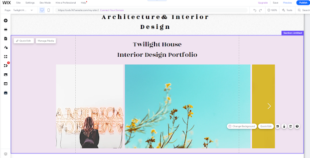
 In this post, I will be creating my portfolio and website gallery on my Wix website.  I will be adding my finalised Interior Design Project onto the gallery. 


The first element I changed was the colour of my portfolio page to match the rest of my site, I right clicked on the mouse and clicked on change background and then I chose the colour as per my other pages. 


I added an image to the page by clicking on the Add button on my left hand tools menu on Wix and then I clicked on image, the upload image.  I then chose an image from my project from my desktop file.  I then added this to the page and used the transform tools to change the size and position of the image. 


My next step was to go to the pages and menu and create a new page for project.  I went to the bottom of the pop up menu and clicked on 'New Page' and then I changed the name to the name to the name of my project.  I then clicked on the three dots at on the menu page and on that pop up menu I clicked on subpage.  The new page now appears underneath my portfolio  page on the navigation menu.


I then changed the background colour to the same colour as my other pages, now my page is ready for my portfolio work for this term.  I then added my Title of my project by clicked on the add button and then text and 'heading'  I changed the font to be consistent with the rest of the website to Rozha One I changed the size to 42pts and then I used the move and transform controls to put this in place and I used Wix gridlines to line this up. I then went back to the add tool in the left hand menu and chose 'Gallery' and then I chose a suitable landscape orientation gallery for my interior design project. 


I then added a button for navigation.  I did this by clicking on the add in the left hand menu and then clicking on button.  I then chose a button design and dragged this onto my page.  I then clicked on the button and changed the text to 'Back to Portfolio' and then I linked this to my portfolio page.  I then went to the design button on the button and I changed the shape of the button and then customised my designed changing the font to Rohza One to match the font choice of the website and then I used the move and transform tools and Wix gridlines to line the button up on the page. 


I then went back to my pages and menu and added a button in the same manner as on the project page.  I ensured consistency and chose the same size and background colour and font.  I then linked this to my project page and then I went into the preview button the top right hand corner and checked that both buttons worked correctly. 


I then uploaded all my images to my gallery.  I did this by clicking on 'manage media' and then uploading

from my desktop and external hard drive.  I then organised the gallery as per below by just dragging and dropping my boards into position.


I then went to the page and checked all the boards had uploaded correctly and expanded to full size.  I did this by clicking on preview and making sure this worked correctly.  All of the boards worked and were in correct order.


I clicked on 'save' to ensure all my changes were saved.  I then just made some minor adjustments to my front page to ensure everything was consistent.  I have a couple of final outcomes to still upload however everything looks good and is ready for publishing.

I then check my mobile view and I changed the size of the title and removed blank Space that was unnecessary by using the arrow button the section. 


I then checked my gallery page on the mobile view and adjusted the size of the font on the button just by clicking on the A- sign and then I changed the size of the font of the title again just by using the A- icon to reduce the size.  Again I removed unwanted blank space  using the arrows on the page.  I then previewed and checked that all buttons and the gallery sliders were working and would come up full size once published. 


Saturday, 2 March 2024

Website Gallery: Creative Media

 I have now completed all the elements of my projects and I can now add these to galleries on my website I will begin with the photographic gallery.  I began by clicking on the menu button on the left-hand side of Wix and adding a new blank page. I then added the title 'Everywhere & Nowhere' using the same font as the rest of the site Palentino Linotype, I changed this to 50pts and aligned this to centre the text.


I then added the images I had created and the cubes of the images to the page.  I did this by clicking on the add button and then images and upload images.  I uploaded the jpegs and the cube gif from my desktop.  I then just adjusted the page and aligned these using gridlines on Wix.


I then added a short introduction by clicking on add and then adding a paragraph, again in the same font and I also added a pack to portfolio button and set this link up.


I then went to the front portfolio page and added another button and created a link and I updated my copyright to 2024. 


I will also be updating my Homepage and embedding my book project this week.  However the photo project I will now consider whether this looks okay, and I can reflect on this and change this if necessary this week if I think there is a better way to present this work. 

Final Development: Everywhere and Nowhere

 After taking the images I put the mages that I wanted to use on Photoshop. The idea was to place all the images together to create a composite image.  In each image I wanted to disappear as I discussed as my theme for this project so the first thing I needed to do was set the background image, this was just the image of the room itself.


I then opened each image I intended to use (5 in each case) as the brief was for 10 images and then I used the quick selection tool on the left-hand side menus and selected the subject (myself).  I used the + and - tools to adjust the selection in the top menu bar and then I clicked on Edit and Copy and went back to my back ground image and clicked on paste. 


I then once I had the new layer used the move and transform tool to place the image in the correct position as in the original image 


I then lowered the opacity so that I was faintly visible. I repeated this same process for each image.


Once completed with all the images that I wanted in the final piece I saved as psd and jpeg ready for my gallery.


I also created a cube to go with this on the site.


Everywhere and Nowhere: Second Shoot

 My first images for 'disappearance' were all about the light, the light of the morning sun in my flat and myself becoming overexposed through a flare and then not being there at all.  I made these images into a cube that I have had sat on my desk for a few weeks now and I quite like these images and the physicality of the cube. Here is the digital version..


However, for these second images linking the idea of twilight and disappearance, I took these in the dusk light.  In the later images, I had to switch on the house lights as it had moved from dusk to darkness.  I used my camera by braille for the shoot.  For the images here I wanted the camera static so I had the same shot over and over and only I moved within the frame. 

These are the contacts and in these shots, I used aperture priority, F.3.5, ISO 400, and exp compensation +1.  I shot in monochrome and in RAW and high-quality jpeg.  Also, I did a few shots in the middle using a fixed 25mm lens as I had some other thoughts which involved redaction. 


The images on their own are not that interesting as that is not their point to be alone.. However here are a couple of the shots and EXIF details 


This shot is well balanced with a good rule of thirds and the pose and the domestic bedroom setup works for this particular project as I stated earlier the camera is static and there was no variation in focal length.


As stated there is no real variation in settings the shutter is slow making these quite soft images but this was useful to the final result I am aiming for.


The image above is the centrepiece of the final image and I wanted this looking to the viewer as all the other images are more passive and this is the direct connection. 

In my next post, I will show the development of the final pieces for the website.


Friday, 1 March 2024

Final Boards: Twilight House

 The completed boards are here at last, I still have a couple more final outcomes to add and another materials and sustainability board but this gives the idea of how they will look finally. Remember if you are doing commercial property use SMARTdraw for floor/site plans but only use the free trial - don't pay for anything!


Twilight House Final Boards Process

 I have been working on an interior design project this term 'Twilight House', I created the design on Homesbyme as this is free and you can have fully rendered 3D images of the designed rooms and I could create my floor/sit plan easily in 2D with dimensions and square footage.  

The boards, I created on Photoshop by creating a canvas ('New' in the top menu and then I clicked on 'Print' in the dialog box and then chose A3, landscape orientation at 300 resolution, I also just chose a white background to begin)  I then added an abstract image by Ben ayes from Unsplash to use as my backdrop on each board for my designs.  To add this I went to the top menu clicked on File and then Open and then just chose 'Select' and then All in the top menu and Edit and copy.  I then went back to my canvas tab in photoshop and went to Edit and then paste, I used the move and transform tools to adjust the image so it covered my canvas.  I then went over to my layers panels and adjusted the opacity to 78%. 


I then added the logo that I had already created on Freelogodesign.com, I clicked on 'File' and then 'Open' in the top menu and then again used 'Select' and 'All' and then Edit and copy.  I went back to my canvas board and clicked on Edit and Paste then used transform and move tools to adjust size and place in the correct position in the right-hand corner.


I then added the text using the text tool in the left-hand side menu - I clicked on the 'T' and then clicked on my canvas.  I then could change my font, size, and colour easily by using the tool menu that appeared at the top of the screen as I used the tool. 


I used here the Baskerville Old Face Font in 60pts for the title of my project and 48pts for the title of the board.  I will do this for each board so that every board is consistent. 

I now just need to add images and information using the same tools as above.  Here I have used the same font and the titles here, are at 30pts and the text at 24pts. On this board, I could only fit the flooring.  I will need to make another board for furniture and certification for sustainability. I also completed a spelling and grammar check by clicking on Edit in the top menu and then check spelling.


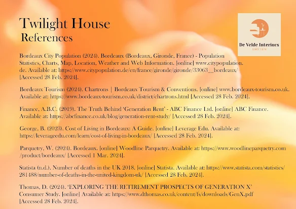
I have created a list of references on MyBib as I have gone along so that these are easily copied to my final references board. 

The process for the architectural/interior boards is the same as which means there is consistency and these can easily be saved as both psd files for editing and jpegs for uploading to Wix in a gallery.