Neoteric Photography aims to explore photography in an age where the image is everywhere. The image has become prolific yet easily forgotten. Hoping to find something to hold onto, something that will survive longer that it takes for pixels to appear upon a screen.
Continuing on my theme of Feminism for the term I would like to do work about Feminism through photography.
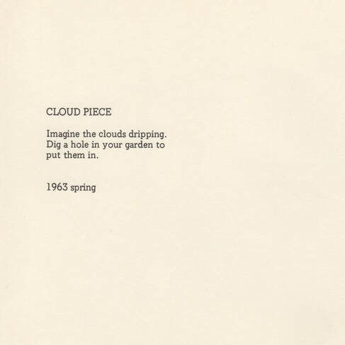
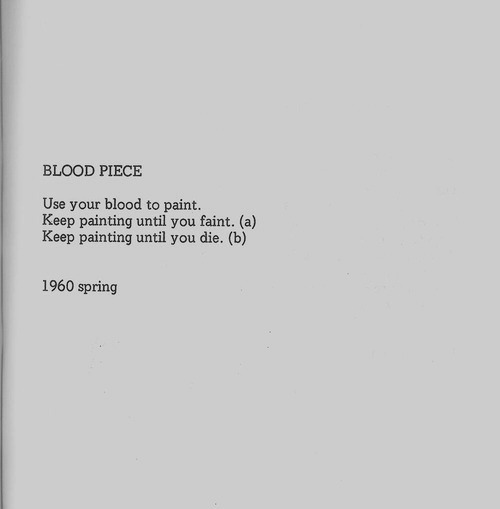
This could take various forms - I could work with my own body as a woman, or I could work through objects and stories like Sophie Calle and her work Striptease where Calle worked as a Striptease artist and turned this into her artwork. 'Calle's oeuvre has flirted with these opposites: control and freedom, choice and compulsion, intimacy and distance.'(Jeffries, 2009) I like the idea of a small book and a narrative and like Calle and Yoko Ono following a set of instructions or using boundaries to create images.
I would like to consider instructions for photographs further and perhaps use existing ideas or stories that would work for my instructions for photographs. I do also enjoy photographic instruction manuals and This is also something I might like to play with as an idea for creating a photographic instruction manual.
This could be really good for the feminism and photography theme and this is definitely an idea to be explored further through research. I have many Photography books and manuals as I collect these so the source material here would be original and very useful.
I will consider all these ideas and I will add more when I feel I have decided on the idea I would like to pursue.
References
Jeffries, S. (2009) Sophie Calle: Stalker, stripper, sleeper, spy, The Guardian. Guardian News and Media. Available at: https://www.theguardian.com/artanddesign/2009/sep/23/sophie-calle (Accessed: October 20, 2022).
While creating my own advert I looked at other feminist campaigns and consider how they worked, how successful the message was and who the target market was. I began by looking at Emma Watson's Un Speech as what I wanted to convey was very much in line with the ideas that Watson is talking about in her speech.
Here Watson talks about the importance of men and boys being involved in change, she discusses the word 'feminism' and how unpopular this is and how women have turned away from this stating; 'my recent research has shown me that feminism has become an unpopular word. Women are choosing not to identify as feminists. Apparently, I’m among the ranks of women whose expressions are seen as too strong, too aggressive, isolating, and anti-men. Unattractive, even.' ( Cole L.N. 2020) This speech really does have the basis of good Feminism that if these values were embraced by both sexes perhaps real change could begin.
HeforShe is still going strong and their website has resources and action kits and ideas so that YOU can get involved and promote change. HeforShe website. The target audience is all men and all women, so we can really work together for gender equality.
Another campaign - 'This is what a Feminist Looks like' was high profile and the Fawcett Society & Elle the fashion Magazine promoted this campaign. 'The Fawcett Society's story begins with Millicent Fawcett, a suffragist and women's rights campaigner who made it her lifetime’s work to secure women the right to vote.' (FawcettSociety 2022) now it still continues and promotes women's rights across the globe. The campaign that we are discussing here - 'This is what a feminist looks like' (2014) started well with many male celebrities and politicians wearing T-shirts to promote feminism. Conscious Magazine stated; “This is What A Feminist Looks Like” shirts that you might have seen on the chests of some of the most in-demand men in Hollywood to raise awareness for this movement (in the guise of consumerism, of course, but we can save capitalist holidays/agendas for another time). In theory, the idea of getting influential men to spread the word about, and trying to normalize, feminism, sounds like a decent way to attract more men to join the cause'(Katebi, 2014) and it really did and it is a pity that teh fashion idustry acyauly brought thsi campaign with a bang as it was disciveered that teh T-shirts were being made by women in sweatshops in Mauritius for pennies an hour causing the men to withdraw from the campaign, all the profits from the T-shirts were going to promote women's rights and women's charities.
I have looked at these two campaigns as they were of the same mindset as my own, engage men and change could happen. Education, conversation and understanding will get us further and we should be trying to do this everyday and speak up when we see a woman being treated in a way that is not equal or fair.
We do need to keep going, we are now entering the 5th wave of feminism, what will it bring? What will we contribute to change?
References
HeforShe (2022) HeForShe. Available at: https://www.heforshe.org/en/champions (Accessed: October 16, 2022).
Nicki Lisa Cole, P.D. (2020) Full transcript of Emma Watson's 2014 speech on Gender Equality, ThoughtCo. ThoughtCo. Available at: https://www.thoughtco.com/transcript-of-emma-watsons-speech-on-gender-equality-3026200 (Accessed: October 16, 2022).
FawcettSociety (2022) The Fawcett Society. Available at: https://www.fawcettsociety.org.uk/ (Accessed: October 16, 2022).
Reporter, S. (2014) Nick Clegg: 'I wouldn't have worn pro-feminism T-shirt if I knew, Evening Standard. Available at: https://www.standard.co.uk/news/politics/nick-clegg-i-wouldn-t-have-worn-profeminism-tshirt-if-i-knew-where-it-was-made-9836819.html (Accessed: October 16, 2022).
Katebi, H. (2014) This is what a feminist looks like. The Feminist Shirt Controversy, Conscious Magazine. Available at: https://consciousmagazine.co/the-feminist-shirt-controversy/ (Accessed: October 16, 2022).
The advert here works quite well, I think the image is strong and the tagline works. The logo is more in keeping with the message I was trying to convey. The additional words could have been bolder and easier to read and here I think is the weakness of this advert. Also my son, who is Gen Z, stated that the advert was 'cringy and awful' this made me consider that the target audience for this advert would not be men of Gen Z, it perhaps is too feminine, it does not appeal to a younger audience and perhaps the target market for this would be millenials or Gen X. The idea here was to appeal to men and women and still I am not sure that it would do that...more work is definitely needed!
After practising in class on Pixlr, I wanted to create my final advert using Photoshop. I liked the design and the image however I wanted to improve on this and create a new logo.
I began by creating a new canvas on Photoshop, File, New and then in the dialog box I went to Print and A4.
I then opened the image I used originally in Photoshop, clicked on Select and select all in the top menu and then edit, copy and then went to my new canvas and clicked on edit, paste. The image was now on my canvas. I aligned this using Photoshop guidelines to ensure the image was centred correctly.
I then added Text by clicking on the 'T' in the tools menu on the left-hand side of my workspace. I added the words and then used the move tool in the tools menu to place it where I wanted it in the image. I then changed the font which was Lucida Bright, Demi Bold ay 48pts and adjusted the colour to the shade of brown/orange to match the image.
I then created a new logo I wanted to create something that represented the message much better than the original so I went with 'Humans for Change' as the idea was for men and women to unite and work together to create a better world for all. I created this on Tailor Brands again as this was a time constrained piece of work.
I then added the logo by exporting it as a png and uploading to Photoshop, I adjusted the size using the transform tools and I also lowered the opacity so that it stood out but did not just have a white background and that it integrated with the image.
Before I finished the advert I actaully wanted to make a T-Shirt with just the image, logo and tagline so I saved the image as a jpeg and then used T-Shirt transfer paper in my printed, on print setting I set this up and so it printed this in reverse to that it could then be ironed onto the T-shirt after printing and appear the correct way round. I asked my son to take a polaroid of me wearing the T-Shirt!
The idea here was to show the potential of the campaign and that this could be added to T-shirts that would be easily recognisiable.
Finally I added the rest of the wording to the actual advert so that those who were interested could get involved and join Humans for Change! I will add the final advert on the next post.
Today I will be practicing creating my advert using the online Pixlr software. I will put my practice process here and then I can explore ideas and explain technically how I am doing this.
I began by opening Pixlr and using Pixlr E
I clicked into File, new and then clicked onto 'Print' i the top menu and then I chose A4 to follow my brief. I then added a title and chose a white background. I think clicked on 'create' and this opened up my workspace on Pixlr with my white canvas
I then clicked on 'Page' in the top menu and then 'rotate'
I then opened my image in Pixlr which I upload from my desktop and then I selected the image using Select in the top menu and then I clicked on edit in the top menu and then copy. I then clicked on my canvas and then I clicked on edit in the top menu and the paste
I clicked on the left hand side tool bar and clicked on the 'T' which is the text tool to add words to my image. I clicked onto the image and Pixlr asked if I wanted to make a text layer and I stated apply. I then typed in my text and selected and used the top menu to choose the font which was Adolfini and the color and size of my text.
I created a logo on Tailor Brands online. I chose my company name which was Charity and the logo maker created several options, I chose the one above and then customised to the correct the colours to match my advert.
I then saved my logo as a png to the desktop and then clicked on File , open image and chose my logo file. This opened in my Pixlr workspace and I then clicked on Select in the top menyu and then edit copy in the top menu and clicked back to my practice advert and clicked on edit again and paste. I used my move tool to put the logo in place.
I then exported my image as a png to my desktop just by clicking on File, export.
I can now upload the final image here and my practice in complete. this is my final image.
I really like this image and think it worked well for my message. I liked the colour with the shades of brown which worked well n the logo and text. However I think the font is too thin and needed to be bolder and I need to look further at fonts and typography.
Reference for Image
apratama, V. (2022) Man and Woman by a Body of water. [online] Pexels. Available at: https://www.pexels.com/photo/man-and-woman-standing-beside-body-of-water-1179975/ [Accessed 13 October 2022].
As my theme for the term is feminism I would like to make an advert for feminism. I first need to study what others have done and so I will look at some adverts to start with.
The above has been used in various feminist campaigns but actually 'The "We Can Do It!" image, also known as Rosie the Riveter, has since gone on to be one of the most widely used feminist icons in the world. But in 1943, it was simply meant to help female employees feel motivated. The artist, J. Howard Miller, would probably be seriously startled to see its status in the modern world.' (Thorpe, 2015) It is unsurprising that this became a iconic image with the woman in bright colours and in a simple image the tagline is simple and memorable with a clear power.
This post above shows how often there is a backlash towards feminism and feminist causes therefore in my own idea I want to create a campaign that would be about standing together with men to create a more equal and safer world with an emphasis on education and communication.
I think the image would be man and woman side by side and a tagline of something like: 'Stand Together for Feminism' and then promoting education and communication in some way perhaps through school/work talks, workshops and promotional events
References
Thorpe, J.(2015) The 9 Most Feminist Ad Campaigns Of All Time. [online] Bustle. Available at: https://www.bustle.com/articles/108127-the-9-most-feminist-ad-campaigns-of-all-time [Accessed 12 October 2022].
When I was creating my own sequential images I was reminded of Francesca Woodman (1958-1981), a young photographer, now a martyr to photography as she took her own life. Woodman created many self-portraits which are poignant and haunting exploring issues of womanhood and place.
Many of her images are in abandoned or wrecked buildings and the textures of the dilapidation contrast to Woodman's own body and perhaps express her sense of herself as she explores photography, technique and composition. 'Corey Keller describes in her accompanying essay, her work “approached female selfhood and sexuality from a deeply personal – rather than political or programmatic – point of view.”' (Wrigley, 2011). Woodman did create sequential images, and these were staged narratives that did explore feminity in the environment often in her images faces are not seen just disappearing or blurred bodies mingled into the surroundings. 'The privacy, light, space, and peeling walls of the pasta factory also allowed her to experiment further with her confrontational nudes, the hazy figures blending into furniture, her disappearing forms, elements that have since become synonymous with Woodman’s style, and in some cases interpreted as dark omens foreshadowing her tragic end' (Wrigley, 2011) Why I was reminded of her work was the image below where he is dressed in multiple suspender belts. Solomon Godeau writes about Woodman from a feminist standpoint and 'she points out that Woodman’s seemingly traditional nudes (with reference to art history) often include a detail that disrupts the composition and forces us to consider them more deeply. One example is Untitled (1979–80). A naked woman is lying across a Victorian sofa. On closer inspection, we see that she is wearing several garter belts. The extra stockings adorn the wall behind the sofa, inviting various interpretations.' (Tellgren, 2015)
I like to think of this image as the multiple selves or sides to woman, every day playing the part of woman. As the 'other' in society, we are in the eyes of others still an object which many ideas of what we are being placed on. The use of traditional and sculptural lend these images weight and as Solomon-Godeau points out there is a disruption in the image that makes the viewer think. There should be disruption in photographs, now more than ever, as we are bombarded by images we need something to make us stop and actually look at an image to consider deeply everything in the frame. Here the stockings hanging in the background almost give a sense of history or of previous lives, the multiplicity of the belts could be interpreted as restraints as much of women's clothing is made to be restraining. The picture itself is almost restrained the woman is not looking directly at us, we are not being challenged directly however it does challenge indirectly and subtly and plays upon your mind upon turning away and perhaps this is why thsi photograph is the one I returned to..
References
Tellgren, A. (2015) Francesca Woodman: On Being an Angel. [online] Artblart.files.wordpress.com. Available at: https://artblart.files.wordpress.com/2015/12/essay.pdf [Accessed 12 October 2022].
Wrigley, T. (2011) Francesca Woodman. [online] AnOther. Available at: https://www.anothermag.com/art-photography/1532/francesca-woodman [Accessed 12 October 2022].