Followers

Thursday, 31 October 2024

Creating a Website: Contact Page & Social Media

 Today I created my contact page and I began by creating a new page I did this by clicking on the left hand side menu button for menu and pages.  I then clicked on 'add page' and created a new 'contact' page.  I then added added a new contact form by clicking on the left hand side menu 'Add' button and choosing 'Contact and forms'.  I then began customsing my form.  I did this by clicking on 'settings' and I went 'design'  I then went through the menu to change the font to 'Playfair display ' I adjusted the title to 40pts and I adjusted background colour.


As my page was not working well I deleted the above page and started again with a new page and contact form.  I adjusted the form as per above.  I then added an image my going to 'Add' image and chose an image I had uploaded to my site files.


I then saved all my changes and previewed to check the page was working correctly and looked good for when it will be published. 


I then added my social media links which were blogger, Youtube, Linkedin and X.  I have placed these in my header so they are visible and easy to find on each page. 


I saved all my work and then previewed the site and previewed each link to check that it was working.  I will check these again once published prior to assessment. 

I then checked my mobile view.  I just adjusted the positioning of the contact form and reattached the image as this had become detached.  I then removed any gaps and saved. 


I then previewed and check ed that everything worked - I will check again later when we complete UX testing. 

Project Plan: Photography & Mortality

 This is my major project plan on my photographic project: Photography and Mortality.  I created this on Visme as infographic.


Wednesday, 30 October 2024

Project Plan: Photography & Death

 I created this plan on Visme using an infographic template.  To create a visual timeline for my project. 


Creating Website: About Page

 Zoe’s Bio


Zoe began life in the flatlands of the fens, in school she lived in the black box and performed, wrote and directed plays.  Once she escaped at 16 and flew away to Germany, she knew she had to keep creating by any means.  Zoe fell in love with the camera from an early age, and still considers it a magic box. Zoe has kept the first photograph she ever took (a blurry Christmas Tree), when her father gave her a camera aged seven.  Zoe’s photography, writing and films explore themes of womanhood, feminism, the strange and surprising.  Zoe now lives in a high tower in Leicester looking down on the ravaged city, considering her disappearance into the final frame.


Zoe also teaches art, design, and media at DMU International College.  Zoe has a first degree in English and Media She also achieved an MA with Distinction in Creative Media Arts (Photography) from the London South Bank University. Zoe's film 'Let's Eat Hair' was shown at the Phoenix Cinema in Leicester.


I created this About Page I will change the image and redesign later however this gives me a good idea of how it will look.

I have checked my mobile view on my About Page and I just needed to reposition the image from the bottom to the top so I just used the move too to do this. I then clicked on the text and used the text size buttons to reduce the size of my text so that it was smaller as it was the mobile view.


I then saved this and previewed and checked this would work live. I will check again once I have changed this to the final image.

When I sourced a good image that I could use I changed the picture so my final About page looks as below:


This seems to work quite well and I thought was consistent with the page design. I also checked the mobile view


This did not need adjustment and again works well with this page, so for the moment I am happy with this.

Monday, 28 October 2024

Creating a Website: Art & Photography

 Today I am starting to make my website on Wix.  This will be in my 'progression' route art and photography. 

I began by choosing a website template that I thought would work in structure for my work.  


I changed the navigation(menu) bar and customised this by clicking on the bar and then clicking on the design icon changed the font size, changed it it bold and chose the font I would use throughout the website.  I then went to 'manage menu' and I clicked on the Home page and in the drop down box I clicked on 'show on menu'.  

I then changed the position of the title and subtitle by using the move tool and dragged this to the Header so that i could be seen on each page.  I then double clicked on the title and changed the font to 'Palatino Linotype' at 74pts.  I also made this bold.  The subtitle was in the same font at 46pts.

I then centred all the text and the navigation bar - I may change this later depending on how my design looks when I have added the image. 


I then uploaded my own image onto the site files.  I did this by clicking on 'image' and 'upload image'.  I then went to teh site files and edited it so I had a black and white copy in case I decide to use a black and white image on my home page.

I then right clicked on the background and changed the background image from my site files.  I then went o the header and changed the colour on the header by clicking on 'change' background' and colour and I chose an appropriate colour from the color palette. 


I went to the footer and changed ten colour to match the header by right clicking and then clicking on 'change background' and 'colour'  I then used the colour that had saved from the colour palette.  I then clicked on the copyright text and changed to my name and edited the font to Palatino Linotype and the correct year.  


I have saved all my changed by clicking on the save button in the right hand top corner and then I have previewed the site to check all ages are working and everything is appearing correctly.  There was an issue with my footer not appearing on each page so I right clicked on the footer and went to the 'show on all pages' button'.  Once this was completed I saved again and then previewed for a final check.  

I will be continuing to post my progress on creating my website through the term. 

While I was thinking about how to improve my homepage I added a quotation by Susan Sontag which I think compliments my work that I intend to put on here.


I am now going to look and edit my mobile view. I will start with my homepage.  This is how it looks when I started


I edited the image in the Wix editor to create a portrait image.  I the tried to add this as background by changing the background and there were issues with this so I will come back to the image.

I changed the header items by going into the left hand side menu and checked through the buttons and settings to check everything was where it should be and nothing was hidden.  I then clicked on the text and adjusted the alignment and adjusted the size and positioning to ensure that the text was correct on the header which will show on each page. 


I then saved and previewed this to check that it worked correctly. I then found a work around the image problem by just adding the image over the top and then rearranging the positioning of the writing by right clicking and clicking on 'arrange' and bring to front' in the drop down box. 


I will see if I can find a better solution to this but for now this is okay.


Wednesday, 23 October 2024

Game/Concept Art Example of Ideas

In this post, I will discuss my ideas for my Game/Concept Art Project. I have been thinking about the concept of transformation and I have been looking at artists and designers' work that will help me explore this concept.

I have been looking at Yoshitaka Amono and his work.  I am particularly interested in examining this as Amano; 'is a Japanese artist, character designer, illustrator and a theater and film scenic designer and costume designer.' (Amano, 2024).  The image below is a take on David' Bowie's Thin White Duke, Bowie here has been transformed into an anime character. This was based on a story by Neil Gaiman set in futuristic New York.   


The first image here reminds me somewhat of Klimt and his 'Three Ages of Woman' (1905).  Not so much in style but in terms of framing.  The soft colour palette and the framing of the hero within the women and then the landscape almost wrapping around the characters make this a compelling image. Yoshitaka combines; 'elements of art nouveau and traditional Japanese woodblock prints.' (Zoryasch, 2016) Here, I enjoy the combination of techniques, the traditional and the contemporary in dialectial opposition within the picture. 


The image here also reminded me somewhat of Edvard Munch's Madonna, the swirling universe and the figures of woman.  Going back to my original thoughts that I would like to explore some kind of transformation I like these different versions of the same image and I am interested how things are changed or interpreted over time. Maybe the character creation here is one character but different versions of themselves just like the Thin White Duke was just one of David Bowie's many characters. 


Through this process, I may create one character who has many identities and then these characters could inhibit a story or a game.  I will be thinking about this further and creating some test characters to see if this idea will work. 


References

Amano, Y. (2024). YOSHITAKA AMANO. [online] YOSHITAKA AMANO. Available at: https://www.yoshitakaamano.com/ [Accessed 22 Oct. 2024].

Barder, O. (2016). That Time When Yoshitaka Amano Painted David Bowie. Forbes. [online] 12 Jan. Available at: https://www.forbes.com/sites/olliebarder/2016/01/12/that-time-when-yoshitaka-amano-painted-david-bowie/ [Accessed 23 Oct. 2024].

Zoryasch, F. (2016). ‘The Return of the Thin White Duke’ - Amano’s tribute to David Bowie. [online] Eyesonff.com. Available at: http://home.eyesonff.com/showthread.php/165501-The-Return-of-the-Thin-White-Duke-Amano-s-tribute-to-David-Bowie [Accessed 23 Oct. 2024].

Sunday, 20 October 2024

Mikiko Hara: The Fleeting Moment

 I will begin my research with Mikiko Hara, mainly as I have not investigated her work previously and I very much want to photograph objects and things within my project.  Hara uses a German-made Ikonta from the 1930s and as I am using film photography through the Polaroid I felt an affinity to this artist.  The images Hara takes are in snapshot style; 'She [Hara] photographs the nonchalant figures of fleeting passersby, as well as the landscapes and material things that emerge and disappear before her eyes wherever she goes' (IBASHO, 2024)  The idea of fleeting moments, things, objects, people are important and made more so by their capture.  The image below of a room, too small and containing the three young men, reminds me somewhat of a frame by Bill Brandt with a Miner and his wife at a table.  Their whole life was in the frame and here these young men's life surrounds them in this small space where they live and eat and sleep. They are packed into the frame and the gentle light makes these; 'intriguing images are printed from colour negatives made with a classic camera originally designed for monochrome films, adding a distinctively soft tonality and texture.'  (Yoshinaga, 2024).  The softness is in contrast to the chaos of the small space, the young man sleeping looks as if he passed out uncomfortably exhausted in this odd position while the other young men one dressing, the other eating pay no mind to each other clearly used to this existence, maybe thinking that this will not be forever.  However, now in this image, it is for eternity.


chromogenic print
14 x 14 in (image)


In this next image by Hara from the series 'Small Myths' (2022)  Hara captured passerbys and things without the awareness of the subjects, her camera hidden, 'Yet, these portraits reveal something infinitely personal, as if the photographer and her subjects were bound by an invisible pact' (IBASHO, 2024)  It can seem like that in the image as if the image were meant to exist.  The image below of the boy standing by the bed, looks ghostly, angelic and so still as if asleep.  I remember my own child when he was very young and could not sleep or had a bad dream just standing by my bed in this way (used scare me so much, to awake to find him just standing there).  Again the soft colours and gentle light are present and in the frame the domestic environment seems to hold the boy in place within the frame. 


Soto states of Small Myths that; 'Hara’s personal vision full of authenticity and intimacy is established throughout a lively sequence of pictures, regardless of whether they were taken in her living room or the streets of Japan.' (Soto, 2023) and this is certainly true it does feel as if by looking at these images we are intruding in a personal moment, even in the image below of the pear, it feels intimate and personal.  Small Myths is work made over two and a half decades (Colberg, 2023) Colberg argues that Hara' photography; 'is based on connecting with things and people, on being in and with the world — and not on extracting pictures.' (Colberg, 2023) I think this is important as pictures that are good come from an understading a connection to teh subject in some way and taht is what I am hoping to achieve in my own work.


I am unsure what I will photograph, I have ideas and thoughts but nothing concrete and with this in mind I took a few practice shots, I thought that they were overexposed and I have not quite understood the idiosyncrasies of the camera yet (all cameras have their quirks!) The practice shots here are just called 'Sunday Morning' these were shot using the manual polaroid with I-Type black and white film.  I used settings of F16, 1/125 and I adjusted the exposure compensation.  I used a tripod and the self-timer function

'Magic'
In this first image I liked it that the only thing that was clear was the word 'magic' across my t-shirt

'Pensivity'
Here the pose worked and the framing, I will work more on this image, I may shoot this again in colour thinking of Hara with the soft tones and gentle lighting


'Day Slumber'
I liked the colour tones here and I may work more in colour as it is a very soft look. I like it that I am overexposed on one side, as if I am disappearing.

I will experiment further with my own images and I particularly like the idea of working with the tonality of the colour film and will try to explore this further. 

References

Colberg, J.M. (2023). Small Myths. [online] Conscientious Photography Magazine. Available at: https://cphmag.com/small-myths/ [Accessed 20 Oct. 2024].

IBASHO. (2024). Mikiko Hara - Series. [online] Available at: https://ibashogallery.com/artists/46-mikiko-hara/ [Accessed 20 Oct. 2024].

Soto, A. (2023). Mikiko Hara - Small Myths. [online] c4 journal. Available at: https://c4journal.com/mikiko-hara-small-myths/ [Accessed 20 Oct. 2024].

Yoshinaga, M. (2024). Mikiko Hara - Photography Artist. [online] Miyako Yoshinaga. Available at: https://miyakoyoshinaga.com/artists/mikiko-hara/overview/ [Accessed 20 Oct. 2024].

Project Sign Off: Mortality & The Photograph

 I have now finalised my project and this, in my case, has been signed off by me!  Below is an image from Karen Knorr who also uses Photographs and Text.  Below is from 'Gentlemen'; 'The photographic works Gentlemen (1981-1983), photographed in English gentlemen’s clubs in Saint James’ in central London, consider the patriarchal values of the English upper middle classes with text constructed out of speeches of parliament and news. The complete series of 26 images and texts investigate the values that ally these classes to conservative aristocratic values where primogeniture is still an issue in a country symbolically ruled by a constitutional monarchy' (Knorr, 2014) Knorr's image and text pieces are beautifully constructed and presented and this is is an example of the kind of work I intend to produce over the term.

Black and White Silver Bromide Prints on Ilford Paper
50 x 60 cm / 20 x 24 in
Edition of 10 + 1 AP

My own Project Sign Off can be found here. My images will not be as formalised and will be taken using a manual polaroid camera.


References

Knorr, K. (2014). Gentlemen | Karen Knorr. [online] karenknorr.com. Available at: https://karenknorr.com/photography/gentlemen/ [Accessed 20 Oct. 2024].


Wednesday, 16 October 2024

SMART Objective: Photography & Death

This is my SMART Objective for this term.  I will be exploring themes of mortality and the image using images I will make on a Polaroid camera in the manner of Robert Mapplethorpe


 In my photography project I will be creating this term in Digital Arts a Photo and Text book.  I intend to take photographs using a manual Polaroid camera that I am learning how to use, these images will be black and white and will be on the concept of photographs and mortality.  I will be adding text that will be in the form of poetry or prose that will work in conjunction with the images. I will create a book using Blurb and I will create a Flipbook to go onto my digital Portfolio on my website.  This will be completed by 10th December 2024.

Tuesday, 15 October 2024

Milanote: Intended Research

 Today I created a milanote just explore my intended research for my Photography and Death project.


I have added the intended research here which will be the work of Robert Mapplethorpe, Nobuyoshi Araki and Mikiko Hara.  Mikiko Hara's works are new to me and use the snapshot technique, just collecting passing moments, street photography but also photography of objects and buildings. 


In the image above Hra captures this empty urban landscape with evidence of a person living in the space with the bed/tent and trolley.  this reminded me very much of Wim Wenders Places Strange and Quiet.  I like the traces of human existence, evidence of life. I will discuss all my research in much more detail throughout the term in relation to my own work, looking forward to discovering new and occult beauty.


Monday, 14 October 2024

Major Project: Initial Ideas

 It is major project time again in Digital Arts!  This term I am unsure what form my project might take.  However, I have been dreaming of the end and I am reminded again of Araki's images of his wife's funeral.  Araki stated in Tokyo Still Life; 'Someone has said that "photography is the medium of death", That as long as you are using photography you are conscious of death. you can't get beyond death' (Araki:2001:5) I think this has been weighing on my own mind, once an image is taken it is death as that moment is gone and the photograph is just a remembrance.


In Sentimental Journey (1971)  Araki, through his images, tells of the love story with his wife and this image is shot 20 years later after his wife died of ovarian cancer. United Nations of Photography states of the book Winters Journey; 'One of the last scenes is a close-up of the casket: hands place orchids around the dead woman’s body, and Chiro appears again, on a book cover placed by her head. The photograph manages to be moving and beautiful, but also shocking. Not just because of the death of this lovely and still young woman, but because of the intimacy of the image.' (Hayes, 2016) Intimacy is throughout Araki's images whether it is a couple eating in a diner, a flower, a tree branch or an explicit image of women in ropes.  Araki's images always make you feel part of the image, we enter the frame.  We touch the frozen image


I was also thinking of Robert Mapplethorpe's last self-portrait.  Here below, Mapplethorpe's slightly sunken face looms out from the darkness, his hand is strong and holding onto the walking stick with a death's head.  Mapplethorpe died on the 9th March 1989 of AIDS. 'In the three years after his diagnosis in 1986,  the artist organized the Robert Mapplethorpe Foundation to manage his estate, support the medium of photography in arts institutions and fund HIV/AIDS medical research.' (Vin de Vie Wine of Life, 2019) Mapplethorpe lived with the shadow of death after contracting HIV and, at the time there was no cure he spent the last years ordering his estate to support the fight against HIV/AIDs whilst supporting photography and the arts.


Mapplethorpe's work also has intimacy and beauty his images of flowers with their curves and how the light seems sensual against the delicate petals and stems are beautifully shot, just as beautifully as his images of men, whose curves imitate the curve of the flowers.  Mapplethorpe's Flowers were; 'described by Patti Smith as “worthy conspirators in the courting and development of conflicting emotions. [Mapplethorpe] came to embrace the flower as the embodiment of all the contradictions revelling within.”' (Document Journal, 2015)


These images, these still life's, live within the frame but are also the embodiment of death as both the flower and the man will never be as beautiful again as each day we live we walk closer to death.

Ajitto (1981) Gelatin silver print, printed 2009 

These images are my meditation on an idea, a thought that keeps returning  I am thinking I would like to make a small book that has both photographs and text. The text may be poems that are about my own mortality or death in a photographic image accompanied by photographs that illustrate the poems in some way.  I will consider this idea further as I would like to really take photographs this term and go back to where I started in photography to revisit ideas and techniques and look at new ways to see.  I also want to experiment with a manual Polaroid that I have not had a chance to enjoy and learn and see what I can do with an unfamiliar camera.


References

Araki N. (2001) Tokyo Still Life (Text by Adrian Searle), Ikon Gallery Birmingham.

Document Journal (2015). Mapplethorpe’s Flowers by Marcela Gutiérrez. [online] Document Journal. Available at: https://www.documentjournal.com/2015/04/mapplethorpes-flowers-by-marcela-gutierrez/ [Accessed 14 Oct. 2024].

Hayes F. (2016). REVIEW: ‘Araki’ at MNAAG Paris, 2016. [online] The United Nations of Photography. Available at: https://unitednationsofphotography.com/2016/06/30/review-araki-at-mnaag-paris-2016/ [Accessed 14 Oct. 2024].

Vin de Vie     Wine of Life. (2019). ROBERT MAPPLETHORPE:  Five Self-Portraits and a Legacy without Price. [online] Available at: https://vindevie.me/2019/06/28/robert-mapplethorpe-five-self-portraits/ [Accessed 14 Oct. 2024].

Saturday, 12 October 2024

Sentinel - Final Advert

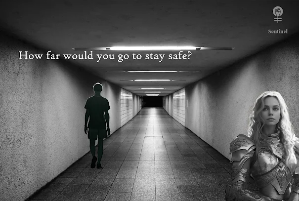
 As I was attempting to make my final piece, I continued my search for a woman in armour that I had in mind, depressingly all the images (and there are thousands) are sexy, pretty women in armour, many AI-generated.  I do feel feminism is going backwards and this idea of generating the perfect woman is rather disturbing.  Tomorrow Woman states that as a woman; 'The mainstream pressures of ‘looking the part’ and living up to unrealistic standards has been taken into a completely new realm with AI. We’re no longer dealing with the likes of Photoshop – instead, we’re battling hyper-intelligent algorithms that have no grounding in reality whatsoever.' (TW Diary, 2024) Deepfake porn and AI girlfriends are further evidence of this disturbing new world in which we all now live. I want to create an advert about women's safety and I am confronted by unrealistic images of women as content.  Obviously, if I was to create this in the real world I would have shot the images myself  and ensured I had exactly what I wanted.  After a frustrating search, I finally found a real woman that I thought would work in the advert.  All the images I used in the end were from Freepik with no AI generation!

To start the process I opened Photoshop clicked on New and then on Print, I chose A3, Landscape 300ppi (high resolution for print output) and chose a grey background as I intended to keep this as a frame.


I then used the same image in the background as my mock-up and changed it to black and white simply by clicking in the top menu on the image, adjustments and then black and white. I then clicked on 'select' in the top menu and then 'select all', I went to 'edit' and 'copy' 


I returned to the canvas clicked on 'edit' and 'paste' and used the transform controls to adjust size and position of the background image.


I opened the image of the woman I would use and again changed her to black and white using 'edit' and 'adjustments', I then clicked on the selection tool in the left hand menu and right-clicked to access the object selection.  I clicked on the women and selected her as the object and then copied her and pasted her into the canvas. 


I then used the same method to add the man in the background.  I added text by clicking on the Text tool in the left-hand menu and then clicking into the canvas to add a text layer.  I used High Tower Text at 44pts for the main tagline. I changed the colour to a very light grey and positioned using transform controls.


I then added the QR code I created in the previous post and added further text to strengthen my message.  The QR code works and goes to a guide to women for staying safe.


I liked the logo but thought I could do better so I created this again in Photoshop using bolder text (Gils Sans Ultra Bold) and a stronger image with a tagline as I felt this again strengthened the message.


I added the logo by just selecting and copying and pasting this into the canvas. 


I then cropped the frame and just quality-checked the final advert. I saved the final advert as a PSD and jpeg file.

This is my final advert ...


I was much happier with this than my mock-up - the woman was closer to my vision and was far more like the Joan of Arc character I had in mind. The logo is far improved and much stronger with the tagline and I like it that I have made this big so it is clear what the advert is for.  I think the tagline works. I also really like the working QR ode with real information available to women travelling alone. Obviously, if I had shot the images myself I would have had wider options and it would be far better than this but this gives a good idea of the concept and in the time given this is a fairly good outcome.


References

TW Diary (2024). Pixel Perfect: The Rise of AI-Generated Women and Its Impact on Society. [online] Tomorrowwoman.com.au. Available at: https://www.tomorrowwoman.com.au/blog-posts/pixel-perfect-the-rise-of-ai-women [Accessed 12 Oct. 2024].


Women's Safety Advert: Mock up Process & Final Piece

 I began my final process by looking for images that I could use in my final piece - I looked on Pexels, Pixabay and Unsplash.  

I started with trying to make a mock up as I was looking for women in armour and a train or train environment for my background.

I found these images on Pexels and Pixabay 


Tunnel by Veneet Panchal

Man

I opened Photoshop and created a new canvas at 300ppi with a black background. This was A3 in size and landscape orientation.  I then opened the three images above that I was going to use.  I wanted them to be black and white so I went to the top menu and clicked on 'image' then 'adjustments' then went to 'black and white'.  I went to the image of the environment and to 'select' and then 'select all' in the top menu and then I clicked on 'Edit' then 'copy'.  I went to my canvas and clicked on 'Edit' and 'paste'.  I wanted to add the woman in the foreground, returned to the original image, and then clicked on 'Select' and 'Object 'on the left-hand tool menu.  I clicked on the woman and then right-clicked to copy.  I then went back to my canvas, clicked on edit and then paste and then changed the size and positioning of the woman using transform controls.  I repeated this process to add the man.  I then clicked on the Text tool in the left-hand menu and then clicked on the canvas to add a text layer I changed the font to High Tower Text at 47pts.  Finally, I added the logo that I made on Adobe Express and just used transform controls to position this.  I then saved this as a PSD and jpeg file.


This advert works okay but needs much more information and also I need better images as this was not my vision for the woman in the image.  I have now created information and a QR code to access this please scan the code to see the document. I will add this to my final poster.